Collection Banner
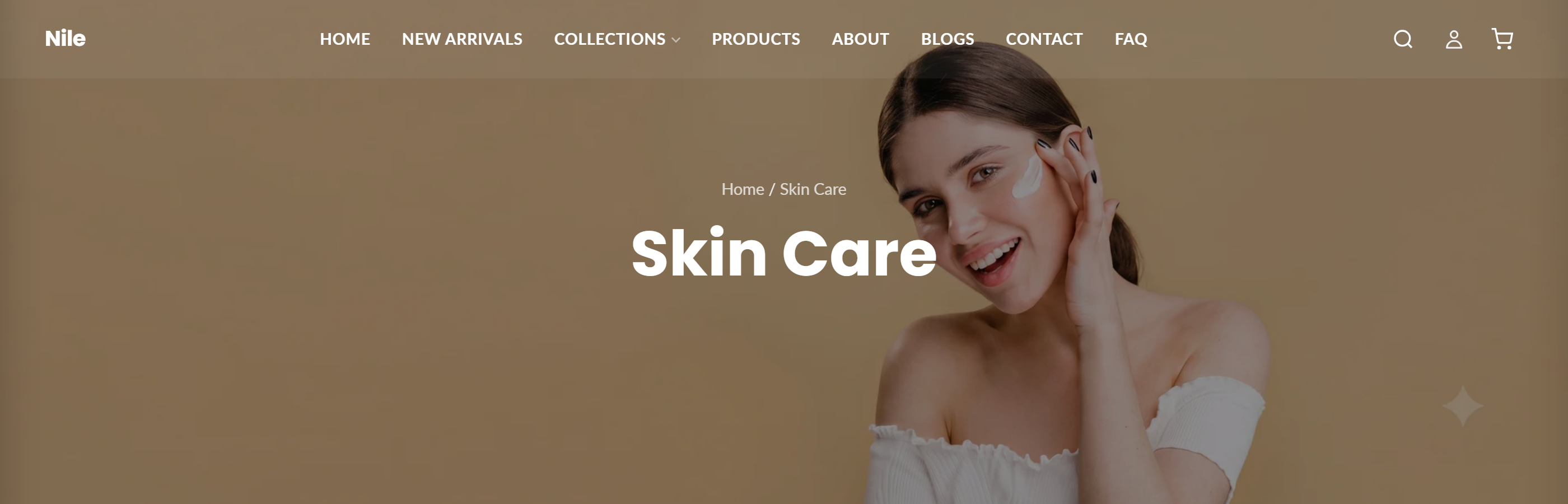
Displays a full-width collection banner with a background image, dark overlay, breadcrumbs, title, and optional description at the top of collection pages.
The Collection Banner section renders a hero-style banner at the top of a collection page. It shows the collection's title over a background image with a dark overlay, plus optional breadcrumbs and the collection description. When disabled, it still emits a visually hidden <h1> for SEO and accessibility.
How to use it
In the Shopify theme editor, add or open this section, then:
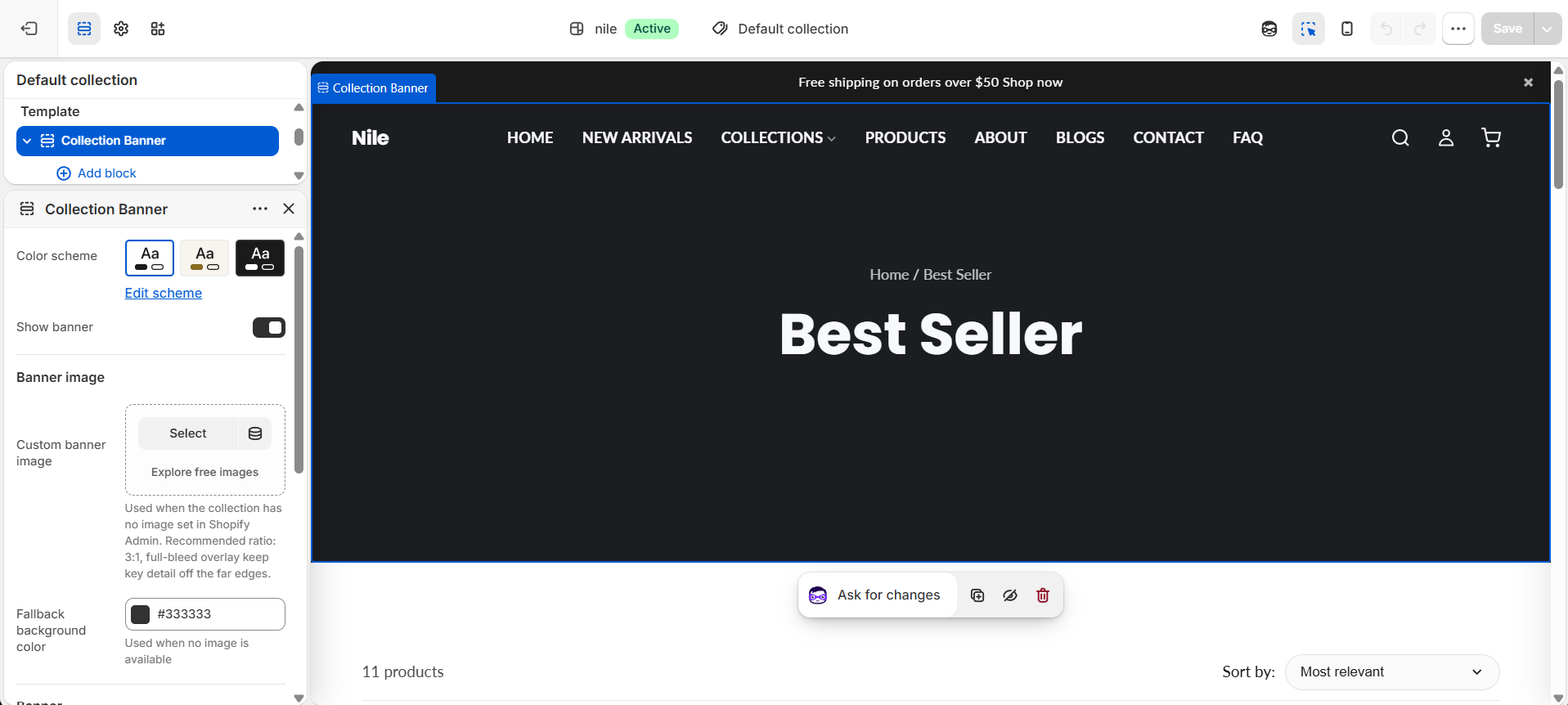
- In the theme editor, open a Collection page and select the Collection banner section.
- Keep Show banner checked to display the banner (uncheck to hide it while preserving a hidden page heading).
- The banner uses the collection's image from Shopify Admin automatically; set a Custom banner image for pages with no Admin image (e.g.
/collections/all), or a Fallback background color when no image exists. - Choose a Banner height, adjust Overlay opacity, and pick a Text alignment.
- Toggle Show breadcrumbs and Show collection description as desired, then Save.
Recommended custom image ratio is 3:1, full-bleed under the overlay, so keep key detail away from the far edges.
Image priority is: the collection's Admin image first, then the custom banner image, then the fallback background color.
Banner text is always white over the overlay, so raise Overlay opacity if a light image makes the title hard to read.
Settings reference
| Setting | Type | Default | What it does |
|---|---|---|---|
| Color scheme | color_scheme | scheme-1 | Color scheme applied to the section. |
| Show banner | checkbox | true | When off, the banner is hidden but a visually hidden collection heading is still output for SEO and accessibility. |
| Custom banner image | image_picker | - | Used when the collection has no image set in Shopify Admin. Recommended ratio: 3:1, full-bleed overlay - keep key detail off the far edges. |
| Fallback background color | color | #333333 | Used when no image is available. |
| Banner height | select | medium | Small (300px), Medium (450px), Large (600px), or Auto. Heights shrink on mobile (200/300/400px). |
| Overlay opacity | range | 40 | Darkness of the overlay over the image, 0-80% in 5% steps. |
| Text alignment | select | center | Aligns banner text Left, Center, or Right. |
| Show breadcrumbs | checkbox | true | Shows a Home / Collection breadcrumb trail above the title. |
| Show collection description | checkbox | false | Displays the collection's description under the title when the collection has one. |
The section only accepts @app blocks, letting Shopify apps inject content into the banner.
Developer notes
Scoped styles and IDs use #CollectionBanner-{{ section.id }}; all CSS/JS is inline in the section with no external asset dependencies.
- Background image is rendered with
image_tagat width 1920 usingloading: 'eager',fetchpriority: 'high', and a responsivewidthsset for LCP performance. - Inline scripts toggle header classes: enabled adds
header-transparentandhas-banneron.site-header-wrapper; disabled addsno-bannerfor a solid header. - Overlay opacity is computed as
overlay_opacity | divided_by: 100.0into anrgba(0,0,0,...)background (FB13: hidden<h1>retained when disabled).
{%- liquid
  assign banner_image = nil
  if collection.image
    assign banner_image = collection.image
  elsif section.settings.custom_banner_image != blank
    assign banner_image = section.settings.custom_banner_image
  endif
-%}