Collection description
Displays a collection's description text, with an optional heading and adjustable alignment, on collection pages.
The Collection description section pulls the description you write for a collection in Shopify admin and shows it on the collection page. You can add a heading above it, change the text alignment, and pick a color scheme. The section hides itself automatically when the collection has no description.

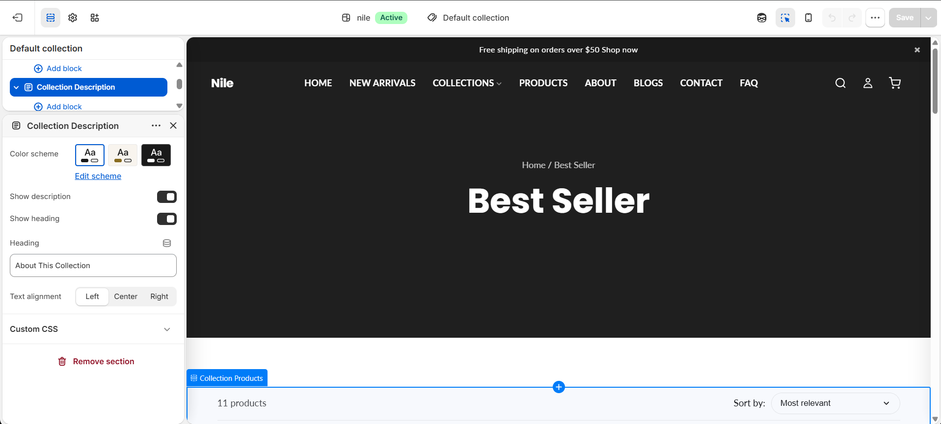
How to use it
In the Shopify theme editor, add or open this section, then:
- In the theme editor, open a Collection page and select the Collection description section.
- Make sure Show description is checked so the collection's text appears.
- Toggle Show heading and type your heading text (for example, About This Collection).
- Set Text alignment to Left, Center, or Right to match your layout.
- Choose a Color scheme to control the background and text colors, then Save.
- To edit the actual body copy, go to Products → Collections in Shopify admin and update the collection's Description field.
The section only renders when the collection has a description and Show description is enabled; an empty description means nothing shows on the page.
The description text is your collection's rich-text field, so links and paragraphs from the admin editor carry through. Links are styled with the theme primary color and underlined.
Empty paragraphs (or paragraphs containing only a line break) are hidden automatically, so stray blank lines from the admin editor won't add gaps.
Settings reference
| Setting | Type | Default | What it does |
|---|---|---|---|
| Color scheme | color_scheme | scheme-1 | Sets the background and text colors for the section. |
| Show description | checkbox | true | Master toggle. When off (or the collection has no description), the section is hidden. |
| Show heading | checkbox | true | Displays the heading text above the description. |
| Heading | text | About This Collection | The heading shown above the description when Show heading is on. |
| Text alignment | select | left | Aligns both the heading and description: Left, Center, or Right. |
Supports only @app blocks, so you can drop in compatible Shopify apps within the section; it has no built-in content blocks.
Developer notes
Starts with {% render 'section-color-scheme' %} and is wrapped in #shopify-section-{{ section.id }}-scoped inline {% style %}, using theme CSS variables (--color-background, --color-text, --color-primary, --spacing-*, --font-body).
- Content is wrapped in
.page-width; the heading uses.description-headingand the body uses.description-text. No JavaScript is used. - The whole section is gated by
{% if section.settings.enable_section and collection.description != blank %}, so it self-hides with no description. - CSS hides empty paragraphs via
.description-text p:emptyandp:has(> br:only-child); the section class iscollection-description-section no-padding.
{% if section.settings.enable_section and collection.description != blank %}
  {% if section.settings.show_heading %}
    <h2 class="description-heading">{{ section.settings.heading }}</h2>
  {% endif %}
  <div class="description-text">{{ collection.description }}</div>
{% endif %}