Collection products
Renders a collection page's product grid with sidebar filters, sort dropdown, color swatches, and infinite scroll.
This is the main body of every collection page. It shows a product grid with a toolbar (product count, filter toggle, and sort menu), an optional filter sidebar built from Shopify's storefront filters, and loads more products automatically as the shopper scrolls.
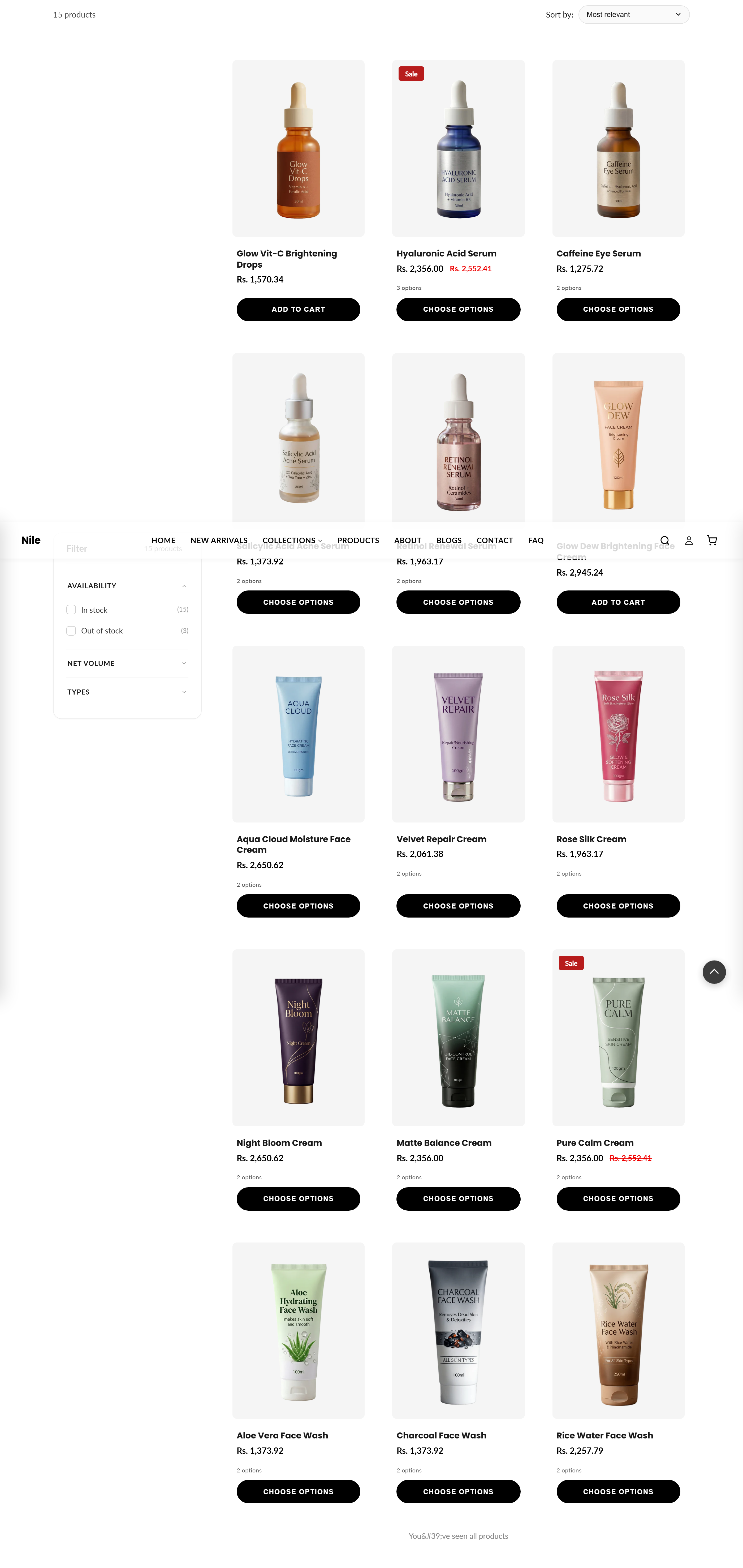
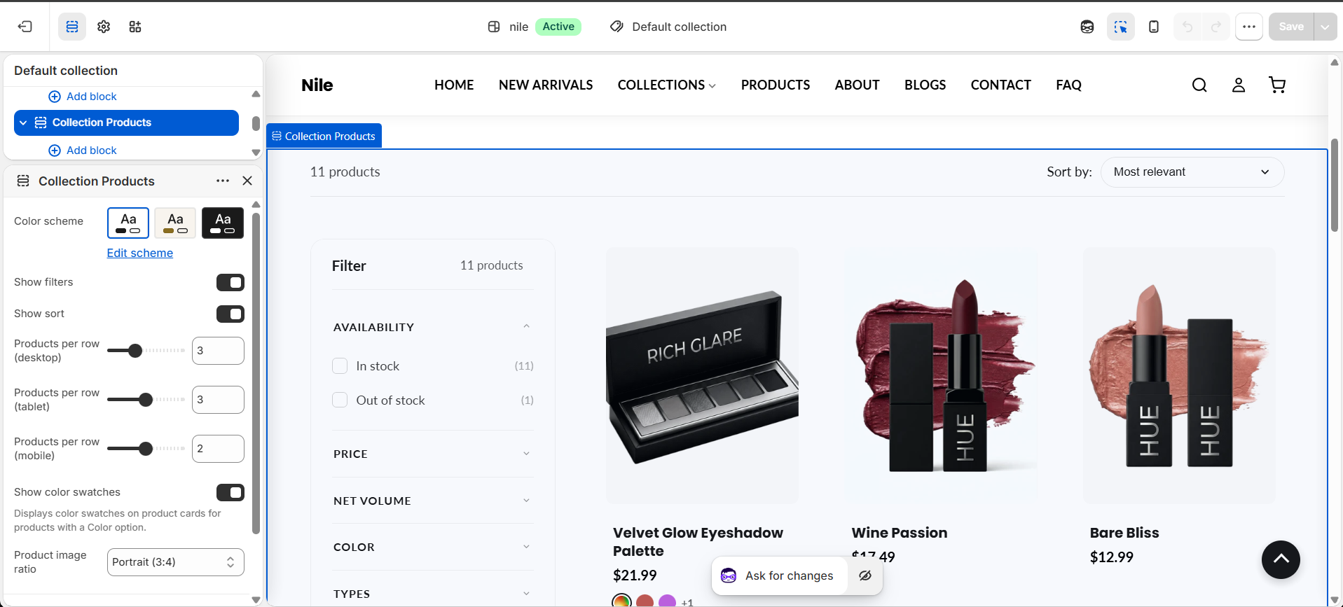
How to use it
In the Shopify theme editor, add or open this section, then:
- In the theme editor, open a Collection page and select the Collection products section.
- Toggle Show filters and Show sort to control whether the filter sidebar and sort menu appear.
- Set Products per row for desktop, tablet, and mobile to control grid density.
- Choose a Product image ratio (square, portrait, tall, or landscape) to match your product photography.
- Enable Show color swatches to display color chips on product cards, and pick a Color scheme for the section.
Filters only appear if you have enabled Storefront filtering in Shopify admin under Online Store > Navigation (or if products have multiple variants).
Color swatches use the value's admin swatch image first, then the product's color-pattern metaobject image, then the swatch color, falling back to a CSS color chip named after the value.
Single-variant products' default Title option filter is hidden automatically so it never clutters the sidebar.
Settings reference
| Setting | Type | Default | What it does |
|---|---|---|---|
| Color scheme | color_scheme | scheme-1 | Applies one of the theme's saved color schemes to this section. |
| Show filters | checkbox | true | Requires Storefront filtering to be enabled in Shopify admin under Online Store > Navigation. |
| Show sort | checkbox | true | Shows the sort-by dropdown in the toolbar. |
| Products per row (desktop) | range | 3 | Grid columns on desktop (2-5). |
| Products per row (tablet) | range | 3 | Grid columns on tablet up to 989px (2-4). |
| Products per row (mobile) | range | 2 | Grid columns on mobile up to 749px (1-3). |
| Show color swatches | checkbox | true | Displays color swatches on product cards for products with a Color option. |
| Product image ratio | select | 1/1 | Card image aspect ratio: Square (1:1), Portrait (3:4), Tall (2:3), or Landscape (4:3). |
Supports only @app blocks, letting apps inject content into the collection section.
Developer notes
Loads collection-main.css and defers collection-filters.js; also renders the quick-view-assets, product-card, pagination, and section-color-scheme snippets.
- Grid columns are set inline per
section.idfrom the three products-per-row settings; the 480px override was removed (FB15) so mobile respectsproducts_per_row_mobile. - Infinite scroll is always on (paginate by a fixed 24, with an
#InfiniteScrollSentinel);products_per_pageis not merchant-facing. - Color swatch resolution reads
metafields.shopify['color-pattern']using bracket notation (dotted syntax is parsed as subtraction in Liquid); matched by handleized label into a~~handle::url~~map.
{%- paginate collection.products by products_per_page -%}
  {%- for product in collection.products -%}
    {% render 'product-card', product: product, context: 'collection', show_swatches: section.settings.show_color_swatches %}
  {%- endfor -%}
  {%- render 'pagination', paginate: paginate -%}
{%- endpaginate -%}