Collections list
Displays a paginated grid of your store's collections, either all of them or a hand-picked, ordered set.
The Collections list section renders a grid of collection cards with a heading and subheading. It can automatically show every collection in your store (paginated 12 per page) or show only the specific collections you add as blocks, in the order you arrange them.
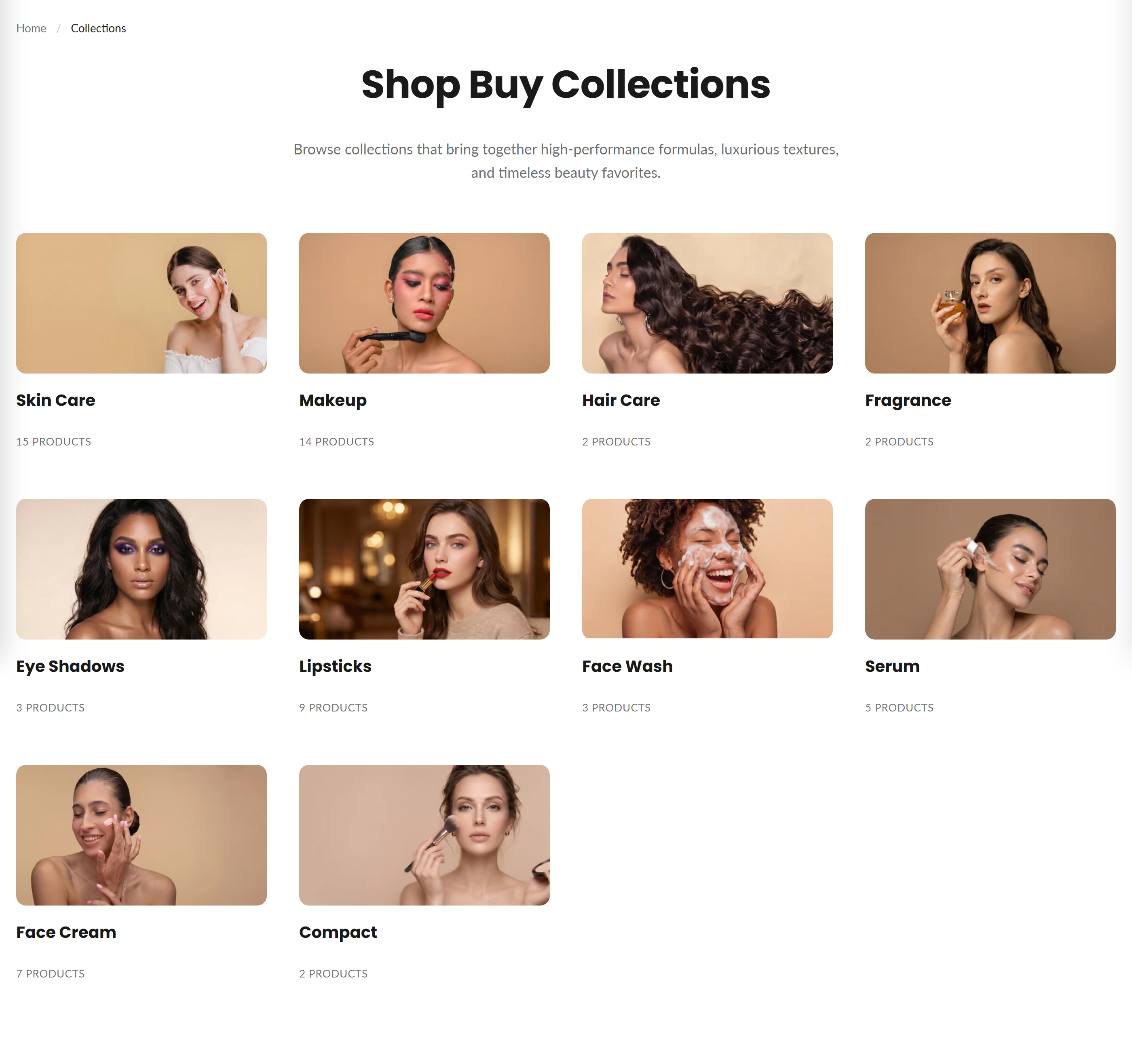
How to use it
In the Shopify theme editor, add or open this section, then:
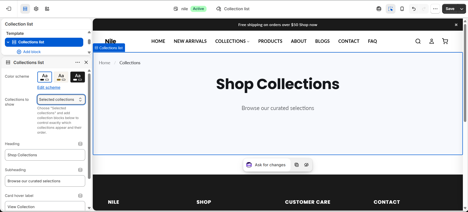
- In the theme editor, open the List collections page and select the Collections list section.
- Set the Heading and Subheading shown above the grid.
- Under Collections to show, pick All collections to display every collection automatically, or Selected collections to curate them.
- If you chose Selected collections, click Add block → Collection and choose a collection for each block, dragging blocks to reorder them.
- Edit the Card hover label (e.g. Shop Now) and choose an Image shape for the cards.
- Pick a Color scheme and save.
The built-in all collection is automatically skipped in All collections mode, so it won't appear as a duplicate card.
Pagination (12 per page) only shows in All collections mode; Selected collections shows every block you add on one page with no pagination.
Use square or circle image shapes with consistently-sized collection images so cards line up neatly across the grid.
Settings reference
| Setting | Type | Default | What it does |
|---|---|---|---|
| Color scheme | color_scheme | scheme-1 | Sets the background and text colors for the section. |
| Collections to show | select | all | Choose "Selected collections" and add collection blocks below to control exactly which collections appear and their order. |
| Heading | text | Shop Collections | Title shown above the grid; leave blank to hide it. |
| Subheading | text | Browse our curated selections | Supporting line under the heading; leave blank to hide it. |
| Card hover label | text | Shop Now | Call-to-action text shown on each collection card. |
| Image shape | select | square | Options: Square, Landscape, Circle, Angled. |
Repeatable Collection blocks (each with a single collection picker) let you curate and order which collections appear when Collections to show is set to Selected collections; an @app block type is also supported for app integrations.
Collection blocks
Only used when Collections to show is set to Selected collections. Add one Collection block per collection you want in the grid, and drag to set their order.
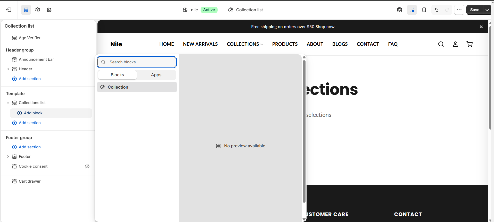
| Setting | Type | Default | What it does |
|---|---|---|---|
| Collection | collection | - | The collection this card shows and links to. |
Developer notes
Loads collections-list.css via asset_url | stylesheet_tag and renders section-color-scheme for scheme variables.
- Each card is rendered through the
collection-grid-itemsnippet, passing the collection and section; breadcrumbs and pagination use thebreadcrumbsandpaginationsnippets. - The
collection_sourcesetting switches between iterating the paginatedcollectionsglobal (skipping theallhandle) and loopingsection.blocksof typecollection. - Wrapper element id is
CollectionsList-{{ section.id }}; whole grid is wrapped in{% paginate collections by 12 %}.
{%- if section.settings.collection_source == 'selected' -%}
  {%- for block in section.blocks -%}
    {%- if block.type == 'collection' and block.settings.collection != blank -%}
      {%- render 'collection-grid-item', collection: block.settings.collection, section: section -%}
    {%- endif -%}
  {%- endfor -%}
{%- endif -%}