Search results
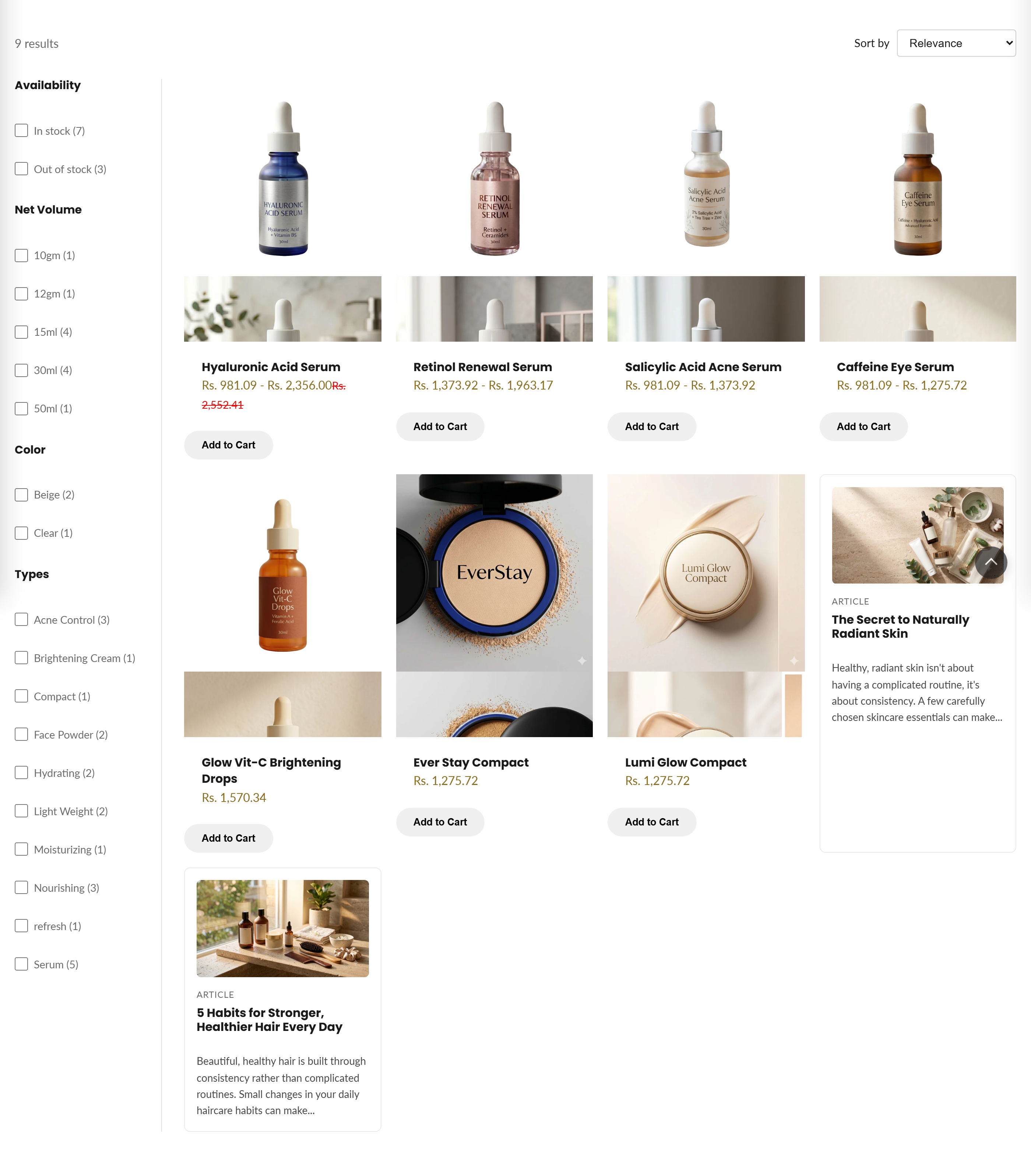
Displays storefront search results (products, articles, and pages) with a filter sidebar, sortable results grid, and pagination.
This section powers the storefront search results page. It shows a live count of matches, an optional filter sidebar and sort dropdown, and a responsive grid that renders products as product cards plus articles and pages as compact result cards. Results are paginated, and an empty state with a Browse all link appears when nothing matches.
How to use it
In the Shopify theme editor, add or open this section, then:
- In the theme editor, go to a search results page (search for a term in the preview, or open the Search template from the top page selector).
- Select the Search results section in the left panel.
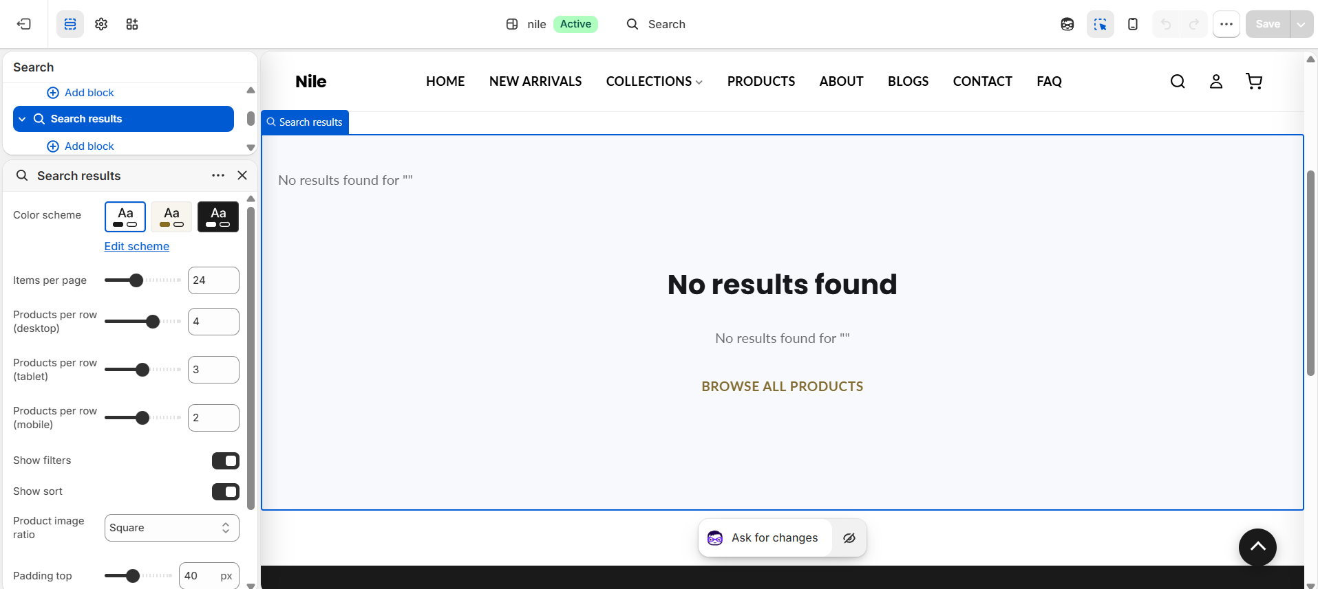
- Set Items per page and the Products per row values for desktop, tablet, and mobile to control the grid density.
- Toggle Show filters and Show sort to display or hide the filter sidebar and the sort-by dropdown.
- Choose a Product image ratio (Square, Portrait, or Landscape) and adjust Padding top/bottom, then Save.
The filter sidebar only appears when Show filters is on and search filters are configured; set these up under Search & Discovery or the storefront filters settings in your admin.
Article images render at 500×375; use reasonably sized blog featured images so result cards stay crisp without bloating page weight.
The visible search filters are Shopify storefront filters, not a theme setting - if no filter groups show up, none have been enabled for search in your store.
Settings reference
| Setting | Type | Default | What it does |
|---|---|---|---|
| Color scheme | color_scheme | scheme-1 | Sets the background and text colors for the section. |
| Items per page | range | 24 | Number of results shown per page before pagination (8-48, step 4). |
| Products per row (desktop) | range | 4 | Grid columns on desktop (2-5). |
| Products per row (tablet) | range | 3 | Grid columns on tablet widths up to 989px (2-4). |
| Products per row (mobile) | range | 2 | Grid columns on mobile widths up to 749px (1-3). |
| Show filters | checkbox | true | Shows the filter sidebar when storefront search filters exist. |
| Show sort | checkbox | true | Shows the sort-by dropdown above the results. |
| Product image ratio | select | square | Aspect ratio for product card images: Square, Portrait, or Landscape. |
| Padding top | range | 40 | Top spacing in px (0-100). |
| Padding bottom | range | 60 | Bottom spacing in px (0-100). |
This section accepts only Shopify app blocks (@app), so apps can inject content into the search results page; it has no theme-defined repeatable blocks.
Developer notes
Results are wrapped in {% paginate search.results by section.settings.items_per_page %}; the grid loops search.results and switches on item.object_type to render products via product-card and articles/pages as inline .search-result-misc cards.
- Renders
section-color-schemeandquick-view-assetssnippets; product tiles come from theproduct-cardsnippet withimage_ratiopassed through. - Sort and filter controls carry
data-auto-submit; an inline script (FB16) AJAX-fetches the GET URL, swaps the.search-results-{id}region in place, updates history, and restores focus, falling back to full navigation on error.<noscript>submit buttons keep it working without JS. - A hardcoded
type=productfilter was intentionally removed (FB5) so article and page results survive sort/filter changes; all CSS is scoped persection.id.
{%- paginate search.results by section.settings.items_per_page -%}
  {%- for item in search.results -%}
    {%- case item.object_type -%}
      {%- when 'product' -%}{% render 'product-card', product: item, image_ratio: section.settings.product_image_ratio %}
    {%- endcase -%}
  {%- endfor -%}
{%- endpaginate -%}