About - Call to Action
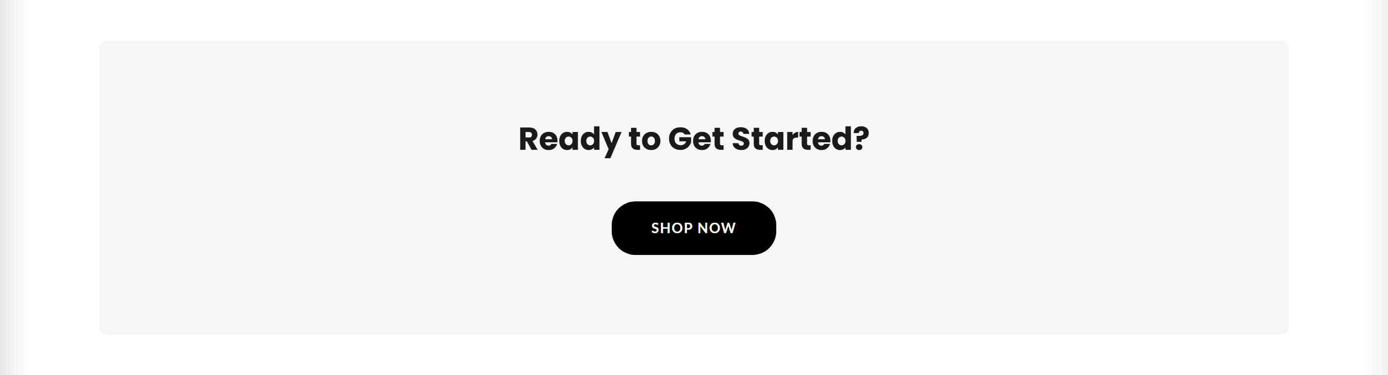
A simple call-to-action banner with a heading and a single button, typically used at the bottom of an About page.
The About - Call to Action section renders a centered heading followed by a single button that links wherever you choose. It is designed to prompt visitors to take the next step, such as shopping a collection, after reading your About content.
How to use it
In the Shopify theme editor, add or open this section, then:
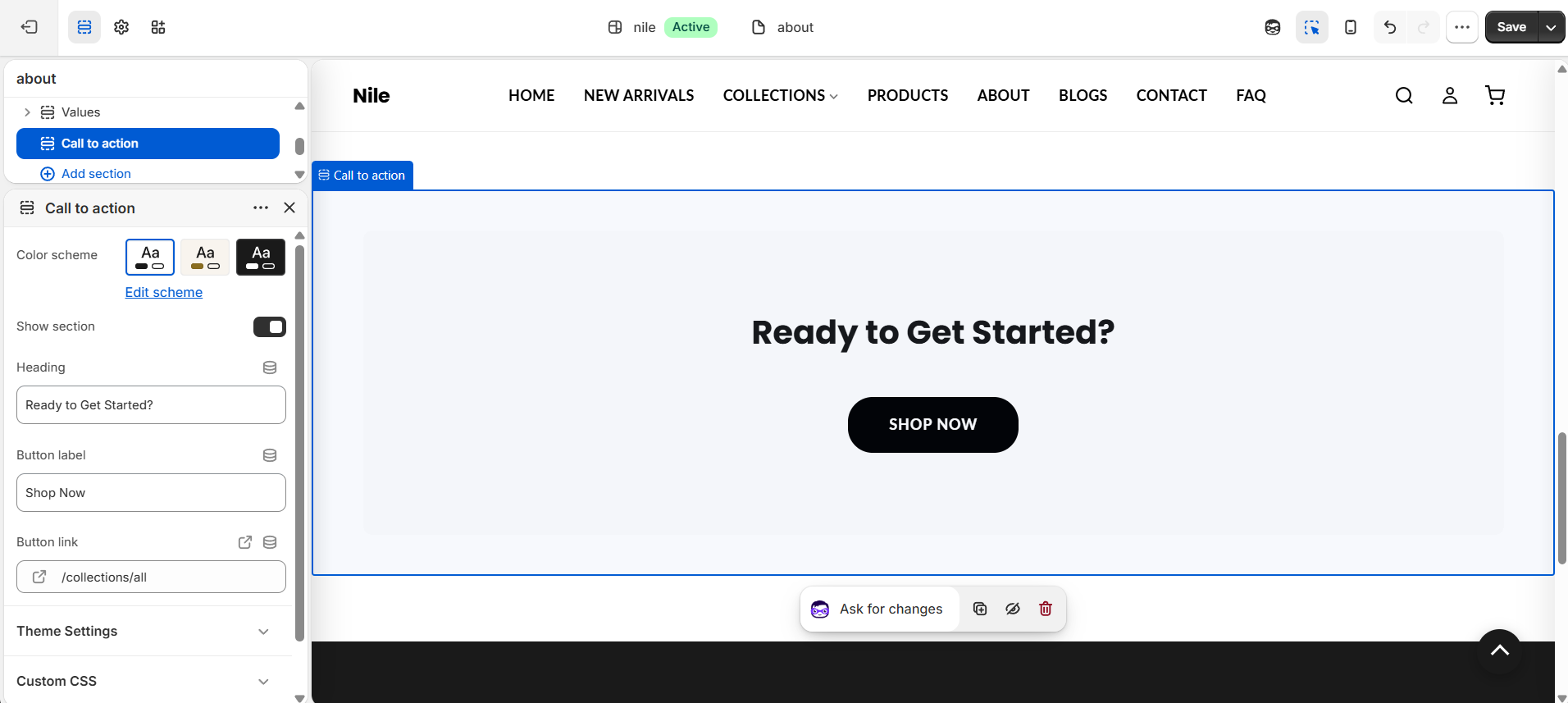
- In the theme editor, open the page and click Add section, then choose Call to action.
- Enter your Heading text (for example, Ready to Get Started?).
- Set the Button label (for example, Shop Now).
- Pick a Button link destination, such as a collection or page.
- Choose a Color scheme and confirm Show section is enabled, then save.
If you leave Heading or Button label empty, that element is hidden automatically - set both for a complete call to action.
Button colors and shape come from your global theme settings (button primary background, text, hover, and shape), not from this section, so it stays consistent with the rest of the store.
Uncheck Show section to temporarily hide the whole banner without deleting it.
Settings reference
| Setting | Type | Default | What it does |
|---|---|---|---|
| Color scheme | color_scheme | scheme-1 | Sets the background and text colors used for the section. |
| Show section | checkbox | true | Toggles the entire section on or off; when unchecked, nothing renders. |
| Heading | text | Ready to Get Started? | Headline shown above the button. Hidden if left blank. |
| Button label | text | Shop Now | Text on the call-to-action button. The button is hidden if left blank. |
| Button link | url | - | Destination the button links to, such as a collection, product, or page. |
Developer notes
Loads about-main.css and renders section-color-scheme; the wrapper uses the .about-main / .about-cta classes with an #AboutCta-{{ section.id }} id.
- Button styling is injected via an inline
{% style %}block driven by globalsettings.button_primary_bg,settings.button_primary_text, andsettings.button_primary_hover; the shape class isbtn-shape-{{ settings.button_shape }}. - No repeatable blocks and no section-level JavaScript; output is purely conditional Liquid based on
enable_section,heading, andlabel.
{% if section.settings.label != blank %}
  <a href="{{ section.settings.url }}" class="about-cta__btn btn-shape-{{ settings.button_shape }}">
    {{ section.settings.label }}
  </a>
{% endif %}