About - Team
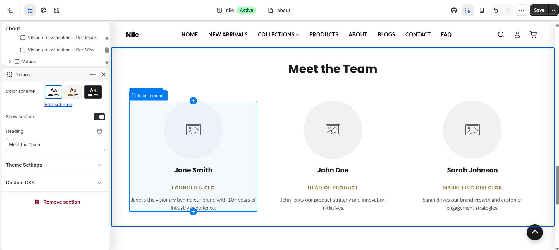
Displays a responsive grid of team member cards, each with a photo, name, role, and short bio.
Not on the About page by default. Add it in the theme editor with Add section → Team on your About page (or any other page).
The About - Team section presents your people in a tidy grid of cards. Each Team member block shows a photo, name, role, and short bio. The grid automatically adjusts its column count to the number of members so rows always divide evenly.
How to use it
In the Shopify theme editor, add or open this section, then:
- In the theme editor, open your About page and add the Team section (or find it if already present).
- Set the Heading (defaults to "Meet the Team") and pick a Color scheme.
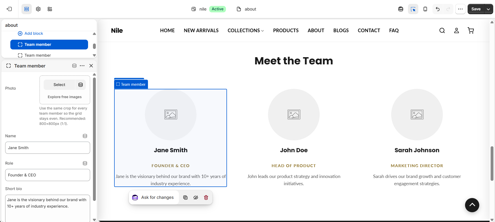
- Add a Team member block for each person, then upload a Photo and fill in Name, Role, and Short bio.
- Reorder blocks by dragging them to control the display order in the grid.
- Use Show section to toggle the whole section on or off, then save.
Use the same square crop for every photo so the grid stays even. Recommended size is 800×800px (1:1).
Desktop shows up to 4 members per row and tablet caps at 2; a 5th member wraps to the next row.
The role text color follows the theme's global accent color.
Settings reference
| Setting | Type | Default | What it does |
|---|---|---|---|
| Color scheme | color_scheme | scheme-1 | Sets the background and text colors for the section. |
| Show section | checkbox | true | Toggle to show or hide the entire section. |
| Heading | text | Meet the Team | The section heading, hidden if left blank. |
Repeatable Team member blocks each hold a Photo, Name, Role, and Short bio; @app blocks are also supported.
Team member blocks
Each person is a repeatable Team member block. Select a block to upload their Photo and fill in Name, Role, and Short bio.
| Setting | Type | Default | What it does |
|---|---|---|---|
| Photo | image_picker | - | Member portrait; a placeholder shows when empty. Use a square crop, around 800×800px. |
| Name | text | Jane Smith | Member name; hidden when blank. |
| Role | text | Founder & CEO | Job title, shown in the theme accent color. |
| Short bio | textarea | A short description about this team member. | One or two lines under the role. |
Developer notes
Loads about-main.css and renders section-color-scheme; the role color is injected inline from settings.color_accent.
- Grid columns are computed in Liquid from the member count: capped at 4 on desktop (min-width 990px) and 2 on tablet (min-width 641px) via a scoped
<style>block keyed to#AboutTeam-{{ section.id }}. - Member photos render at
width: 500with responsivewidths: '300, 500, 700'and lazy loading; a placeholder SVG shows when no image is set. - Empty fields (name, role, bio, heading) are conditionally hidden with
!= blankchecks.
{%- for block in section.blocks -%}
  <article class="about-team-card" {{ block.shopify_attributes }}>
    {{ block.settings.image | image_url: width: 500 | image_tag: loading: 'lazy', widths: '300, 500, 700', alt: block.settings.name }}
    <h3>{{ block.settings.name }}</h3>
  </article>
{%- endfor -%}