About - Vision/mission
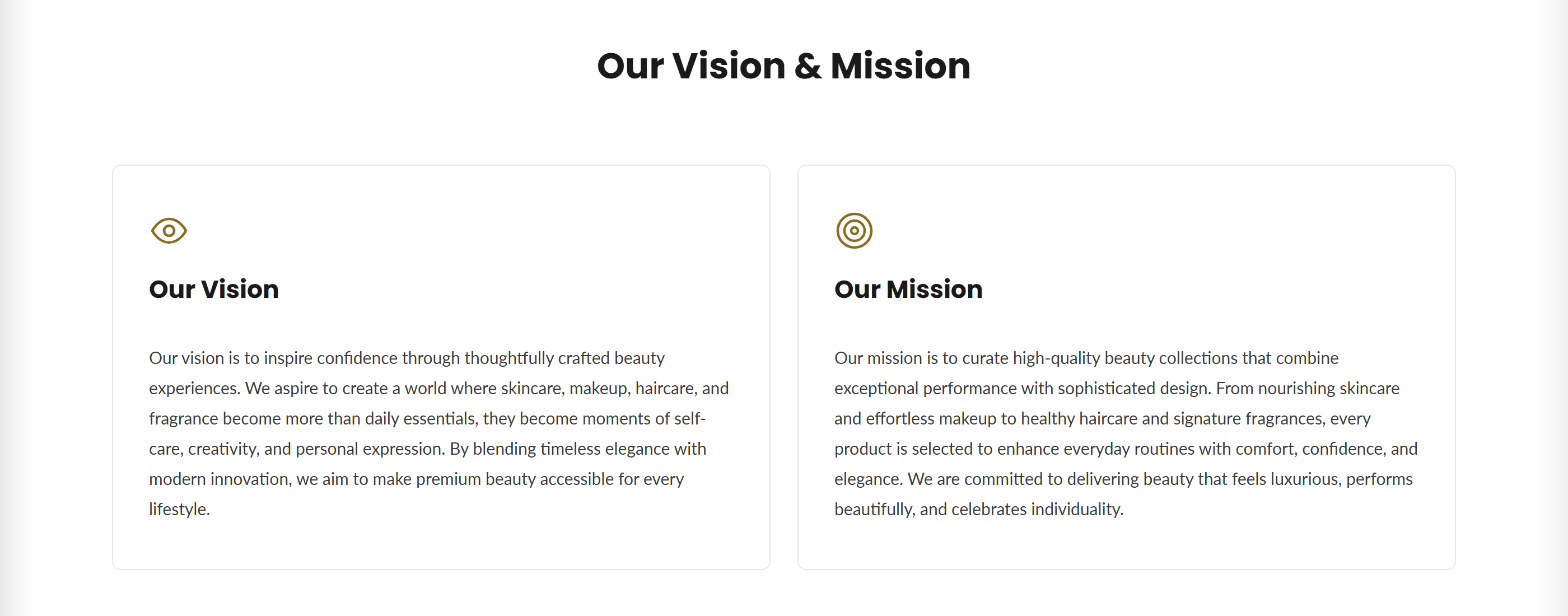
Displays a heading with a grid of icon-topped cards for sharing your company's vision, mission, and values.
This section presents your company's vision and mission as a responsive grid of cards, each with a chosen icon, a title, and rich-text body copy. A section heading sits above the grid, and the entire section can be hidden with a single toggle.
How to use it
In the Shopify theme editor, add or open this section, then:
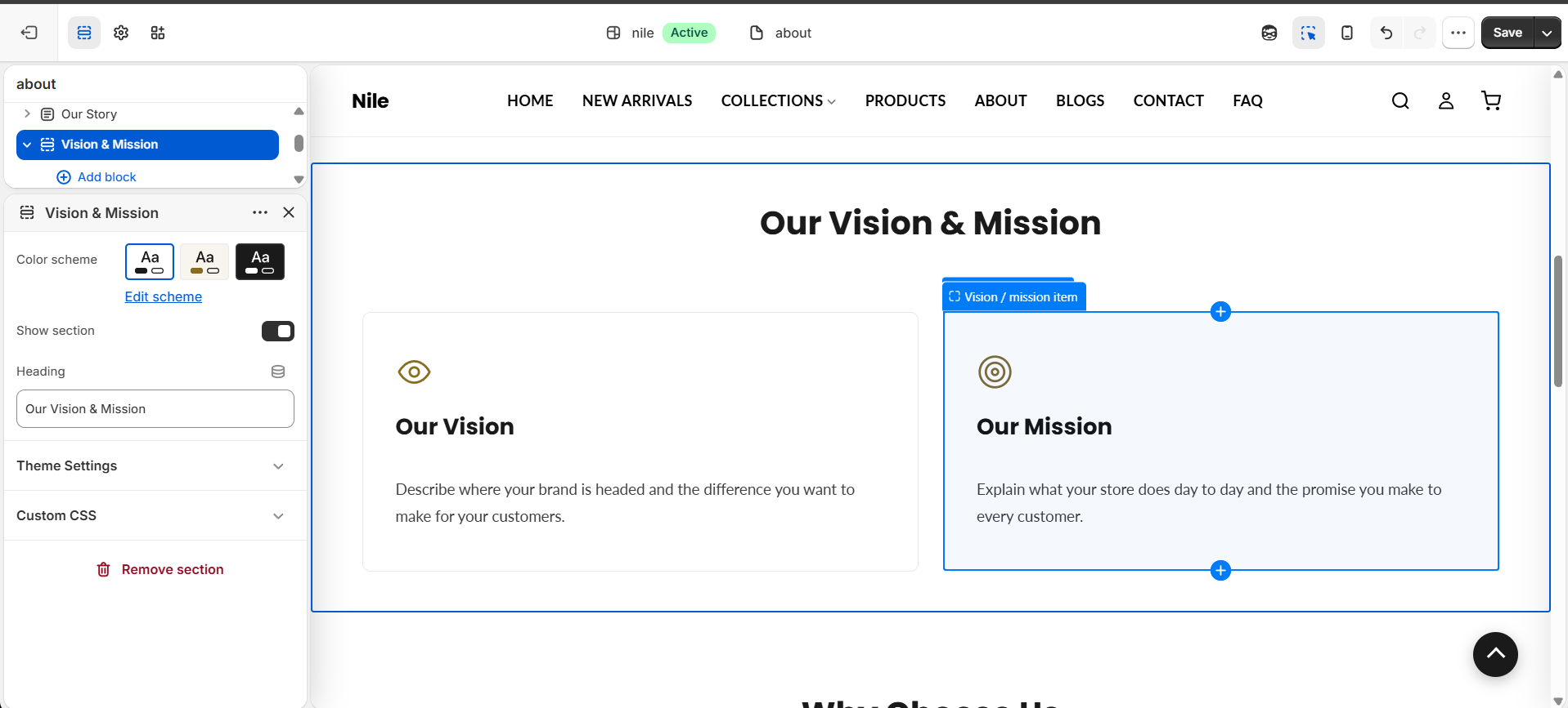
- In the theme editor, open the page and add or select the Vision & Mission section.
- Enter a Heading such as "Our Vision & Mission" (leave blank to hide the heading).
- Add a Vision / mission item block for each card you want to show.
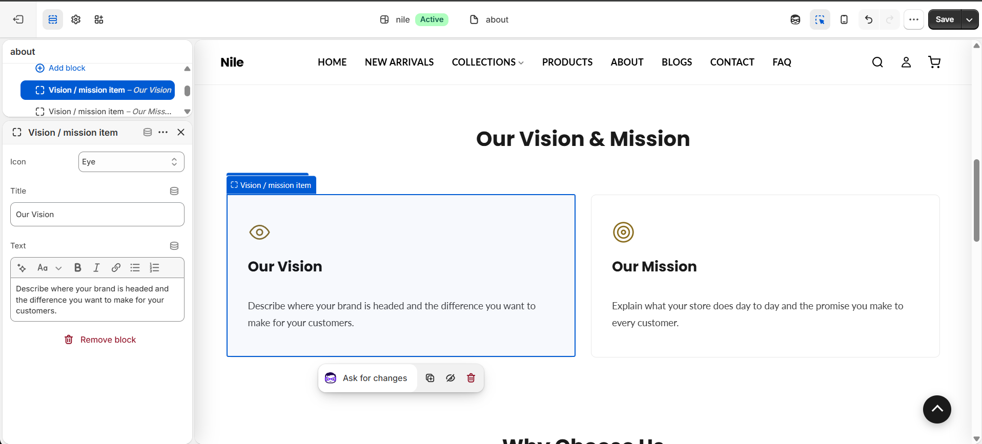
- For each block, pick an Icon, write a Title, and add your Text.
- Choose a Color scheme for the section, then keep Show section checked to make it visible.
- Save your changes.
Card icons use the theme's accent color, so they match your global branding automatically.
Leaving Show section unchecked hides the whole section without deleting your content.
Add two or three items (e.g. Vision, Mission, Values) for a balanced grid layout.
Settings reference
| Setting | Type | Default | What it does |
|---|---|---|---|
| Color scheme | color_scheme | scheme-1 | Sets the background and text colors for the section. |
| Show section | checkbox | true | Toggles whether the entire section renders on the page. |
| Heading | text | Our Vision & Mission | Title shown above the card grid; hidden when left blank. |
Repeatable Vision / mission item blocks, each with an Icon (16 choices: Eye, Target, Star, Heart, Gem, Shield, Leaf, Award, Sparkle, Globe, Lightbulb, Handshake, Community, Shipping, Clock, Check), a Title, and rich-text Text. App blocks are also supported.
Item blocks
Each card is a repeatable Vision / mission item block. Select a block to pick its Icon and write its Title and Text.
| Setting | Type | Default | What it does |
|---|---|---|---|
| Icon | select | eye | One of 16 preset line icons shown at the top of the card. |
| Title | text | Our Vision | Card heading; hidden when blank. |
| Text | richtext | Describe what you aspire to achieve as a company. | Card body copy; hidden when blank. |
Developer notes
Loads about-main.css and renders section-color-scheme at the top; the section wrapper id is AboutVM-{{ section.id }}.
- Icons are drawn via the
about-iconsnippet, passingblock.settings.icon; the icon color is set inline fromsettings.color_accent. - Card borders use
rgba(var(--color-text), 0.1), so they adapt to the active color scheme. - The
@appblock type is supported and rendered directly with{% render block %}.
<span class="about-vm-card__icon">{% render 'about-icon', icon: block.settings.icon %}</span>
<h3 class="about-vm-card__title">{{ block.settings.title }}</h3>
<div class="about-vm-card__text">{{ block.settings.text }}</div>