Blog article
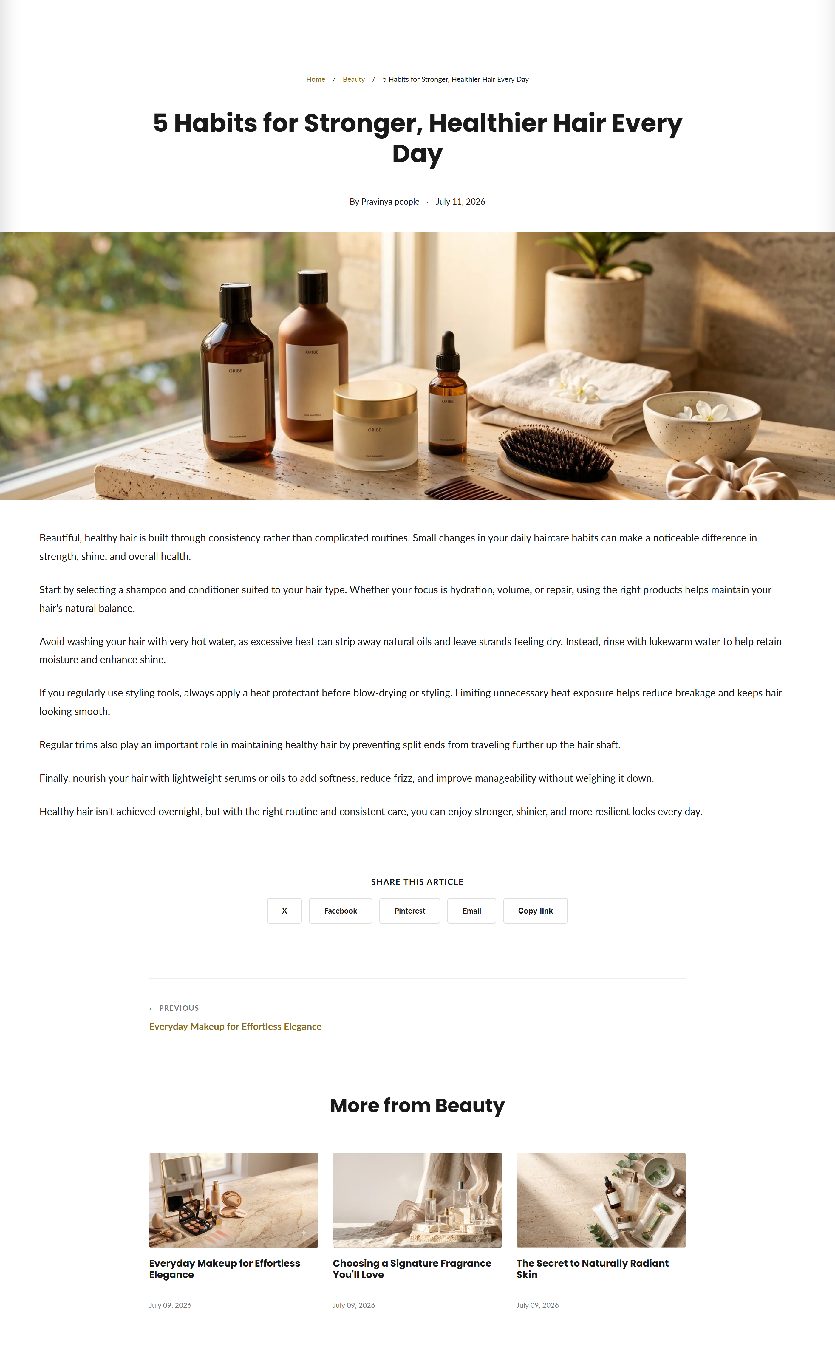
Renders a single blog article with hero banner, reading progress bar, auto table of contents, share buttons, related posts, and comments.
The main content section for a blog article. It pulls the article's title, tags, author, date, hero image, and body from Shopify and adds reading enhancements: a sticky reading-progress bar, an auto-generated table of contents, social share buttons, previous/next navigation, related articles, and a native comments form.
How to use it
In the Shopify theme editor, add or open this section, then:
- Open Online Store > Themes > Customize, then use the top page selector to switch to a Blog post (article) page.
- Select the Article section to open its settings.
- Under Features, toggle Show breadcrumbs, Show share buttons, and Show related articles to taste.
- Under Banner image, pick a Banner image height (Original, Small, Medium, Large, or Full screen) to control how the article's featured image displays.
- Under Spacing, adjust Padding top and Padding bottom, then Save.
The hero banner uses the article's featured image (set on the article in the Shopify admin), not a section setting. Upload a wide, high-resolution image (~2000px wide) for best results.
The table of contents only appears when the article body contains at least 3 H2/H3 headings; otherwise it stays hidden.
Comments only show if they are enabled for the blog in the Shopify admin; the Pinterest share button only appears when the article has a featured image.
Settings reference
| Setting | Type | Default | What it does |
|---|---|---|---|
| Color scheme | color_scheme | scheme-1 | Sets the background and text colors for the section. |
| Show breadcrumbs | checkbox | true | Shows a Home / Blog / Article breadcrumb trail above the title. |
| Show share buttons | checkbox | true | Displays X, Facebook, Pinterest, email, and copy-link share buttons below the article. |
| Show related articles | checkbox | true | Shows up to 3 other posts from the same blog in a card grid. |
| Banner image height | select | original | Controls the featured-image hero height: Original (natural height), Small (300px), Medium (450px), Large (600px), or Full screen (100vh). |
| Padding top | range | 40px | Space above the section (0-120px). |
| Padding bottom | range | 80px | Space below the section (0-120px). |
Accepts only Shopify @app blocks, letting apps inject content at the end of the section; there are no theme-defined blocks to add.
Developer notes
Styles are inline-scoped to #ArticleMain-{{ section.id }} via a {% style %} block; colors read from global settings.color_accent, settings.color_text, and button settings.
- Renders
section-color-schemeat the top and reuses thepaginationsnippet for paginated comments (20 per page). - An inline vanilla-JS IIFE handles the copy-link button (Clipboard API), the scroll-driven reading-progress bar (rAF-throttled), and building the TOC from H2/H3 headings; it respects
prefers-reduced-motion. - Comments use Shopify's
{% form 'new_comment' %}and honorblog.moderated?andblog.comments_enabled?; hero, related, and share output only render when the relevant objects exist.
<div class="article-main__content" data-article-body>
  {{ article.content }}
</div>
<nav class="article-main__toc" data-article-toc hidden></nav>