Blog posts
Displays a blog's articles in a magazine-style layout with a featured lead article, tag filters, and pagination.
Renders the current blog as a magazine-style feed: an optional masthead (subheading + heading), a tag-filter bar built from the blog's tags, a large featured split card for the newest post, a responsive card grid for the rest, and numbered pagination. Article images, reading time, author, and date are pulled automatically from each article.
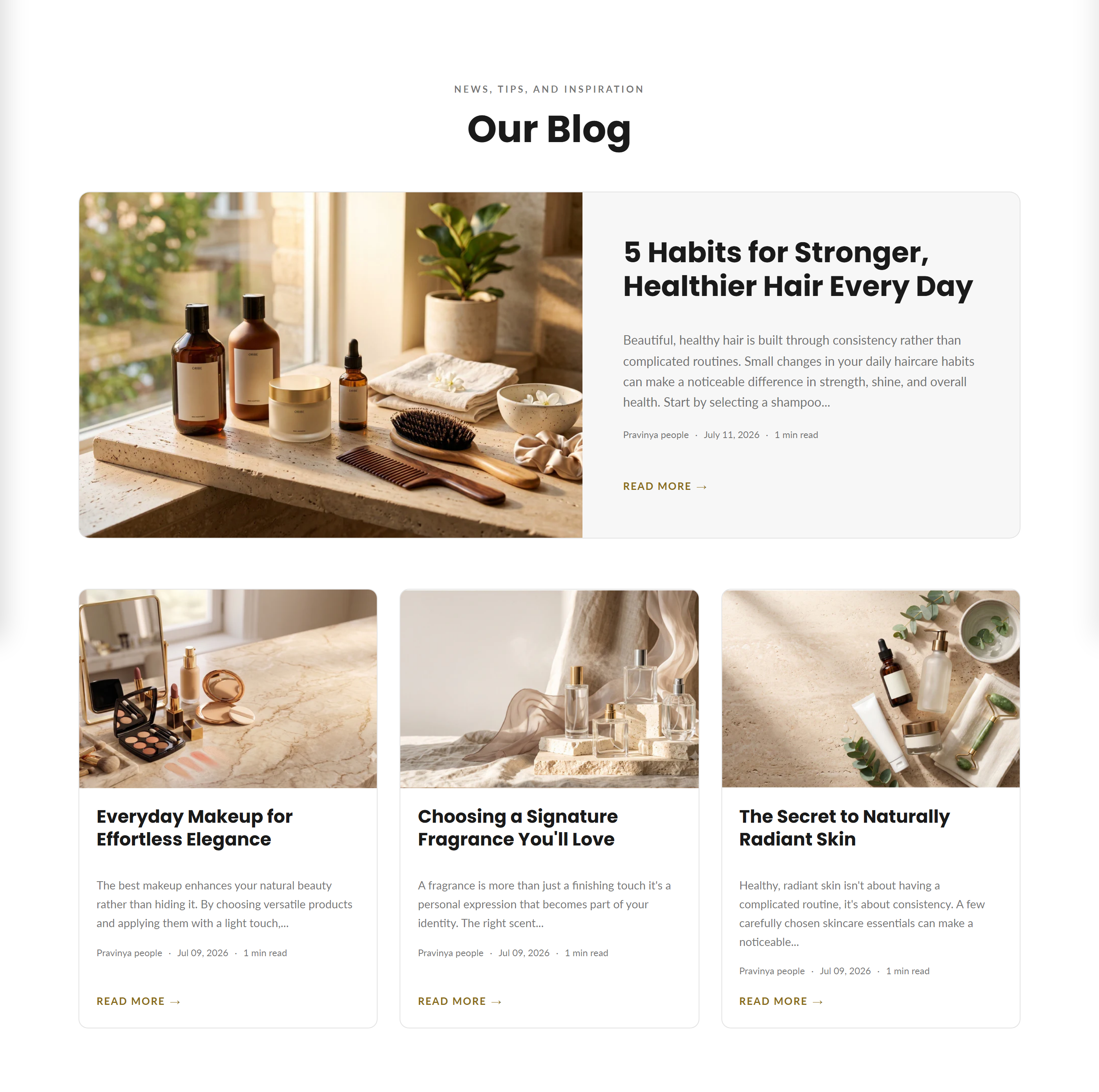
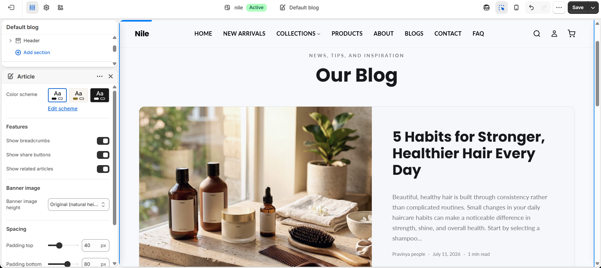
How to use it
In the Shopify theme editor, add or open this section, then:
- In the theme editor, open your Blog template (the page that lists articles) and select the Blog posts section.
- Enter a Heading and Subheading for the masthead, or leave them blank to hide the header entirely.
- Set Articles per page to control how many posts show before pagination appears.
- Pick a Color scheme to match the section's colors to your brand.
- Adjust Padding top and Padding bottom to control vertical spacing, then save.
The featured split card only appears on page 1 when no tag filter is active; on tagged or later pages every post shows as a normal grid card.
The tag filter bar appears automatically only when the blog's articles have tags assigned - add tags to your articles in the Shopify admin to enable it.
Featured images render up to 1200px wide and grid cards up to 700px; use landscape article images for the cleanest crop. Reading time is estimated at ~200 words per minute.
Content (article title, image, excerpt, author, date) comes from each article, not from this section's settings.
Settings reference
| Setting | Type | Default | What it does |
|---|---|---|---|
| Color scheme | color_scheme | scheme-1 | Sets the section's background and text colors. |
| Heading | text | Our Blog | Main masthead title; leave blank to hide the header. |
| Subheading | text | News, tips, and inspiration | Small eyebrow text shown above the heading; leave blank to hide. |
| Articles per page | range | 6 | Number of articles per page (4-24, step 2) before pagination is shown. |
| Padding top | range | 80px | Space above the section (0-120px). |
| Padding bottom | range | 80px | Space below the section (0-120px). |
Supports only @app blocks, letting you drop in compatible Shopify apps; it has no merchant-editable content blocks.
Developer notes
Loads blog-main.css and renders section-color-scheme; the section id scopes an inline <style> block (#BlogMain-{{ section.id }}) that applies settings.color_accent to tags, hover states, active filters, and active pagination.
- Iterates
blog.articlesinside a{% paginate ... by section.settings.articles_per_page %}block; the featured card isblog.articles.first, skipped in the grid loop via{% continue %}. - Reading time is computed inline:
content | strip_html | split: ' ' | size | divided_by: 200 | at_least: 1. - Uses many
t:translation strings (e.g.blog.read_more,blog.min_read,accessibility.pagination) and responsivesrcset/sizesimage markup with lazy loading.
{% paginate blog.articles by section.settings.articles_per_page %}
  {% if paginate.current_page == 1 and current_tags == blank %}
    {% assign featured = blog.articles.first %}
  {% endif %}
  {% for article in blog.articles %}...{% endfor %}
{% endpaginate %}