Contact form
A customizable contact form that emails submissions to the store owner, with client-side validation and extensive styling controls.
Not on any page by default - your Contact page uses the Contact page section instead, which has its own built-in form and contact details. Use this section when you want a contact form on any other page: add it with Add section → Contact form.
The Contact form section renders a Shopify-native contact form (name, email, optional phone and subject, and message) that posts to Shopify and emails the store's contact address. It layers on JavaScript validation, accessible error messaging, and a full set of color, spacing, and typography settings so the form matches your brand.
How to use it
In the Shopify theme editor, add or open this section, then:
- In the theme editor, open the page (or template) where you want the form and add the Contact form section, or edit the existing one on your Contact page.
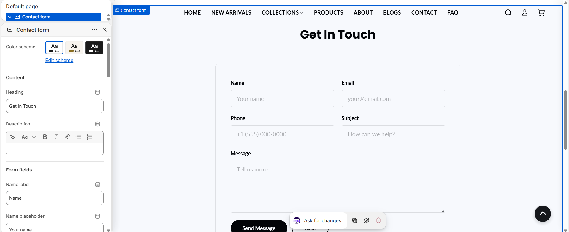
- Under Content, set the Heading and optional Description shown above the form.
- Under Form fields, edit each field's label and placeholder, and toggle Show phone field and Show subject field as needed.
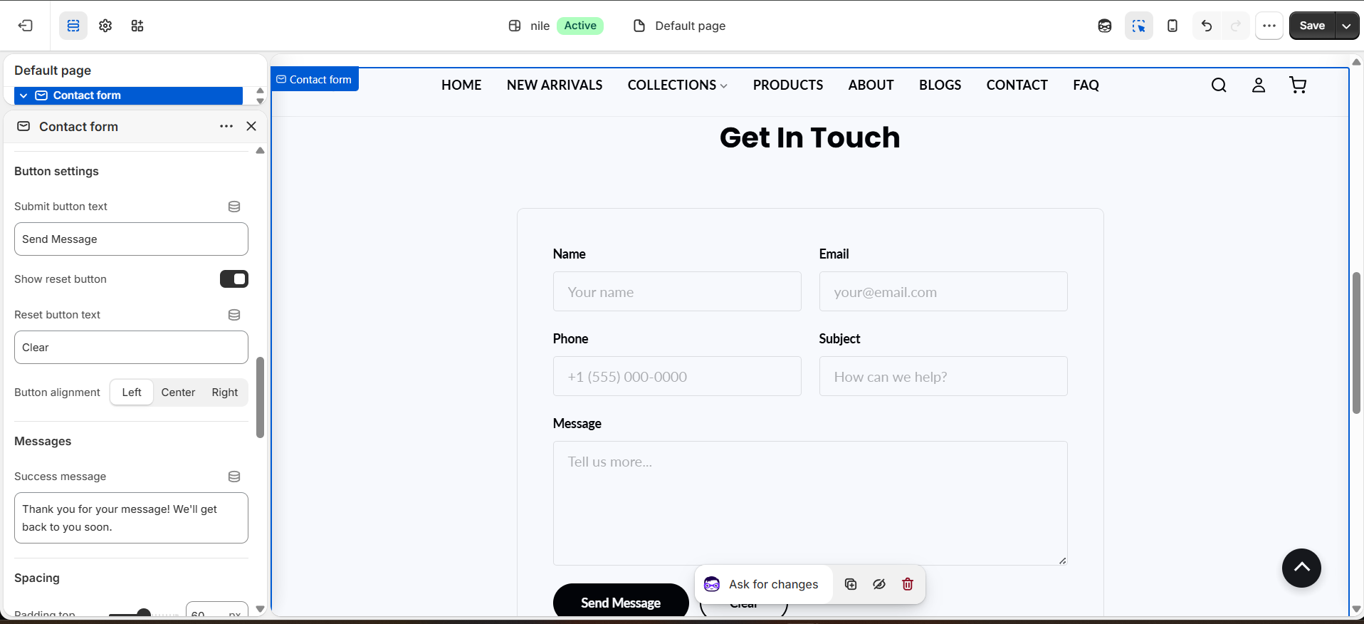
- Under Button settings, set the submit button text, choose whether to show a Clear (reset) button, and pick the button alignment.
- Under Messages, edit the Success message shown after a successful submission.
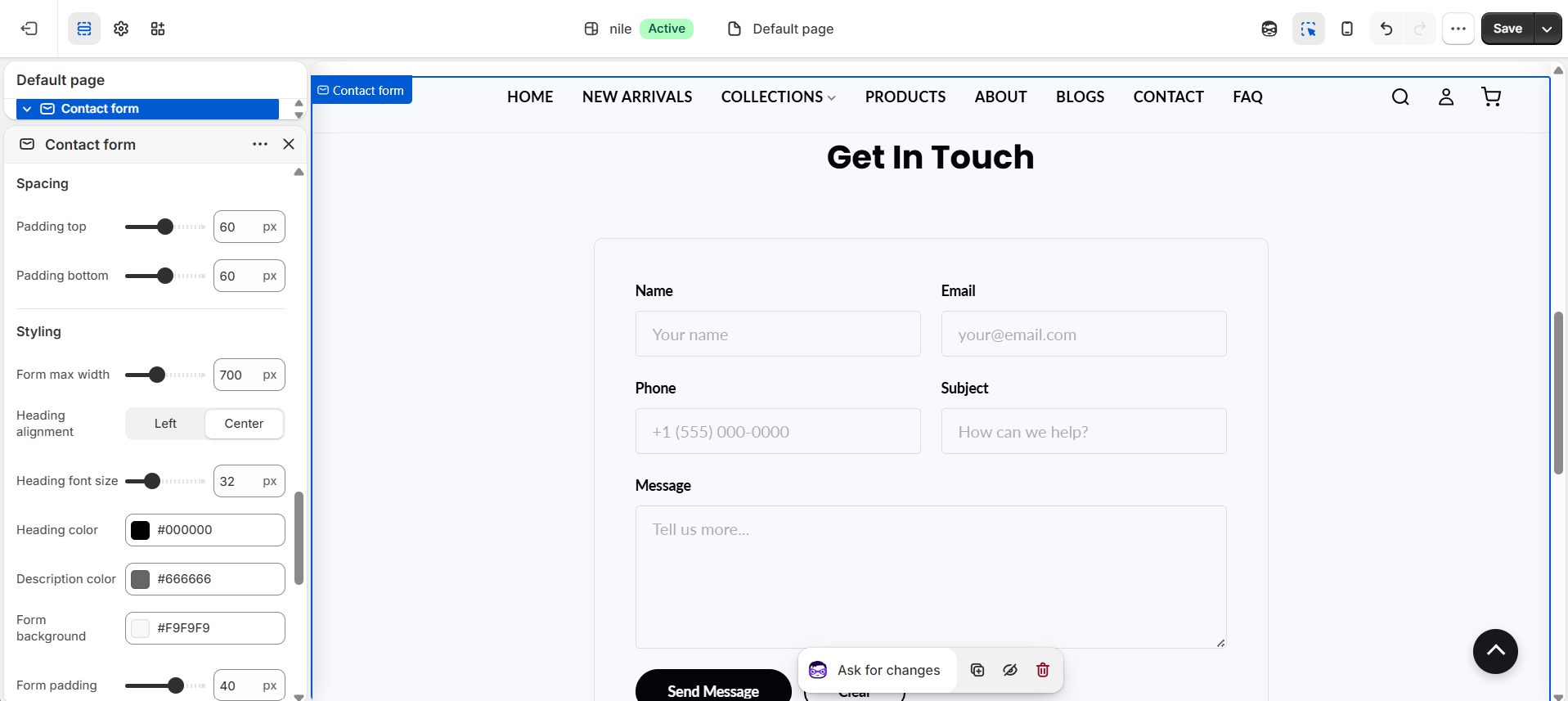
- Use the Styling settings to adjust max width, heading size/color, form background, padding, border, and input colors, then Save.
Submissions are emailed to the address set in Shopify Settings → Store details → Sender/contact email, not configured in this section.
Input font size is fixed at 16px on purpose to stop iOS from auto-zooming when a field is focused.
The phone and subject fields render independently, so turning off phone no longer hides the subject field.
Settings reference
| Setting | Type | Default | What it does |
|---|---|---|---|
| Color scheme | color_scheme | scheme-1 | Base color scheme applied to the section. |
| Heading | text | Get In Touch | Title shown above the form; leave blank to hide the header. |
| Description | richtext | (empty) | Optional rich-text intro shown under the heading. |
| Name label / placeholder | text | Name / Your name | Label and placeholder for the required name field. |
| Email label / placeholder | text | Email / your@email.com | Label and placeholder for the required email field. |
| Show phone field | checkbox | true | Adds an optional telephone field (validated only if filled in). |
| Show subject field | checkbox | true | Adds an optional subject line field. |
| Phone label / placeholder | text | Phone / +1 (555) 000-0000 | Label and placeholder for the optional phone field. |
| Subject label / placeholder | text | Subject / How can we help? | Label and placeholder for the optional subject field. |
| Message label / placeholder | text | Message / Tell us more... | Label and placeholder for the required message textarea. |
| Submit button text | text | Send Message | Text on the primary submit button. |
| Show reset button | checkbox | true | Shows a secondary Clear button that resets the form. |
| Button alignment | select | left | Aligns the buttons left, center, or right. |
| Success message | text | Thank you for your message! We'll get back to you soon. | Shown after Shopify confirms a successful submission. |
| Padding top / bottom | range | 60px / 60px | Vertical spacing around the section (0-120px). |
| Form max width | range | 700px | Maximum width of the form container (400-1200px). |
| Heading alignment / font size | select / range | center / 32px | Aligns and sizes the heading (font size 20-60px, scales responsively). |
| Description color | color | #666666 | Text color for the optional description under the heading. |
| Form background / padding / radius / border | color / range | #f9f9f9 / 40px / 8px / 1px #e0e0e0 | Controls the look of the form card wrapper. |
| Heading color | color | #000000 | Text color of the heading. |
| Label color | color | #000000 | Text color for the form field labels. |
| Input background / text / border / focus colors | color | #ffffff / #000000 / #ddd / #000000 | Colors for form inputs, including the focus border color. |
This section accepts only Shopify app blocks (@app), which render after the form for integrations; it has no theme-defined repeatable content blocks.
Developer notes
Loads contact-form.css and renders the section-color-scheme snippet; all layout and colors are output in an inline {% style %} block driven by section settings.
- Uses Shopify's native
{% form 'contact' %}with a per-section id (contact-form-{{ section.id }}); the browser POSTs to/contactso Shopify processes and emails the submission. - An inline IIFE does client-side validation (name/email/message required, email and phone regex), toggles
.errorclasses andaria-invalid, focuses the first invalid field, and only disables the submit button once valid. - Buttons reuse global theme settings
settings.button_primary_bg,button_primary_text,button_primary_hover, andbutton_shape; on server-side success the confirmation message receives focus and is scrolled into view.
{%- form 'contact', id: form_id, class: 'contact-form' -%}
  {%- if form.posted_successfully? -%}
    <div class="form-message success">{{ section.settings.success_message }}</div>
  {%- endif -%}
{%- endform -%}