Gift Card
Displays an issued Shopify gift card with its amount, redemption code, scannable QR code, and print/wallet actions on the storefront gift card page.
This section renders the customer-facing gift card page a buyer sees after a gift card is issued. It shows the card title, the card's initial value, its redemption code, a locally-generated QR code for in-store scanning, an optional expiry date, balance, and personal message, plus Print, Continue shopping, and (when available) Add to Apple Wallet actions.
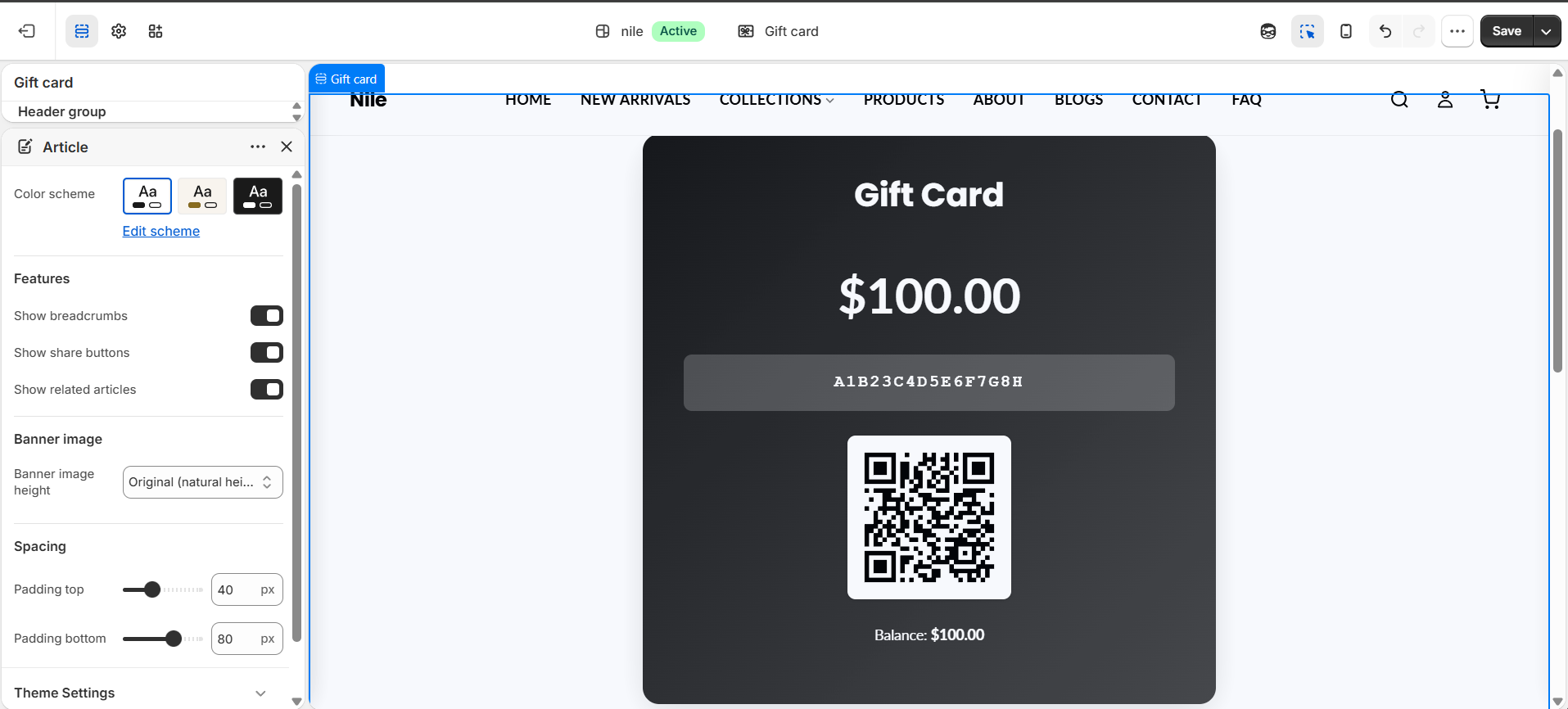
How to use it
In the Shopify theme editor, add or open this section, then:
- In the theme editor, open the Gift card template from the top page selector.
- Select the Gift card section to reveal its settings in the sidebar.
- Set the Card title text and pick a Color scheme.
- Adjust the card colors (background, accent, text) and the button colors to match your brand.
- Save. Real card details (amount, code, expiry, balance, message) are supplied automatically by Shopify when a live gift card is viewed.
The card face uses a diagonal gradient from the Card background color to the Card accent color - pick two tones that read well together.
Ensure the Card text color has enough contrast against both gradient colors, since it is used for the amount, code, and expiry over the gradient.
In the theme editor with no real card loaded, the section shows placeholder values ($50.00 and XXXX-XXXX-XXXX-XXXX); actual values only appear on a genuine gift card URL.
Settings reference
| Setting | Type | Default | What it does |
|---|---|---|---|
| Color scheme | color_scheme | scheme-1 | Base color scheme applied to the section via section-color-scheme. |
| Card title | text | Gift Card | Heading shown at the top of the gift card. |
| Card background color | color | #1a1a1a | Start color of the card face gradient. |
| Card accent color | color | #4a4a4a | End color of the card face gradient. |
| Card text color | color | #ffffff | Color for the title, amount, code, expiry, and balance text on the card. |
| Button background color | color | #000000 | Fill color of the primary Print button and the border/hover of the secondary Continue shopping button. |
| Button text color | color | #ffffff | Text color inside the primary button and on secondary button hover. |
The section only accepts Shopify @app blocks, which let apps inject content onto the gift card page; there are no theme-defined repeatable blocks.
Developer notes
Card data comes from the global gift_card object (initial_value, code, qr_identifier, expires_on, balance, message, pass_url); placeholders render when it is absent.
- QR code is generated client-side by
qrcode.jsinto the[data-gift-card-qr]canvas usingdata-identifier;gift-card.jswires up the Print (data-gift-card-print) and Continue shopping (data-gift-card-continue) buttons. - Styling is inlined in a
{% style %}block scoped to.gift-card-*classes, with a@media printrule hiding the actions and a mobile breakpoint at 640px. - Apple Wallet button only appears when
gift_card.pass_urlis present; all button/section labels resolve fromgift_card.*translation keys.
{% if gift_card %}
  <div class="gift-card-amount">{{ gift_card.initial_value | money }}</div>
  <div class="gift-card-code">{{ gift_card.code | upcase }}</div>
{% else %}
  <div class="gift-card-amount">$50.00</div>
{% endif %}