Global theme settings
The store-wide settings that cascade to every section - set these once in Theme settings.
Open these from the theme editor: click the gear / Theme settings icon at the bottom of the left panel (not a specific section). Everything here applies store-wide, so it's the first thing to set up after installing Nile. Individual sections then inherit these values (for example, every section can pick one of your global color schemes).
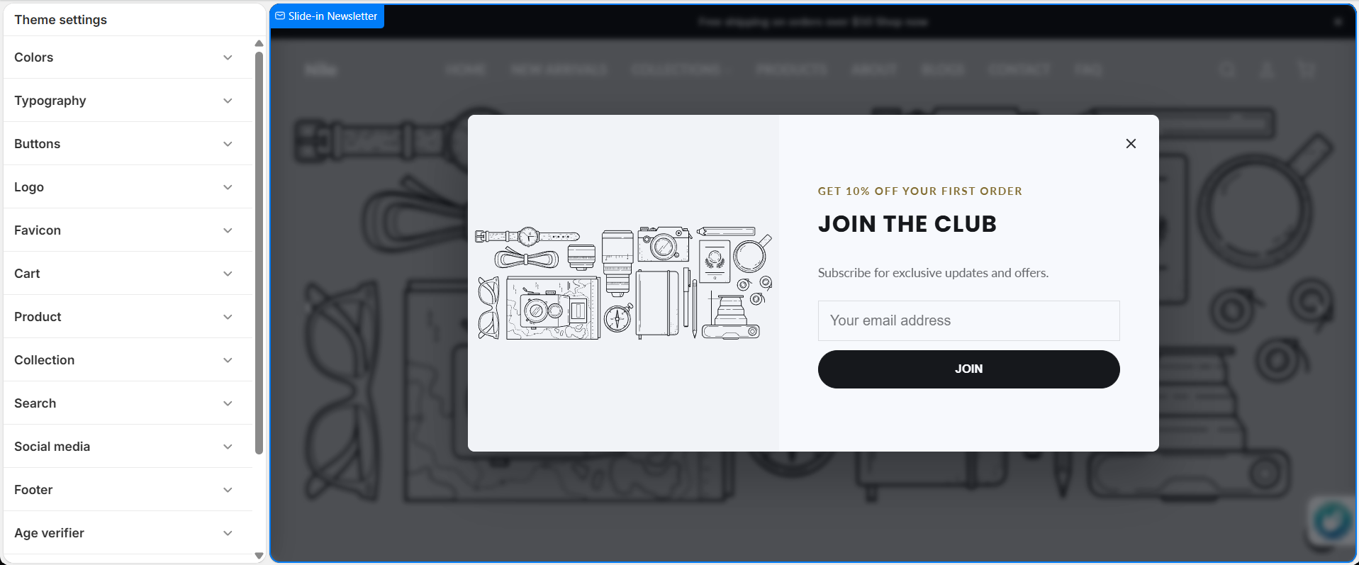
Colors
Set your five global brand colors, then define reusable color schemes that each section can apply.
| Setting | Type | Default | What it does |
|---|---|---|---|
| Primary color | color | #1a1a1a | Main brand color. |
| Accent color | color | #8a6d1f | Links, navigation hovers, underlines and focus states. |
| Sale / alert color | color | #b71c1c | Cart count bubble and sale badges - keep it distinct (e.g. red) so it reads as a status signal. |
| Text color | color | #333333 | Default body text color. |
| Background color | color | #ffffff | Default page background. |
| Color schemes | color_scheme_group | 1 default scheme | Reusable schemes (background, text, button, shadow…). Sections pick a scheme instead of being recolored one by one. |
Define your color schemes once here, then choose a scheme per section via each section's Color scheme setting. That keeps the whole store consistent and makes rebrands a one-place change.
Typography
| Setting | Type | Default | What it does |
|---|---|---|---|
| Heading font | font_picker | Assistant | Font for all headings. |
| Body font | font_picker | Assistant | Font for body text. |
| Base font size | range | 16px | Base text size (14-20px). |
| Heading size scale | range | 1x | Scales all headings (h1-h3, hero) relative to the base size (0.8x-1.6x). |
Buttons
Global button colors and shape. Most sections use these unless a section is set to "Custom" button colors.
| Setting | Type | Default | What it does |
|---|---|---|---|
| Primary button - Background | color | #000000 | Primary button fill. |
| Primary button - Text color | color | #ffffff | Primary button label color. |
| Primary button - Hover background | color | #333333 | Fill on hover. |
| Primary button - Hover text color | color | #ffffff | Label color on hover. |
| Primary button - Border color | color | #000000 | Border color. |
| Secondary button - Background | color | transparent | Secondary/outline button fill. |
| Secondary button - Text color | color | #000000 | Secondary button label. |
| Secondary button - Hover background | color | #1a1a1a | Secondary fill on hover. |
| Secondary button - Hover text color | color | #ffffff | Secondary label on hover. |
| Secondary button - Border color | color | #000000 | Secondary border. |
| Shape | select | Rounded | Rounded, Rectangle, or Rounded rectangle - applied to all theme buttons. |
Logo
| Setting | Type | Default | What it does |
|---|---|---|---|
| Logo image | image_picker | - | Transparent PNG or SVG. Recommended 600×240px. |
| Logo width | range | 150px | Desktop logo width (50-300px). |
| Logo text | text | Nile | Text logo used when no logo image is set. |
| Mobile logo | image_picker | - | Shown below 990px; falls back to the desktop logo. |
| Mobile logo width | range | 100px | Mobile logo width (40-200px). |
See also the Header doc - the logo is displayed by the header, which has its own layout and color settings.
Favicon
| Setting | Type | Default | What it does |
|---|---|---|---|
| Favicon | image_picker | - | Browser-tab icon. Recommended 512×512px (1:1) PNG; Shopify scales it to 32×32px. |
Cart
| Setting | Type | Default | What it does |
|---|---|---|---|
| Cart type | select | Drawer | Drawer (slide-out) or Page. |
| Enable cart notes | checkbox | true | Allow customers to add an order note. |
| Free shipping threshold | number | 0 | Order amount (store currency) that unlocks free shipping; 0 hides the progress bar. |
| Show "you may also like" in cart drawer | checkbox | true | Recommendation upsells in the drawer. |
| Require agreement before checkout | checkbox | false | Adds a terms checkbox that blocks checkout (including accelerated buttons) until ticked. |
| Agreement text | text | I agree to the Terms of Service and Privacy Policy | Label for the checkbox; supports HTML links. |
These drive the Cart and Cart drawer - the terms gate in particular lives here, not on those sections.
Product
| Setting | Type | Default | What it does |
|---|---|---|---|
| Show vendor | checkbox | true | Show the product vendor on product pages. |
| Show SKU | checkbox | true | Show the variant SKU. |
| Show share buttons | checkbox | true | Show social share buttons. |
| Enable size guide | checkbox | true | Enable the size-guide feature. |
| Product image aspect ratio | select | Square (1:1) | Square, Portrait (3:4), Landscape (4:3), or Original. |
Collection
| Setting | Type | Default | What it does |
|---|---|---|---|
| Enable filtering | checkbox | true | Show filters on collection pages. |
| Enable sorting | checkbox | true | Show the sort dropdown. |
Search
| Setting | Type | Default | What it does |
|---|---|---|---|
| Enable predictive search | checkbox | true | Live results as the shopper types. |
| Show vendor in results | checkbox | true | Show vendor in search results. |
| Show price in results | checkbox | true | Show price in search results. |
Social media
| Setting | Type | Default | What it does |
|---|---|---|---|
| Facebook / Instagram / Twitter / Pinterest / YouTube / TikTok URL | text | - | Your social profile links (used by the footer social icons and contact page). |
| Default social sharing image | image_picker | - | Open Graph / Twitter image for the home page, collections and pages. Recommended 1200×630px. |
Footer
| Setting | Type | Default | What it does |
|---|---|---|---|
| Footer background | color | #121212 | Footer background color. |
| Footer text | color | #ffffff | Footer text color. |
The footer's content (menus, logo, text, newsletter blocks) is configured on the Footer section; these two settings only control its colors.
Related settings with their own pages
- Age verifier - the full age-gate config lives in Theme settings → Age verifier.
- Header - header colors, height, border and transparent-header options.
Developer notes
Global settings are read as settings.<id> in Liquid (e.g. settings.button_primary_bg, settings.color_accent, settings.font_heading). Color schemes are applied per-section through the shared section-color-scheme snippet, which exposes CSS custom properties like --color-background, --color-text, --color-button and --color-button-text. Prefer the scheme variables inside sections so a section follows whatever scheme the merchant selects.