Announcement Bar
A dismissible, auto-rotating bar at the top of every page that displays up to five short promotional messages, each with an optional link.
The Announcement Bar shows a thin, centered message strip across the top of the storefront. You can enter up to five messages that fade-rotate automatically, each optionally linking somewhere, and visitors can dismiss the bar for the rest of their session.

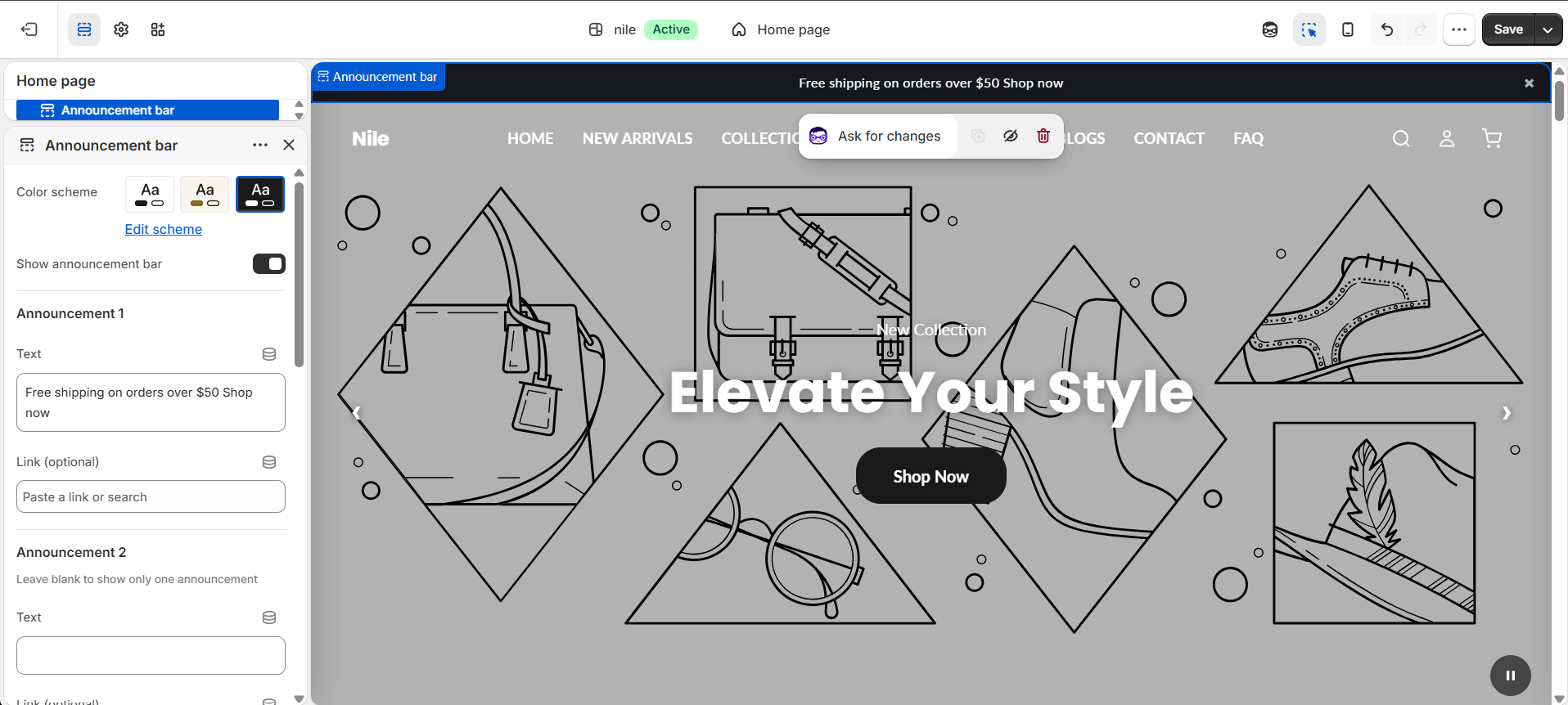
How to use it
In the Shopify theme editor, add or open this section, then:
- In the theme editor, open the Announcement bar section (under the global popups / header area).
- Tick Show announcement bar to make it visible.
- Under Announcement 1, type your message in Text and optionally add a Link (optional) destination.
- Fill in Announcement 2 through 5 to rotate multiple messages, or leave them blank to show just one.
- Under Display settings, choose whether to Auto-rotate every 4 seconds and whether to Show dismiss button.
- Pick a Color scheme for the bar's background and text, then save.
The bar only appears when it is enabled and at least one Text field is filled - an empty first announcement hides the whole bar.
Once a visitor closes the bar it stays hidden for the rest of their browsing session (per-session, not permanent), so they will see it again on a new visit.
Prev/next arrows only appear when you have two or more announcements; keep messages short since the bar is a single centered line.
Settings reference
| Setting | Type | Default | What it does |
|---|---|---|---|
| Color scheme | color_scheme | scheme-1 | Sets the bar's background and text colors. |
| Show announcement bar | checkbox | true | Master toggle; the bar is hidden if unchecked or if no text is entered. |
| Announcement 1 - Text | text | Free shipping on orders over $50 Shop now | The first message shown. |
| Announcement 1 - Link (optional) | url | - | Makes the message clickable. |
| Announcement 2 - Text | text | - | Leave blank to show only one announcement. |
| Announcement 2 - Link (optional) | url | - | Optional destination for message 2. |
| Announcement 3 - Text | text | - | Optional third message. |
| Announcement 3 - Link (optional) | url | - | Optional destination for message 3. |
| Announcement 4 - Text | text | - | Optional fourth message. |
| Announcement 4 - Link (optional) | url | - | Optional destination for message 4. |
| Announcement 5 - Text | text | - | Optional fifth message. |
| Announcement 5 - Link (optional) | url | - | Optional destination for message 5. |
| Auto-rotate every 4 seconds | checkbox | true | Fades between announcements on a fixed 4s timer; ignored when there is only one message or the visitor prefers reduced motion. |
| Show dismiss button | checkbox | true | Adds a close (x) button that hides the bar for the session. |
Developer notes
Self-contained section: inline <style> and an IIFE <script> handle rotation, hover/focus pause, and dismissal - no external assets beyond {% render 'section-color-scheme' %}.
- Announcements are fixed fields
text_1..5/link_1..5(not repeatable blocks); a Liquid loop counts non-blank texts intoann_countand hides the section if it is zero. - Dismissal persists via
sessionStoragekeyannouncement-dismissed-; autoplay uses a hardcoded 4000msdata-intervaland respectsprefers-reduced-motion. - Accessibility:
role="region", translated aria-labels, and 44px min touch targets on nav/close controls; autoplay pauses onmouseenter/focusin(WCAG 2.2.2).
{%- for i in (1..5) -%}
  {%- assign tkey = 'text_' | append: i -%}
  {%- if section.settings[tkey] != blank -%}
    <div class="announcement-slide">{{ section.settings[tkey] }}</div>
  {%- endif -%}
{%- endfor -%}