Cart drawer
A slide-out shopping cart that updates without a page reload and re-renders on demand through Shopify's Section Rendering API.
The Cart drawer is the slide-in mini-cart that opens from the right when a shopper adds a product. The section itself is a thin wrapper that renders the cart-drawer snippet so Shopify's Section Rendering API can refresh the drawer's HTML after every add, quantity change, or removal - no full page reload. It shows line items, quantity steppers, a free-shipping progress bar, an optional cart note, subtotal, and checkout buttons.
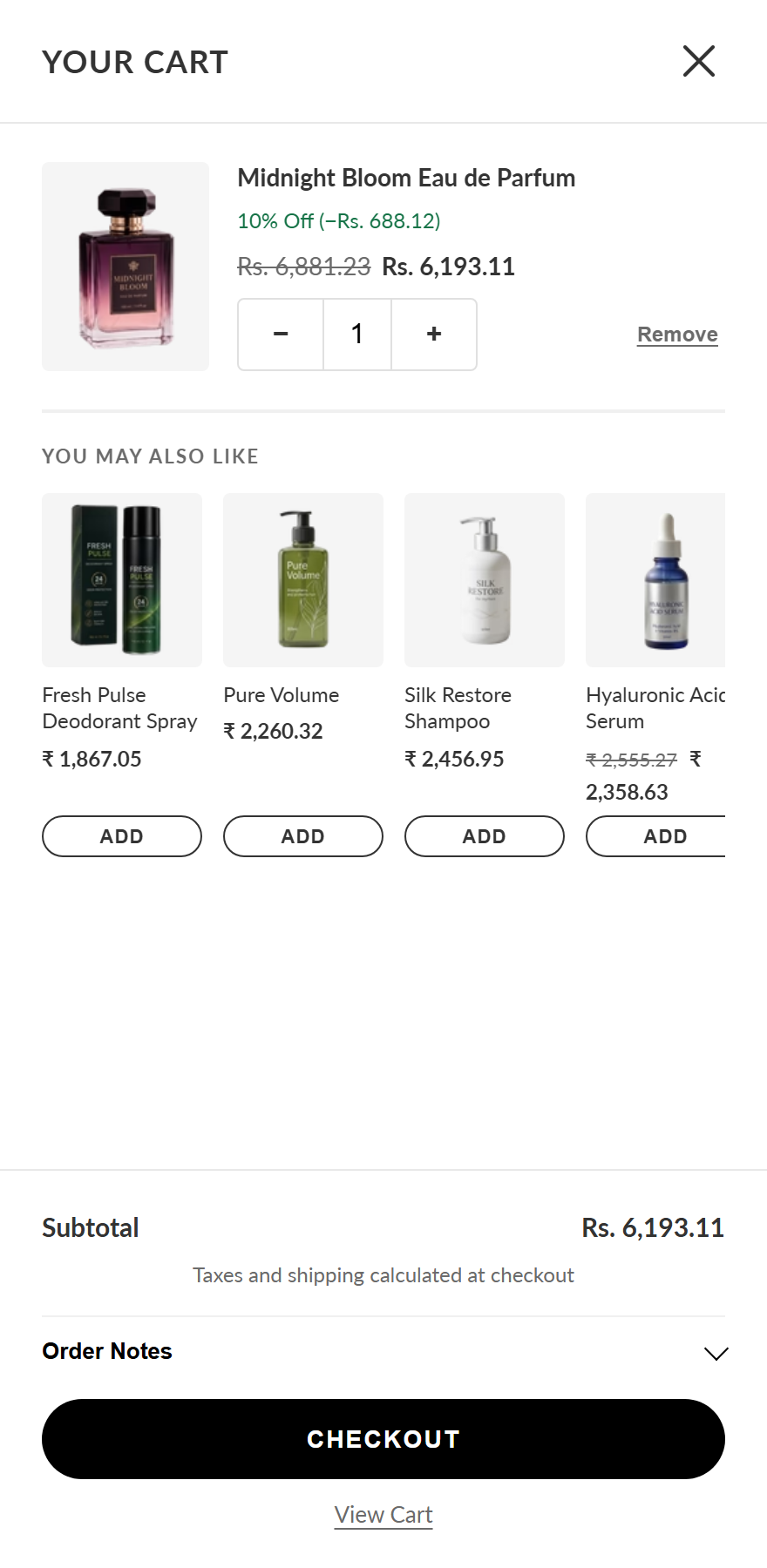
This section has no settings of its own - there is nothing to configure in the theme editor. The drawer's behaviour and appearance come from your global theme settings and the cart snippet. Related options (such as the free-shipping threshold) live in Theme settings.
How to use it
In the Shopify theme editor, add or open this section, then:
- The drawer has no section-editor settings of its own. It appears automatically whenever a shopper adds something to the cart.
- To toggle the "You may also like" recommendations inside the drawer, open Theme settings → Cart (or the relevant settings group) and use the Show "you may also like" in cart drawer checkbox.
- To change the drawer's wording (title, empty message, subtotal, checkout, note prompt), edit the matching entries under Content → Cart in the theme translations.
- The free-shipping bar and cart note appear automatically when the cart has items; enable a checkout note / accelerated checkout buttons in Settings → Checkout to surface Shop Pay, PayPal, etc.
- Preview by adding a product on your storefront - the panel slides in from the right and can be closed with the X, the overlay, or the Escape key.
Product images render at 96×120px (192px source for retina), so use portrait-oriented product photos for the cleanest fit.
The "You may also like" upsells are powered by Shopify's recommendation engine and are based on the last item added - they need enough catalog/order data before they surface good matches.
The drawer width is capped at 440px on desktop and goes full-width below 480px; the quantity input uses a 16px font so iOS doesn't auto-zoom on focus.
Related theme setting
This section exposes no settings of its own. The one option that affects it lives in your global theme settings:
| Setting | Type | Default | What it does |
|---|---|---|---|
| Show "you may also like" in cart drawer | checkbox | true | A theme setting (id show_cart_upsells), not a section setting. Shows product recommendations based on cart contents, powered by Shopify's recommendation engine. |
Developer notes
sections/cart-drawer.liquid only calls {% render 'cart-drawer' %}; the schema declares just a name and exposes no settings or blocks. It is mounted once inside a stable #cart-drawer wrapper in layout/theme.liquid.
- All markup, scoped CSS (inline
<style>, BEM.cart-drawer__*), and structure live insnippets/cart-drawer.liquid; open/close, AJAX add/update/remove, and drawer re-rendering are handled byassets/cart.jsviafetch('/?sections=cart-drawer')and thesectionsparam on Cart AJAX API calls. - Renders helper snippets
free-shipping-bar,icon-close, and the upsell skeletons; upsells only render when the theme settingsettings.show_cart_upsellsis on. Dynamic checkout buttons come fromcontent_for_additional_checkout_buttons. - Accessibility: no local aria-live region (the body innerHTML is swapped wholesale); announcements route through a persistent
#a11y-statusregion viawindow.themeAnnounce. Usesinerton the collapsed note body and honors--btn-primary-bg/--button-radiusCSS variables.
{%- comment -%} Wrapper so the drawer can be re-rendered via the Section Rendering API {%- endcomment -%}
{% render 'cart-drawer' %}