Header
The site header with logo, up to three-level mega-menu navigation, search and account/cart icons, a mobile drill-down drawer, and an optional promotional banner.
The Header renders your logo, main navigation, and the search, account, and cart icons across every page. Desktop navigation expands into a cascading mega-menu that supports up to three nested menu levels plus optional per-item media, while mobile uses a drill-down drawer. An optional promotional banner can be pinned to the right of every dropdown.

How to use it
In the Shopify theme editor, add or open this section, then:
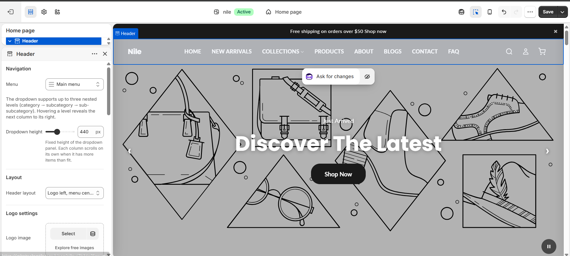
- In the theme editor, open the Header section and under Navigation choose the Menu to display (defaults to your main menu). Nest menu links in Shopify Navigation to build the mega-menu levels.
- Under Layout, pick a Header layout (logo left, logo top / menu bottom, or logo right).
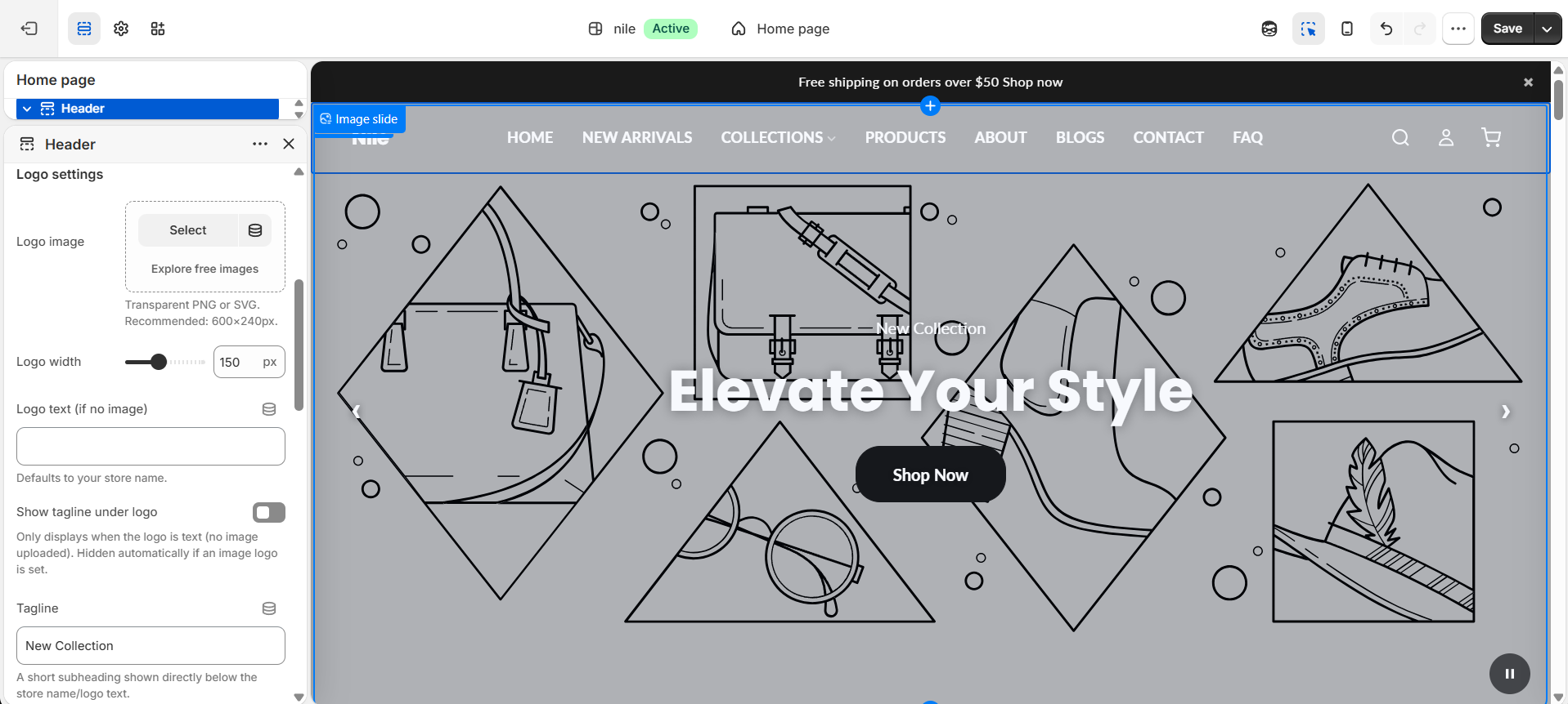
- Under Logo settings, upload a Logo image (or leave blank to use Logo text) and set the Logo width.
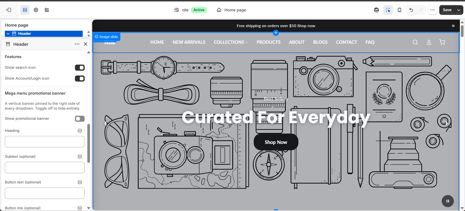
- Under Features, toggle the Show search icon and Show Account/Login icon options.
- To add imagery to a dropdown, click Add block → Menu media, then type the top-level menu name and the item name to match, and upload a video or image.
- To advertise an offer, open Mega menu promotional banner, enable it, and fill in the heading, subtext, button, and optional background image or colors.
Menu media matching is case-sensitive: the Top-level menu name and Category or subcategory name must match your navigation link titles exactly. Leave the item name blank to make it the dropdown's default/fallback media.
Logo image works best as a transparent PNG or SVG at around 600×240px; menu media and the promo background image look best as portrait 3:4 images (about 1080×1440px).
The tagline only appears when you use a text logo (no image uploaded); it is hidden automatically once an image logo is set.
Settings reference
| Setting | Type | Default | What it does |
|---|---|---|---|
| Menu | link_list | main-menu | The navigation menu shown in the header. Nested links become mega-menu / drill-down levels. |
| Dropdown height | range | 440px | Fixed height (320-640px) of the dropdown panel. Each column scrolls on its own when it has more items than fit. |
| Header layout | select | logo-left | Logo left / menu center / icons right, Logo top / menu bottom, or Icons left / menu center / logo right. |
| Logo image | image_picker | (none) | Transparent PNG or SVG. Recommended: 600×240px. Falls back to logo text if empty. |
| Logo width | range | 150px | Displayed logo width, 50-300px. |
| Logo text (if no image) | text | Nile | Shown as a text logo when no logo image is uploaded. |
| Show tagline under logo | checkbox | false | Only displays with a text logo; hidden automatically when an image logo is set. |
| Tagline | text | New Collection | A short subheading shown directly below the store name/logo text. |
| Show search icon | checkbox | true | Shows the search icon and opens a search drawer. |
| Show Account/Login icon | checkbox | true | Shows the account icon (links to account or login depending on sign-in state). |
| Show promotional banner | checkbox | false | Enables a vertical promo banner pinned to the right of every dropdown. Only shows if a heading or image is set. |
| Promo heading | text | (none) | Banner heading, e.g. "Free shipping on orders over $50". |
| Promo subtext / button | text / url | (none) | Optional subtext, button text, and button link for the promo banner. |
| Promo background image | image_picker | (none) | Fills the banner with a dark overlay. Portrait works best. Recommended: 1080×1440px (3:4). |
| Promo background / heading / subtext colors | color | #f8f4ee / #1a1a1a / #1a1a1a | Background color is used only when no background image is set; use light heading text over dark backgrounds. |
The section accepts up to 30 Menu media blocks, each attaching a looping video or image (with optional caption, badge, and link) to a specific dropdown item, matched by top-level menu name and category/subcategory name.
Menu media blocks
Each dropdown image or video is a Menu media block. Select one to set which menu item it attaches to and upload its media.
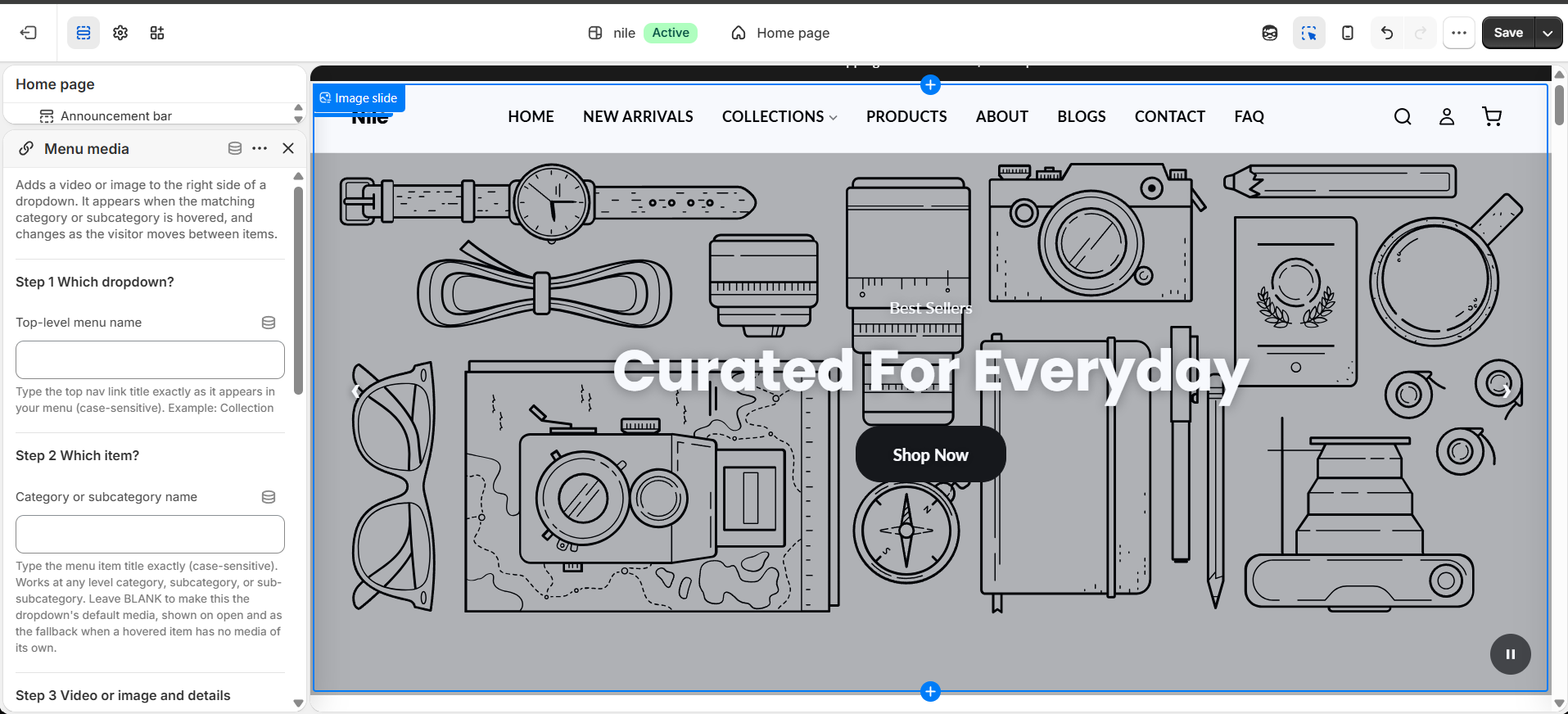
The mega menu structure itself (categories and up to three nested levels) comes from your Shopify navigation menu under Content → Menus, not from the theme editor. This section only controls the dropdown's height, its promotional banner, and the media attached to each item.
Developer notes
Loads header.css and header.js as assets; behavior (mega-menu cascade, mobile drill-down, search drawer, cart toggle) is driven by data-* hooks such as data-header, data-mobile-menu-btn, data-search-drawer, and data-mega-slide.
- Colors, sticky border, and CSS custom properties like
--hdr-bg,--hdr-text,--hdr-accent, and--hdr-heightcome from global themesettings.*(e.g.header_bg_color,header_height,header_border_bottom), not from this section's own schema. - Menu media blocks are matched at render time by comparing
block.settings.top_menutolink.titleandblock.settings.item_nameto the child link title; a blankitem_namebecomes the dropdown's default media viadata-default-media. - App blocks (
@app) are supported and rendered at the end of the section.
{%- for block in section.blocks -%}
  {%- if block.type == 'category_media' and block.settings.top_menu == link.title -%}
    ... crossfading media slide, matched by item_name ...
  {%- endif -%}
{%- endfor -%}