Footer
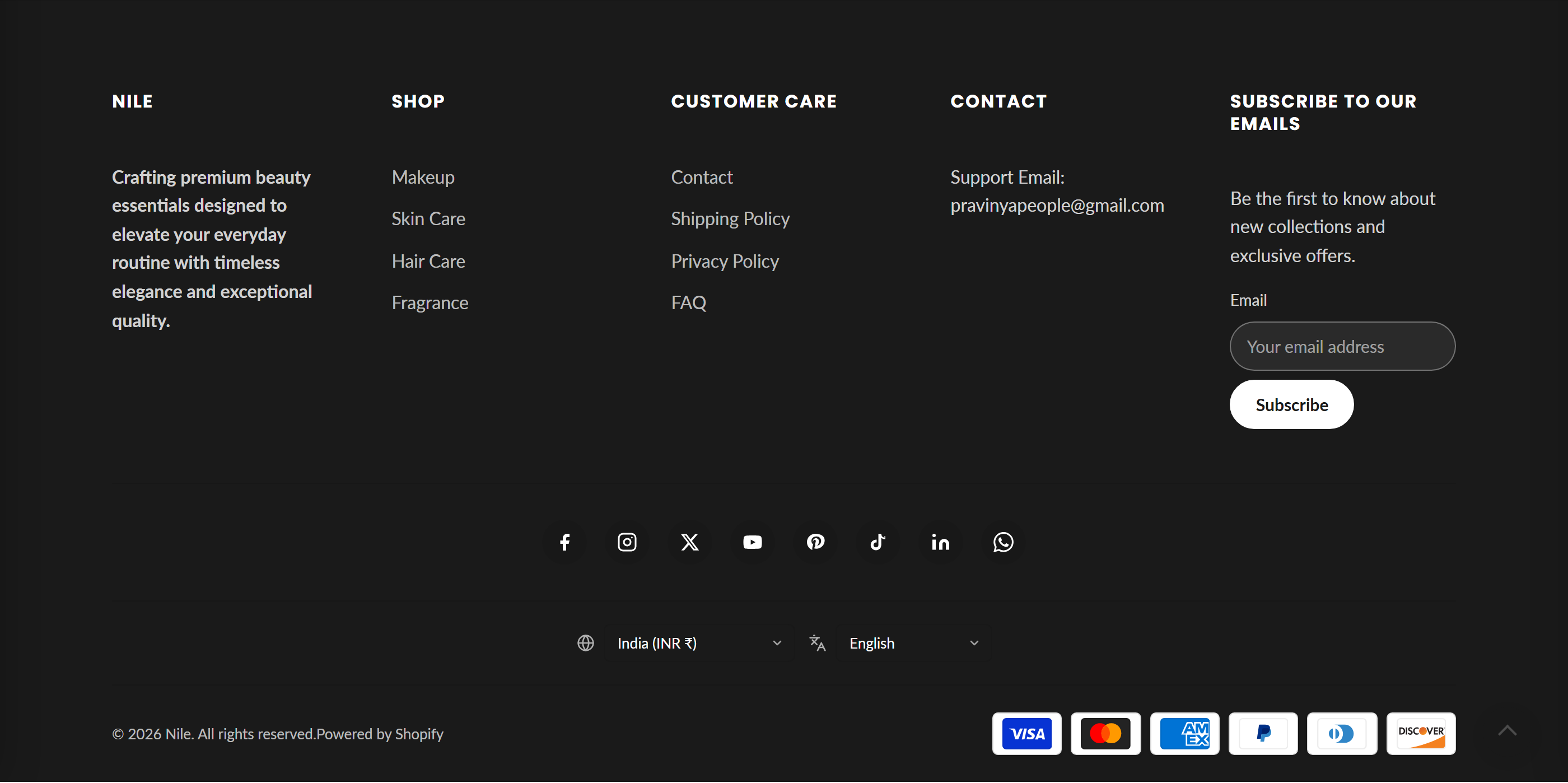
The site-wide footer with a grid of logo, menu, and text columns plus social icons, a localization selector, copyright, and payment icons.
The Footer appears at the bottom of every page. It renders up to six columns (logo/about, menus, text, or a newsletter signup) in a responsive grid, then a centered social icons bar, an optional country/currency and language selector, and a bottom bar with copyright text and accepted payment icons.
How to use it
In the Shopify theme editor, add or open this section, then:
- In the theme editor, open the Footer section from the global sections list.
- Add up to 6 blocks (Logo and about, Menu, Text, or Newsletter) to build the footer columns, and drag to reorder them.
- Under Social media, paste the full profile URLs (or a WhatsApp number) for the networks you want; empty fields are hidden automatically.
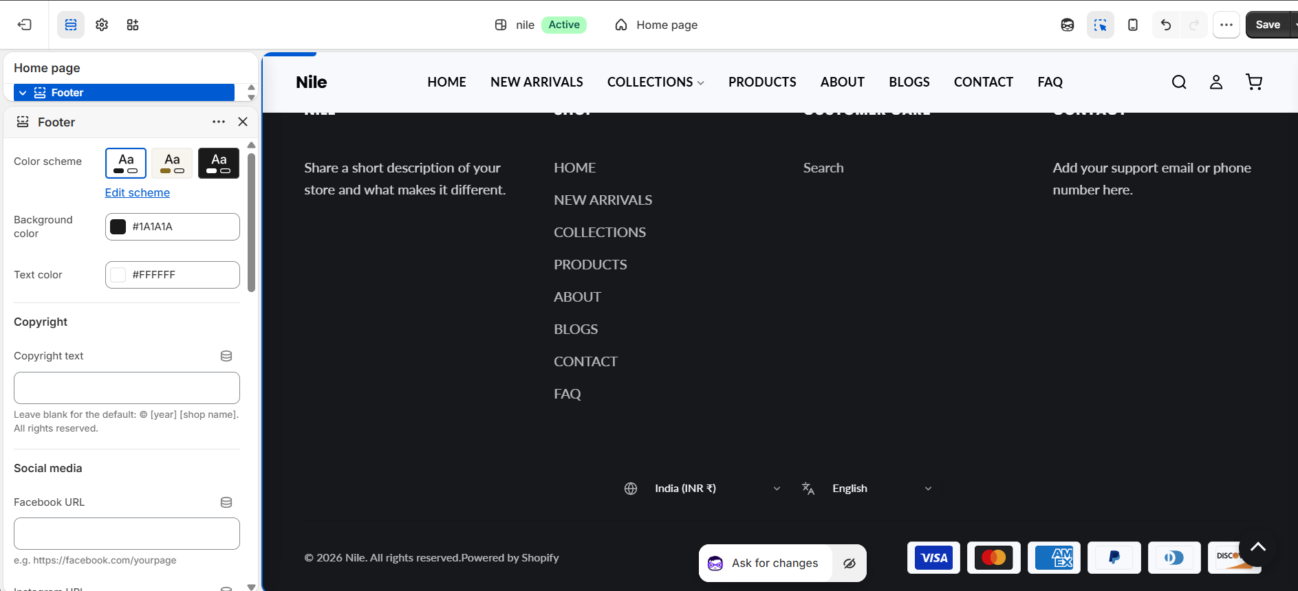
- Set Background color and Text color, and optionally enter custom Copyright text.
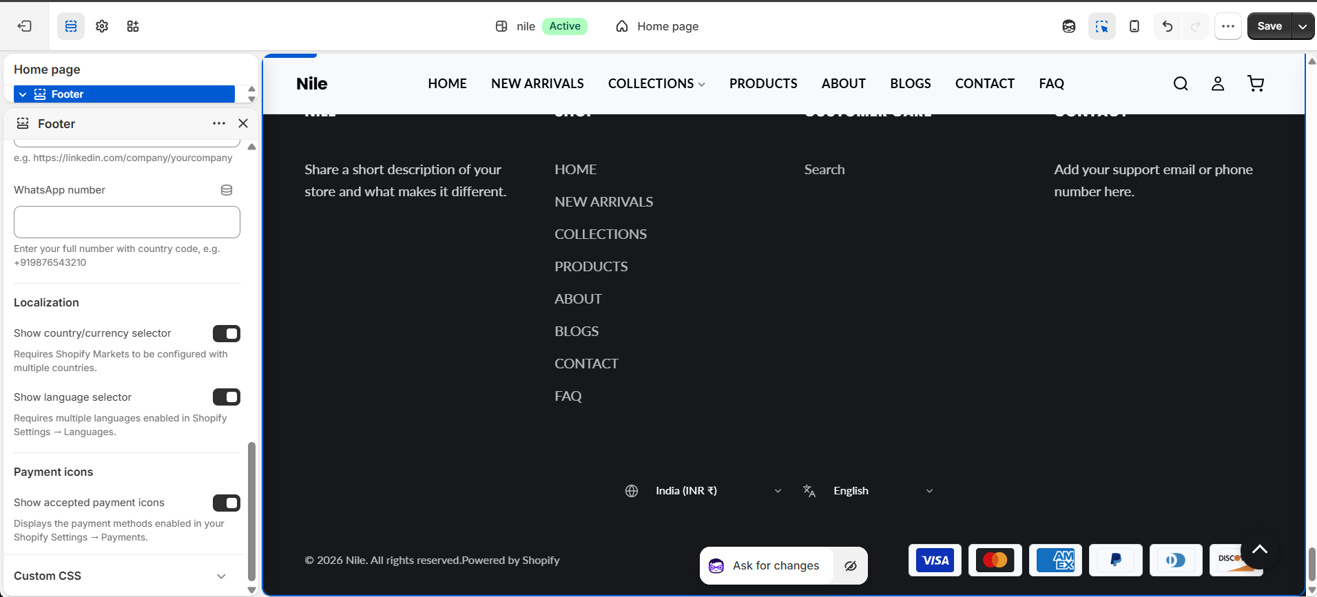
- Toggle Localization (country/currency and language selectors) and Show accepted payment icons as needed.
- Save to apply the footer across the entire store.
The column grid sizes itself to the number of non-app blocks, so 2 blocks give 2 columns and 6 blocks give 6 columns; on mobile it collapses to a single column.
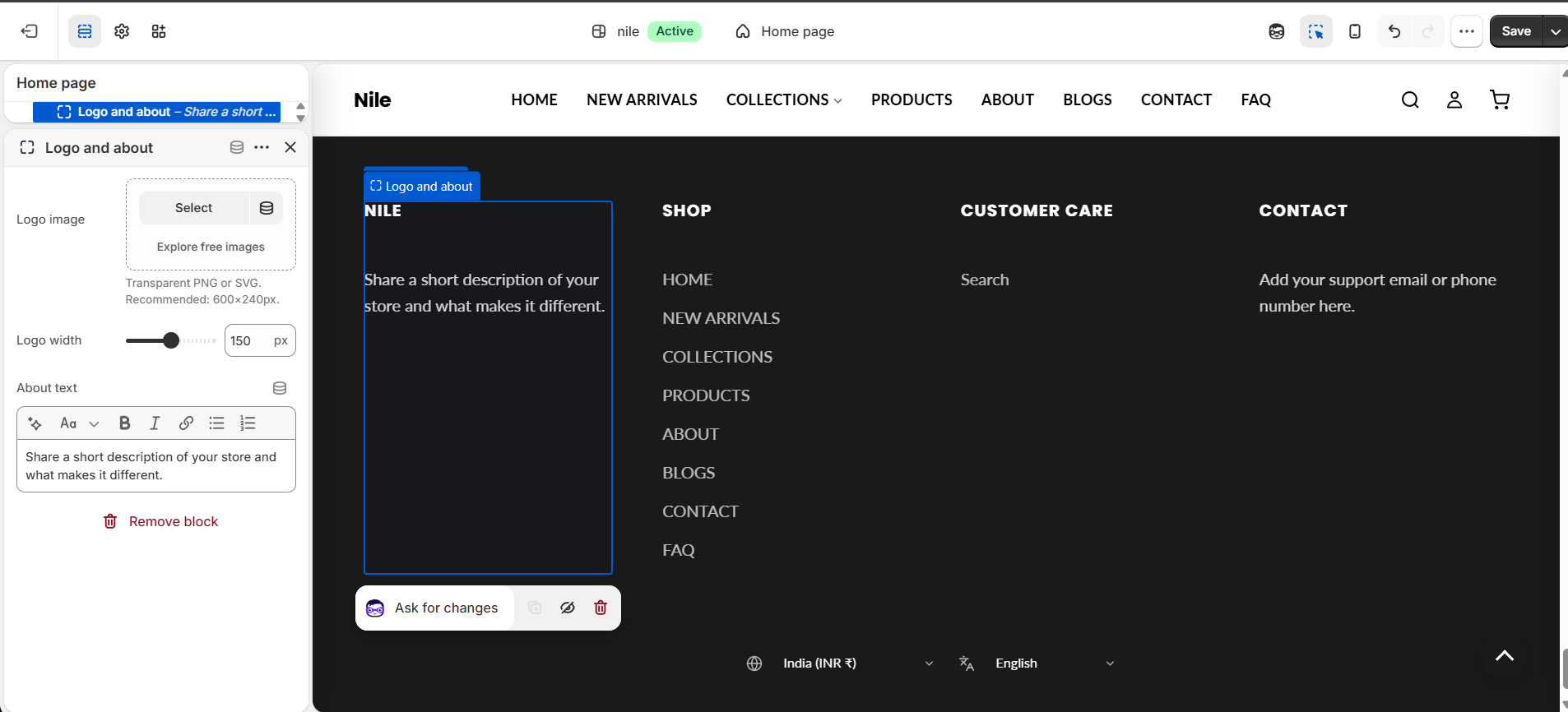
For the logo block, use a transparent PNG or SVG around 600x240px; leave the image blank to fall back to the shop name as a text heading.
The country/currency selector needs Shopify Markets configured, the language selector needs multiple languages enabled, and payment icons only show methods enabled in Settings → Payments.
Settings reference
| Setting | Type | Default | What it does |
|---|---|---|---|
| Color scheme | color_scheme | scheme-1 | Base color scheme applied to the section. |
| Background color | color | #ffffff | Footer background color. |
| Text color | color | #121212 | Color for footer headings, links, and text. |
| Copyright text | text | - | Leave blank for the default: (c) [year] [shop name]. All rights reserved. |
| Facebook URL | text | - | e.g. https://facebook.com/yourpage |
| Instagram URL | text | - | e.g. https://instagram.com/yourhandle |
| X / Twitter URL | text | - | e.g. https://x.com/yourhandle |
| YouTube URL | text | - | e.g. https://youtube.com/@yourchannel |
| Pinterest URL | text | - | e.g. https://pinterest.com/yourprofile |
| TikTok URL | text | - | e.g. https://tiktok.com/@yourhandle |
| LinkedIn URL | text | - | e.g. https://linkedin.com/company/yourcompany |
| WhatsApp number | text | - | Enter your full number with country code, e.g. +919876543210 (rendered as a wa.me link). |
| Show country/currency selector | checkbox | true | Requires Shopify Markets to be configured with multiple countries. |
| Show language selector | checkbox | true | Requires multiple languages enabled in Shopify Settings → Languages. |
| Show accepted payment icons | checkbox | true | Displays the payment methods enabled in your Shopify Settings → Payments. |
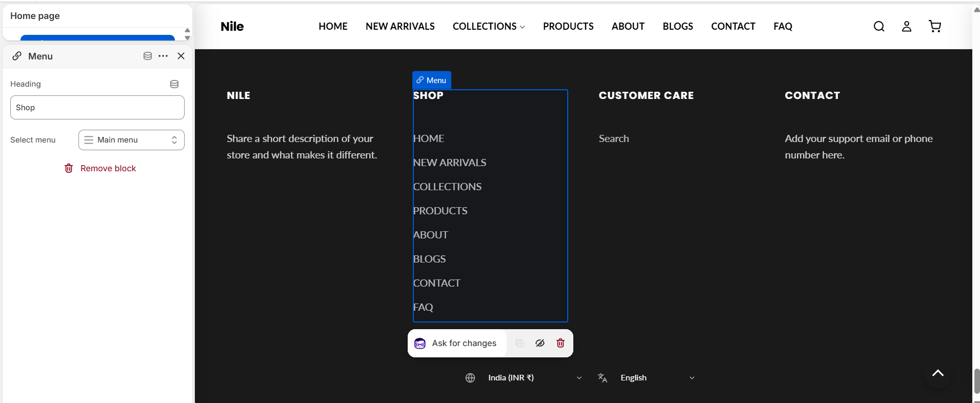
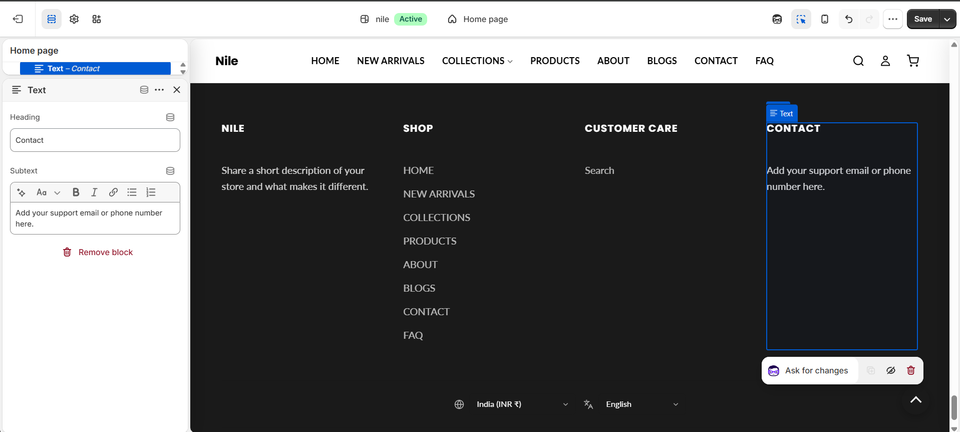
The footer accepts up to 6 blocks that form its columns: Logo and about (logo image with adjustable width plus richtext), Menu (heading and a link list), Text (heading and richtext subtext), Newsletter (heading, richtext, and a signup form; limited to one), and App blocks.
Footer column blocks
The footer's columns are blocks - add up to 6 and drag to reorder them.
Logo and about
Menu
Text
Newsletter
A persistent email-signup column (limited to one) that posts to Shopify's customer form and tags new subscribers newsletter. The email field label and placeholder come from your storefront translations, so the block itself only exposes a heading, intro text, and button label.
| Setting | Type | Default | What it does |
|---|---|---|---|
| Heading | text | Subscribe to our emails | Column heading shown above the signup form; hidden if left blank. |
| Text | richtext | Be the first to know about new collections and exclusive offers. | Optional rich-text intro shown under the heading. |
| Button label | text | - | Text on the subscribe button; falls back to the translated default when left blank. |
Developer notes
Column count is computed by counting non-@app blocks into footer_col_count, which feeds grid-template-columns: repeat(N, 1fr); it clamps to a minimum of 1 to avoid emitting invalid repeat(0,1fr) (FB24).
- Loads
localization.cssand renderssection-color-schemeand thelocalization-formsnippet (idfooter-localization) for the country/language selectors. - Social icons are inline SVGs shown conditionally per non-blank URL; WhatsApp strips
+, spaces, and dashes to build awa.me/link. - Payment icons iterate
shop.enabled_payment_typesviapayment_type_svg_tag, and copyright appends thepowered_by_link.
{%- for block in section.blocks -%}
  {%- unless block.type == '@app' -%}{%- assign footer_col_count = footer_col_count | plus: 1 -%}{%- endunless -%}
{%- endfor -%}
{%- if footer_col_count == 0 -%}{%- assign footer_col_count = 1 -%}{%- endif -%}