Before & After Slider
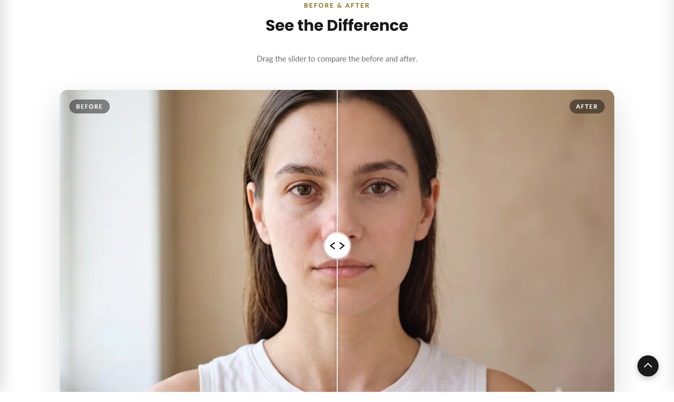
An interactive image comparison section where visitors drag a divider to wipe between a "before" and "after" image.
The Before & After Slider shows two overlaid images with a draggable divider handle. Visitors drag left/right (or use touch, hover, or arrow keys) to reveal more of the before or after image, making it ideal for transformations, renovations, edits, or product comparisons.
How to use it
In the Shopify theme editor, add or open this section, then:
- In the theme editor, add the Before and after slider section (or open it if already placed).
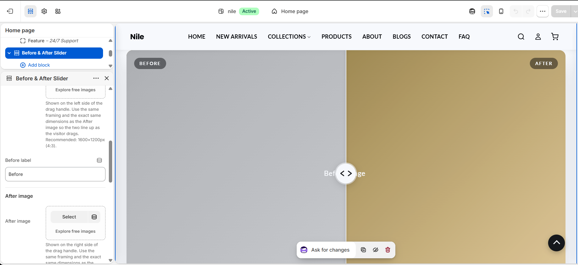
- Under Before image and After image, upload two photos that are the exact same dimensions (recommended 1600×1200px, 4:3).
- Set the Before label and After label text that appears in the corners of each image.
- Optionally fill in the Subheading, Heading, and Description above the slider.
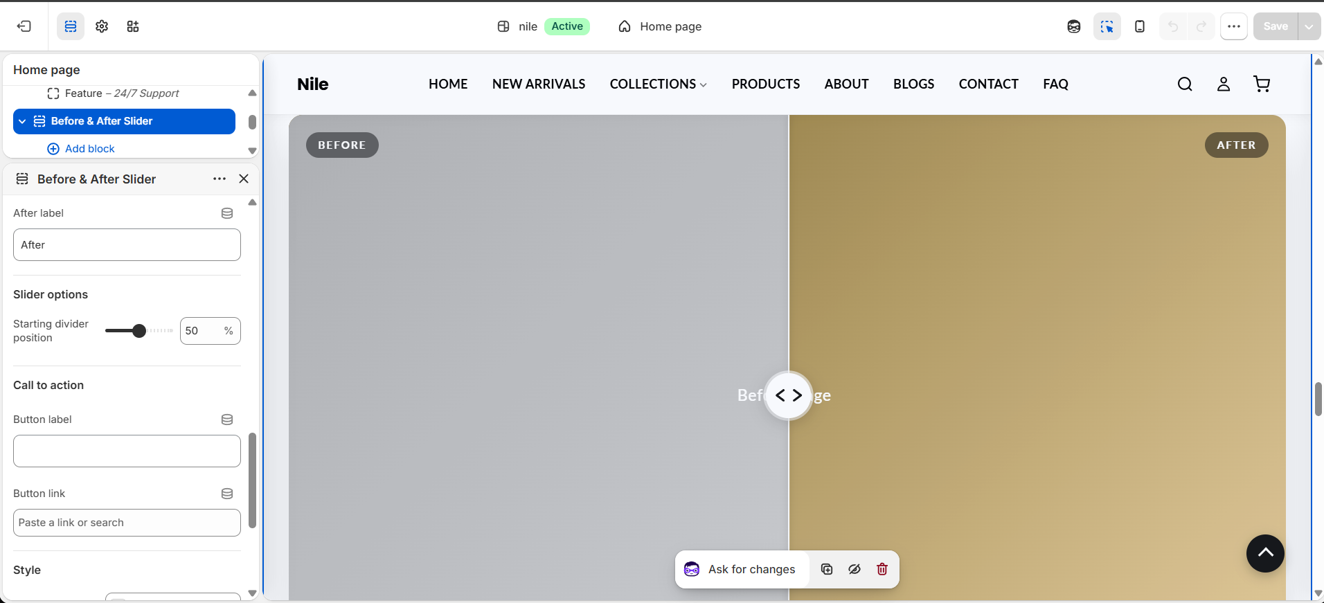
- Adjust the Starting divider position slider to choose where the handle rests when the page loads.
- Optionally add a Button label and Button link below the slider, then set the accent color and padding under Style.
The before and after images must be identical in size/aspect ratio or the wipe will misalign as you drag.
Leave Accent color blank to inherit the theme's global accent color (--color-accent) so the divider stays on-brand.
If you leave an image empty, a labeled placeholder shows in its place so the section still renders in the editor.
Settings reference
| Setting | Type | Default | What it does |
|---|---|---|---|
| Color scheme | color_scheme | scheme-1 | Background/text color scheme for the section. |
| Subheading | text | Before & After | Small text shown above the heading. |
| Heading | text | See the Difference | Main section title. |
| Description | textarea | Drag the slider to compare the before and after. | Supporting text shown under the heading. |
| Before image | image_picker | - | The "before" state, shown clipped on top of the after image. Must be the exact same dimensions as the after image or the wipe will misalign. Recommended: 1600×1200px (4:3). |
| Before label | text | Before | Corner label overlaid on the before image. |
| After image | image_picker | - | The "after" state, shown full width underneath. Must be the exact same dimensions as the before image or the wipe will misalign. Recommended: 1600×1200px (4:3). |
| After label | text | After | Corner label overlaid on the after image. |
| Starting divider position | range | 50% | Where the divider rests on load. Range 10-90% in 5% steps. |
| Button label | text | - | Optional call-to-action button text below the slider. Requires a button link to appear. |
| Button link | url | - | Destination for the call-to-action button. Required alongside a button label. |
| Accent color | color | - | Leave blank to use the theme's accent color. |
| Padding top | range | 80px | Top spacing. Range 20-120px. |
| Padding bottom | range | 80px | Bottom spacing. Range 20-120px. |
The section accepts only @app blocks, letting you inject Shopify app content; there are no theme-defined repeatable content blocks.
Developer notes
Styles come from the before-after-slider.css asset; the color scheme is set via {% render 'section-color-scheme' %}.
- An inline
<script>(self-invoking IIFE) drives the slider through[data-ba-slider], clipping the before image withclip-path: inset()and moving the.ba-divider. - Interaction supports mouse drag, horizontal-only touch (vertical swipes still scroll the page), keyboard (Arrow/Home/End on the
role="slider"handle), and a hover-nudge preview gated to(hover: hover) and (pointer: fine)devices. - The divider is clamped between 2% and 98% via
setPosition(); per-instance scoping uses#before-after-{{ section.id }}with CSS vars--ba-accentand--ba-initial.
<style>
  #before-after-{{ section.id }} {
 --ba-accent: {{ accent_color | default: 'var(--color-accent)' }};
 --ba-initial: {{ initial_position }}%;
  }
</style>