Premium blog grid
Displays the three most recent articles from a chosen blog in a premium grid layout with images, dates, and excerpts.
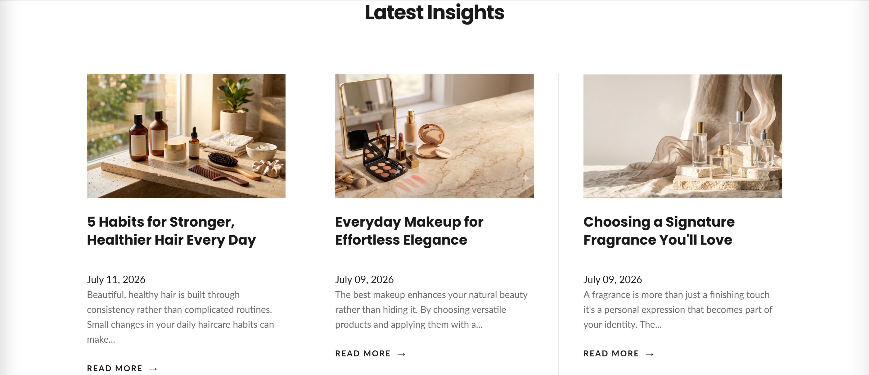
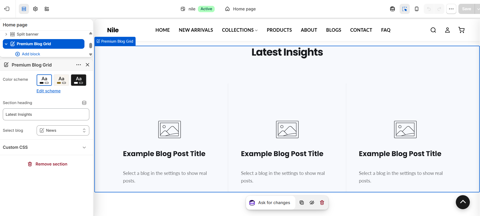
The Premium blog grid showcases the three most recent articles from a blog you select, each shown as a card with its featured image, title, publish date, and a short excerpt linking to the full post. When no blog is selected it shows placeholder example cards so you can preview the layout in the theme editor.
How to use it
In the Shopify theme editor, add or open this section, then:
- In the theme editor, open the page and click the Premium blog grid section.
- Enter a Section heading (defaults to Latest Insights), or clear it to hide the heading.
- Under Select blog, pick the blog whose latest articles you want to feature.
- Choose a Color scheme to match the surrounding section.
- Click Save and preview; the three newest published articles will appear automatically.
Only the 3 most recent articles are shown, so keep your featured blog current.
Add a featured image to each article; the grid crops to width 800px and preserves each image's aspect ratio. Articles without an image show a placeholder graphic.
Excerpts are auto-generated from the article's excerpt or content and truncated to 20 words.
Settings reference
| Setting | Type | Default | What it does |
|---|---|---|---|
| Section heading | text | Latest Insights | Heading shown above the grid; leave blank to hide it. |
| Select blog | blog | (none) | The blog whose three latest articles are displayed. |
| Color scheme | color_scheme | scheme-1 | Background and text color scheme for the section. |
Supports Shopify app blocks (@app) only, letting you insert compatible third-party app content; there are no built-in content blocks.
Developer notes
Loads premium-blog.css via asset_url | stylesheet_tag and renders section-color-scheme at the top.
- Articles are fetched with
blogs[section.settings.blog_type]and looped withlimit: 3; markup is scoped under.blog-grid-premiumwith idBlogGrid-{{ section.id }}. - Images use
image_url: width: 800withloading="lazy"and computed height fromaspect_ratio; the "Read more" label uses theblog.read_moretranslation. - When the selected blog has no articles, three onboarding placeholder cards render for the editor preview.
{%- assign blog = blogs[section.settings.blog_type] -%}
{%- for article in blog.articles limit: 3 -%}
  <article class="blog-grid__item">...</article>
{%- endfor -%}