Countdown banner
A full-width promotional banner with a background image, heading, button, and a live countdown timer ticking down to a sale or event end date.
The Countdown banner pairs promotional text and a call-to-action button on the left with a live day/hour/minute/second countdown timer on the right, laid over a full-width background image with an adjustable dark overlay. The timer counts down in the shopper's own browser to the date you set and automatically shows an Expired message once it passes.

How to use it
In the Shopify theme editor, add or open this section, then:
- In the theme editor, add the Countdown banner section (or open it if already on the page).
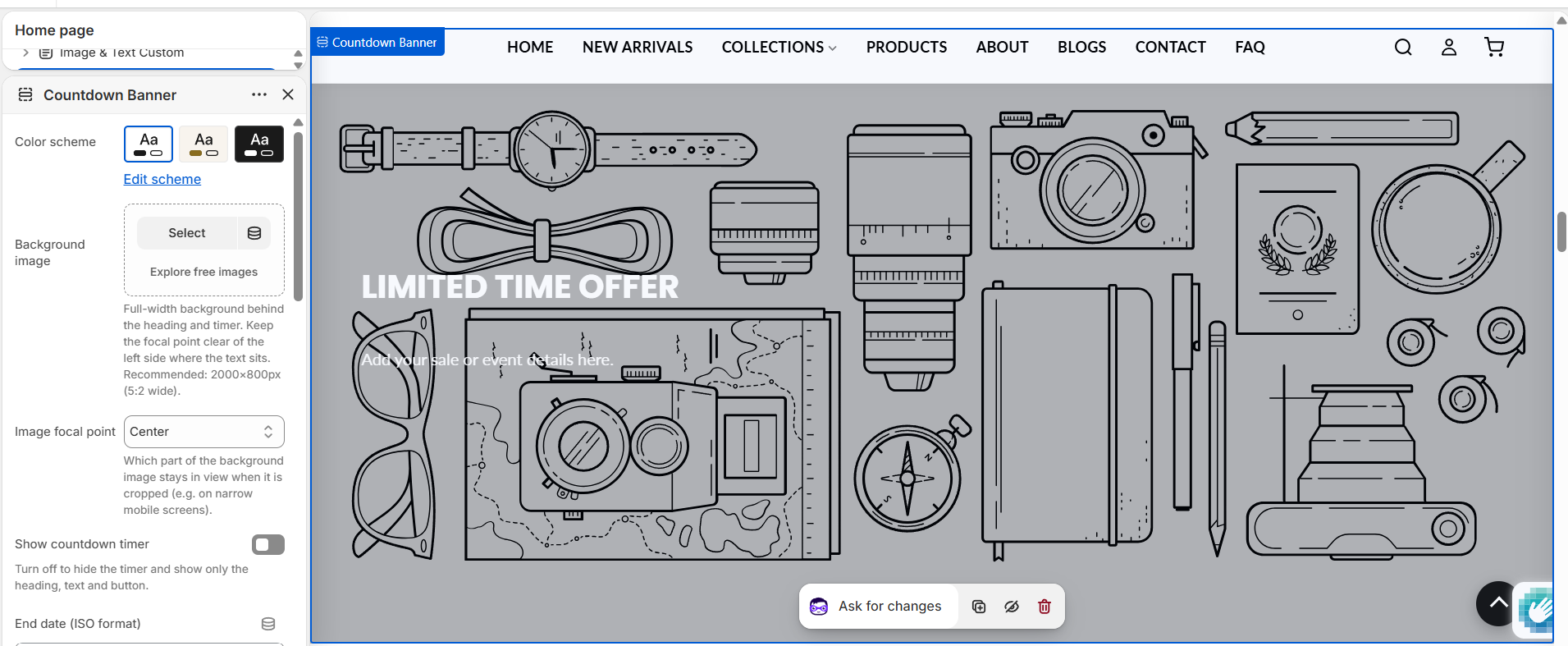
- Keep Show countdown timer on for a live timer, then set the End date (ISO format) using the
YYYY-MM-DD HH:MM:SSformat, for example2026-12-31 23:59:59. - Upload a Background image and adjust Overlay opacity so the text stays readable. To control which part of the image stays in view when it's cropped, set the image's focal point on the file itself in Content → Files (there is no focal-point dropdown in this section).
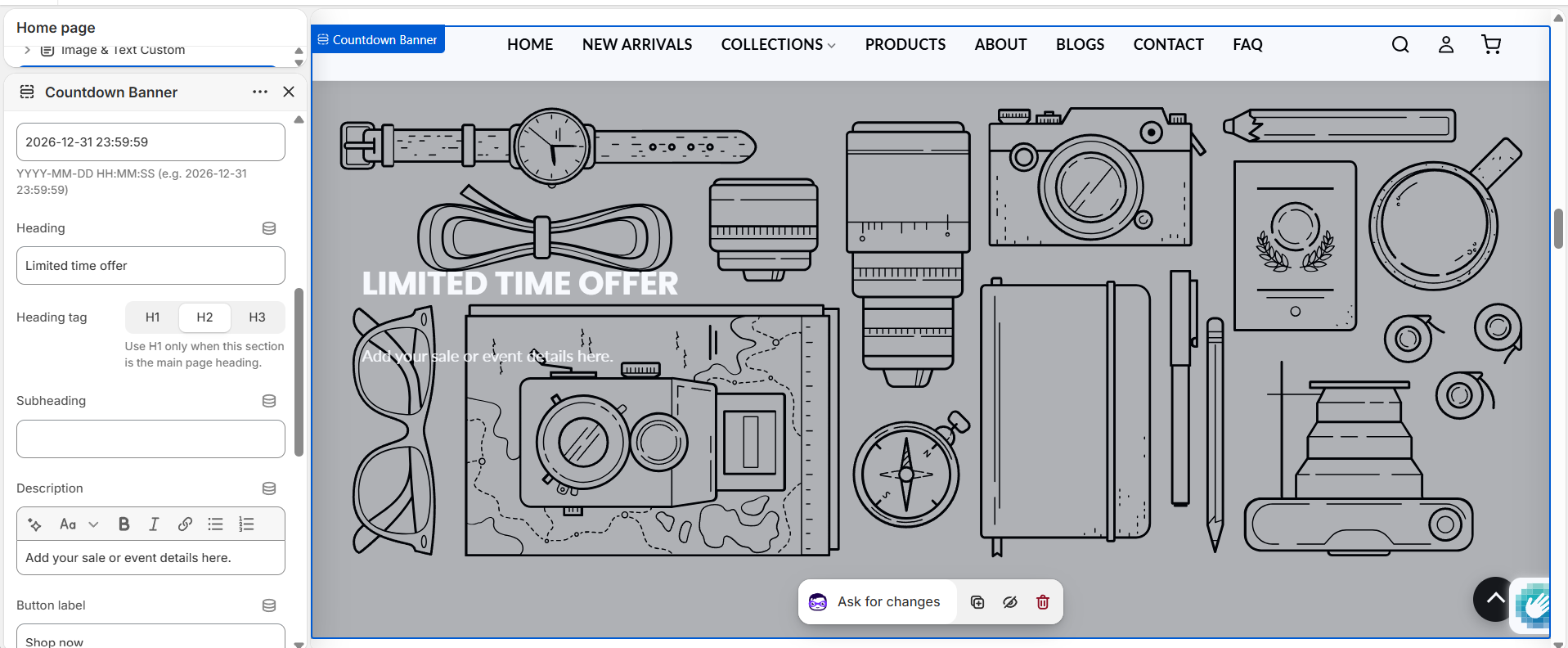
- Enter your Heading, Subheading, and Description, then set the Button label and Button link.
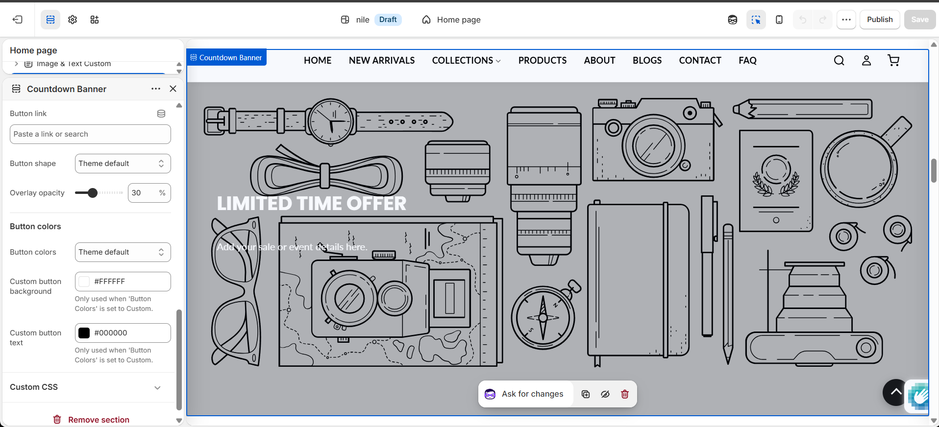
- Optionally set Button colors to Custom to override the theme's default button styling.
- Save and preview to confirm the timer counts down correctly to your chosen date.
Use a wide image around 2000×800px (5:2) and keep the focal point clear of the left side, where the heading, text, and button sit.
The end date is interpreted in the shopper's local time zone, and the timer runs in the browser, so it is a display effect and does not by itself stop sales when it hits zero.
If no background image is set, a placeholder graphic is shown; raise the overlay opacity for lighter images to keep text legible.
Turn Show countdown timer off when there is no fixed deadline - the section then works as a simple promo banner (image, heading, text, button) with no timer.
Settings reference
| Setting | Type | Default | What it does |
|---|---|---|---|
| Color scheme | color_scheme | scheme-1 | Theme color scheme applied to the section. |
| Background image | image_picker | - | Full-width background behind the heading and timer. Keep the focal point clear of the left side where the text sits. Recommended: 2000×800px (5:2 wide). The image's focal point is taken from the file itself (set it in Content → Files), not from a section setting. |
| Show countdown timer | checkbox | true | Turn off to hide the timer and show only the heading, text and button. |
| End date (ISO format) | text | 2026-12-31 23:59:59 | YYYY-MM-DD HH:MM:SS (e.g. 2026-12-31 23:59:59) |
| Heading | text | Limited time offer | Main headline shown on the left. |
| Heading tag | select | h2 | Choose H1, H2, or H3. Use H1 only when this section is the main page heading. |
| Subheading | text | - | Small line shown above the heading. |
| Description | richtext | Add your sale or event details here. | Rich text block below the heading. |
| Button label | text | Shop now | Leave blank to hide the button. |
| Button link | url | - | Destination for the button. |
| Button shape | select | default | Theme default, Rectangle, Rounded, or Rounded rectangle. |
| Overlay opacity | range | 30% | Darkens the background image (0-90% in 5% steps) for text contrast. |
| Button colors | select | default | Select 'Custom' to override the global button colors set in Theme Settings. |
| Custom button background | color | #ffffff | Only used when 'Button Colors' is set to Custom. |
| Custom button text | color | #000000 | Only used when 'Button Colors' is set to Custom. |
This section accepts only @app blocks, so app extensions can be added but there are no theme-provided content blocks.
Developer notes
Loads countdown-banner.css and renders the shared section-color-scheme snippet; all rules are scoped to #CountdownBanner-{{ section.id }}.
- Button colors follow the section's color scheme (
rgb(var(--color-button))/--color-button-text) unlessbutton_color_styleiscustom, in which case the section'sbutton_bg/button_text_coloroverride them via an inline{% style %}block. - The background image renders through the shared
image-focal-pointsnippet ({% render 'image-focal-point', image: section.settings.image %}), which applies the image's native focal point asobject-position; when no image is set it falls back to thelifestyle-2placeholder_svg_tag. - The timer markup and its inline script are both gated behind
{% if section.settings.show_countdown %}, so hiding the timer removes the JS entirely. The script parsesdata-date, normalizing the space to an ISOTseparator (Safari compatibility), ticks each second viasetInterval, and callsclearIntervalto stop and show the localized Expired string once the date passes (FB25). - Timer labels and the expired text come from
sections.countdown-banner.*translation keys (days/hours/minutes/seconds/expired); each unit renders as a.timer-block(number + label) split by:separators.
{%- if section.settings.show_countdown -%}
<div class="shopify-countdown-timer" data-date="{{ section.settings.end_date }}" id="timer-{{ section.id }}">
  <div class="timer-block"><span class="timer-num days">00</span><span class="timer-label">Days</span></div>
  <span class="timer-separator">:</span>
  <div class="timer-block"><span class="timer-num hours">00</span><span class="timer-label">Hrs</span></div>
  <!-- mins, secs … -->
</div>
{%- endif -%}