Creative Reveal Banner
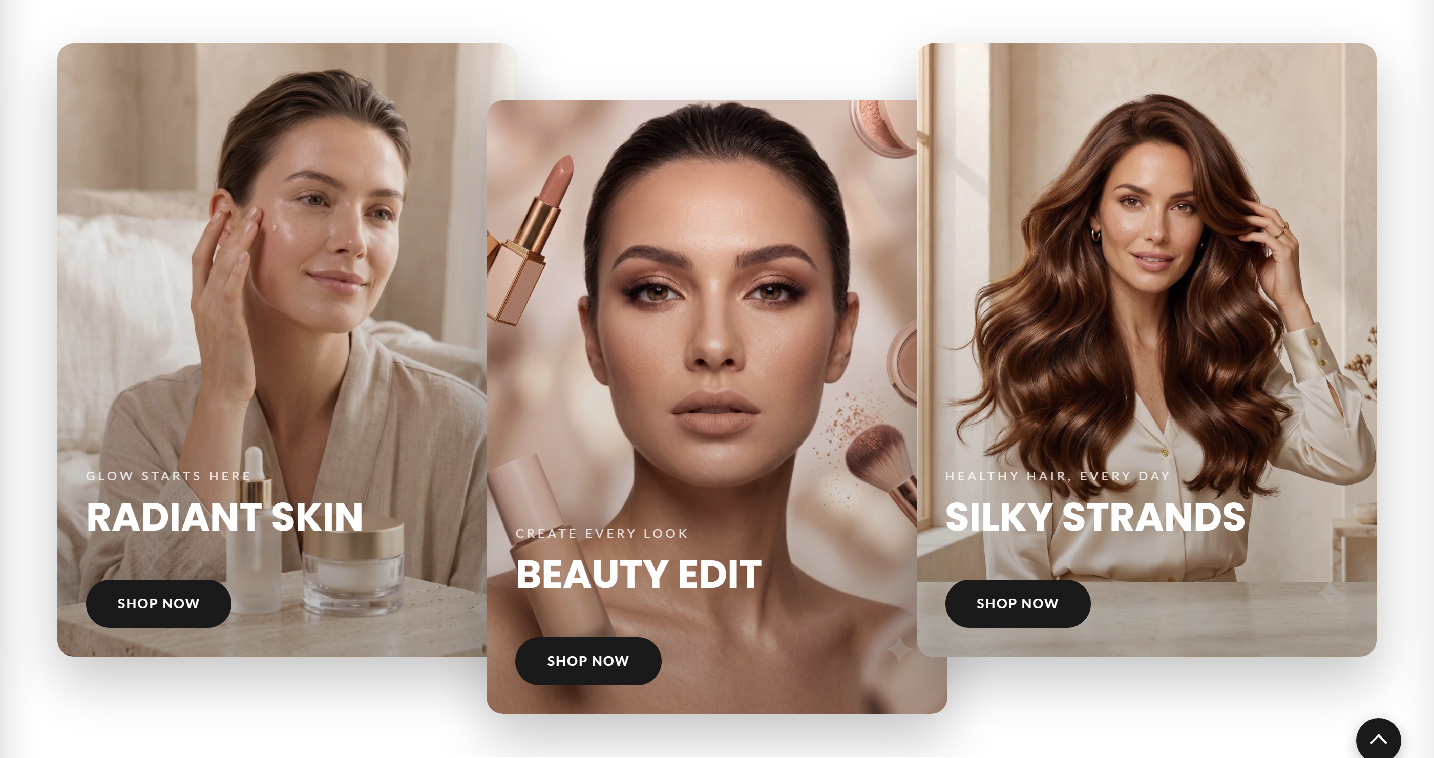
A row of up to five portrait image panels whose headings and buttons reveal on interaction, built from repeatable Slide blocks.
The Creative Reveal Banner displays a row of tall portrait image panels, each with a subheading, heading, and a button that is revealed as the panel becomes active. It is ideal for showcasing collections or seasonal campaigns side by side, and supports up to five Slide blocks plus optional app blocks.
How to use it
In the Shopify theme editor, add or open this section, then:
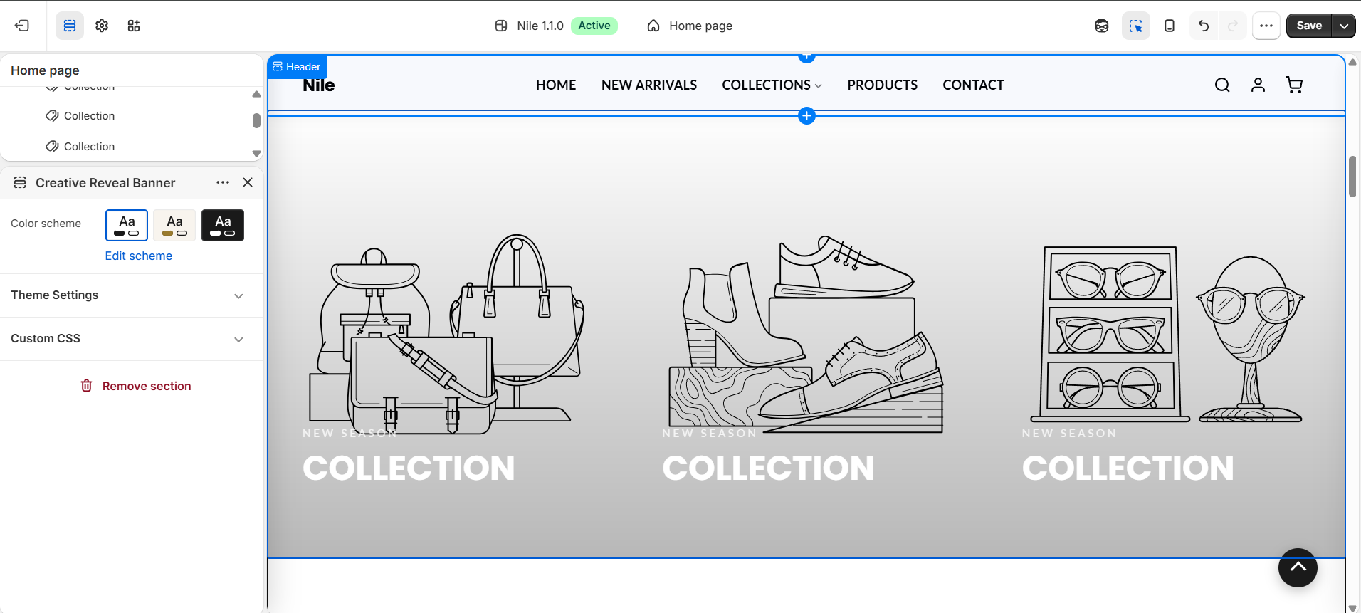
- In the theme editor, add the Creative reveal banner section (or open it if already placed on your home page).
- Add a Slide block for each panel you want, up to a maximum of five.
- In each Slide, choose an Image (portrait works best) and enter the Subheading and Heading.
- Set the Button label and Link so shoppers can jump to the matching collection or page.
- Optionally adjust the Button shape and Button colors per slide, then pick a Color scheme for the section.
- Choose a section Layout - Expand, Diagonal, or Overlap - to change how the panels arrange and reveal.
- Save and preview to check the reveal effect on desktop and mobile.
Use consistent portrait images around 1200×1500px (4:5) so all panels line up; a dark gradient overlay is applied automatically so light text stays readable.
Leave Button colors on Theme default to keep a consistent look, and only switch to Custom when a specific slide needs its own button colors.
If a slide has no image, a numbered placeholder graphic is shown, so add images before publishing.
Settings reference
| Setting | Type | Default | What it does |
|---|---|---|---|
| Color scheme | color_scheme | scheme-1 | Sets the section's background and text colors from the theme's color schemes. |
| Layout | select | expand | Panel arrangement/reveal style: Expand, Diagonal, or Overlap. Applied to the whole section as data-layout. |
| Image | image_picker | - | Portrait image filling the panel; the heading and button overlay its lower area. Recommended: 1200×1500px (4:5). (Per Slide block.) |
| Subheading | text | NEW SEASON | Small text shown above the heading. (Per Slide block.) |
| Heading | text | COLLECTION | Main heading shown on the panel. (Per Slide block.) |
| Button label | text | SHOP NOW | Text on the revealed button; leave blank to hide the button. (Per Slide block.) |
| Link | url | - | Destination for the button. (Per Slide block.) |
| Button shape | select | default | Theme default, Rectangle, Rounded, or Rounded rectangle. (Per Slide block.) |
| Button colors | select | default | Select 'Custom' to override the global button colors set in Theme Settings. (Per Slide block.) |
| Custom button background | color | #ffffff | Only used when 'Button Colors' is set to Custom. (Per Slide block.) |
| Custom button text | color | #000000 | Only used when 'Button Colors' is set to Custom. (Per Slide block.) |
Slide blocks
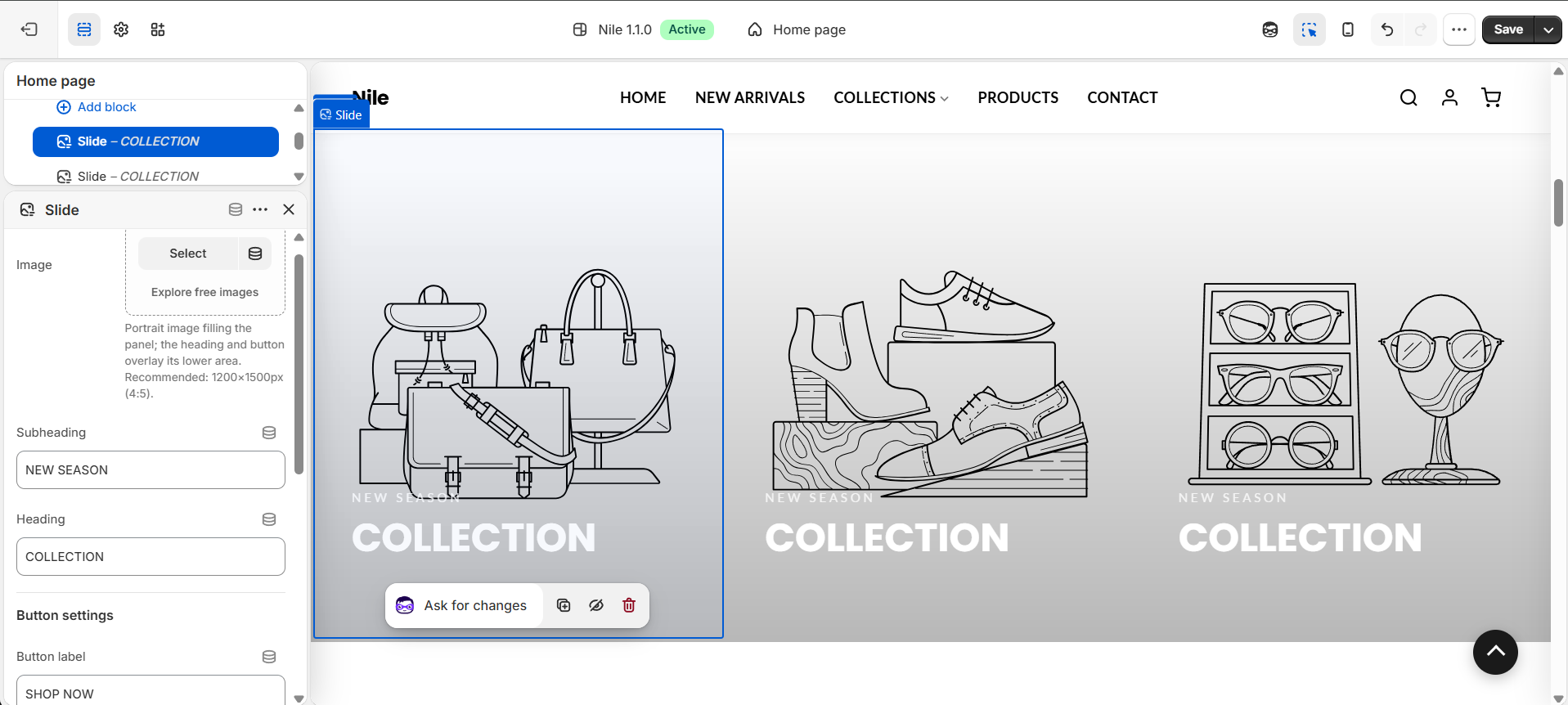
Each panel is a repeatable Slide block (up to five). Select a Slide block to set its own image, subheading, heading, and button - this is where you build each panel. The section also accepts Shopify @app blocks.
Developer notes
Styles live in section-creative-reveal.css (loaded via stylesheet_tag); there is no section-specific JS in the Liquid file, so the reveal/active state is driven by CSS with the first panel marked is-active.
- Per-block button colors are emitted in an inline
{% style %}block scoped to#RevealBtn-{{ block.id }}; the theme-default colors come from the section color-scheme tokensrgb(var(--color-button))/rgb(var(--color-button-text))unlessbutton_color_style == 'custom'. - Images render at
width: 1400withloading="lazy"; empty slides fall back to a numberedplaceholder_svg_tag. {% render 'section-color-scheme' %}applies the selected color scheme, and each panel carriesblock.shopify_attributesfor theme-editor targeting.
{%- for block in section.blocks -%}
  <div class="reveal-panel {% if forloop.first %}is-active{% endif %}">
    <img src="{{ block.settings.image | image_url: width: 1400 }}">
    <h2 class="reveal-heading">{{ block.settings.heading }}</h2>
  </div>
{%- endfor -%}