Featured collections
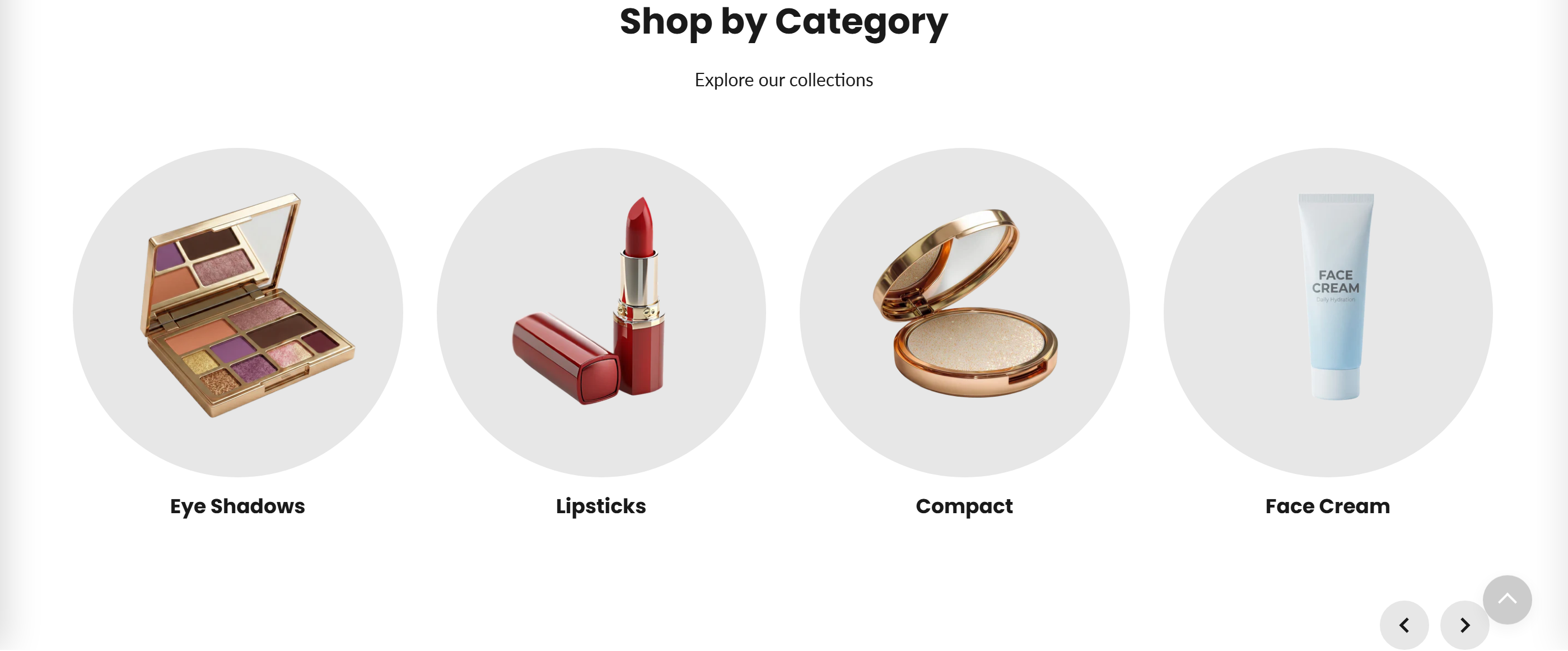
Showcases a set of hand-picked collections as clickable image cards in either a horizontal slider or a static grid.
Featured collections displays a curated list of collections, each shown as an image card with the collection title. Store owners add one block per collection, and each card links straight to that collection's page. The layout can be a swipeable slider (with arrow controls) or a fixed grid.
How to use it
In the Shopify theme editor, add or open this section, then:
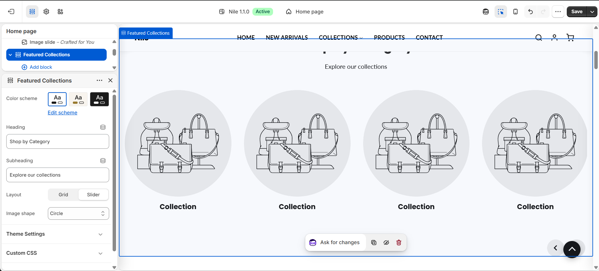
- In the theme editor, add the Featured collections section (or open it if already on your home page).
- Set the Heading and Subheading that appear above the cards.
- Choose a Layout (Slider or Grid) and an Image shape (Square, Circle, or Angled).
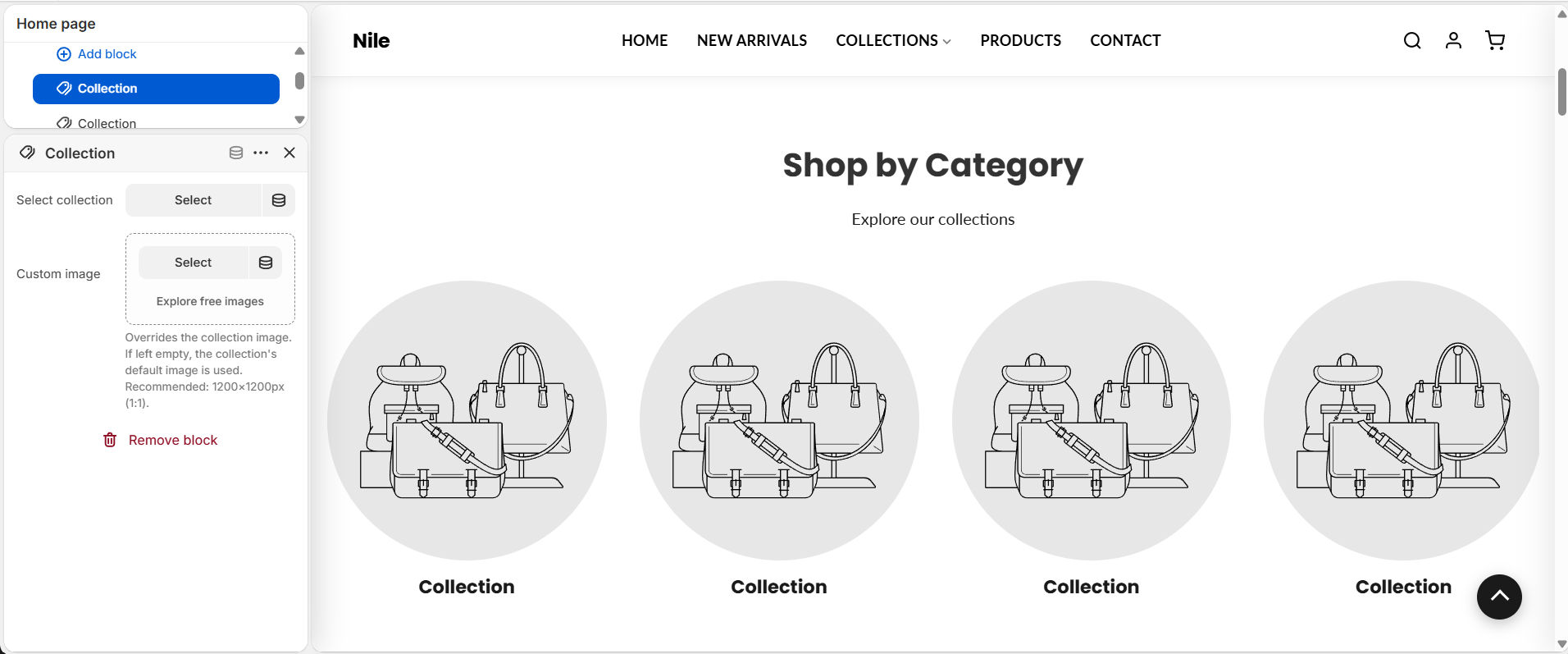
- Add a Collection block for each collection you want to feature, and pick the collection in Select collection.
- Optionally upload a Custom image per block to override the collection's default image.
- Save. In Slider mode, use the arrows at the bottom-right to scroll through the cards.
For custom images, use a square 1200×1200px (1:1) image so cards stay crisp; leave it blank to fall back to the collection's featured image.
If no custom image and no collection image is set, a placeholder graphic is shown, so add images to avoid gray placeholders.
The slider scrolls one card per click on mobile and four cards per click on desktop (screens 750px and wider).
Settings reference
| Setting | Type | Default | What it does |
|---|---|---|---|
| Color scheme | color_scheme | scheme-1 | Applies a theme color scheme to the section. |
| Heading | text | Shop by Category | Main title shown above the collection cards. |
| Subheading | text | Explore our collections | Supporting line shown under the heading. |
| Layout | select | slider | Slider shows a horizontal, arrow-navigated row; Grid shows all cards in a static grid. |
| Image shape | select | circle | Shape of each collection image: Square, Circle, or Angled. |
Collection blocks
Each card is a repeatable Collection block. Select a block to choose the collection in the Select collection picker, and optionally set a Custom image to override the collection's default. (@app blocks are also supported, so apps can inject content.)
Developer notes
Loads its own stylesheet featured-collection.css and renders section-color-scheme at the top for scoped color variables.
- Slider navigation is handled by an inline script scoped by
section.id; it computes scroll distance from item width plus a 30px gap and moves 1 card on mobile / 4 on desktop via amatchMedia('(min-width: 750px)')check. - Card images request a 600px width via
image_urland useloading="lazy"; arrow buttons pick up the globalsettings.button_shapeclass. - Image shape is applied by outputting
section.settings.image_shapeas a CSS class on the.fc-image-boxwrapper.
{% for block in section.blocks %}
  {% assign col = block.settings.collection %}
  <a href="{{ col.url | default: '#' }}">
    <img src="{{ col.featured_image | image_url: width: 600 }}" loading="lazy">
    <h3>{{ col.title | default: "Collection" }}</h3>
  </a>
{% endfor %}