Featured product split
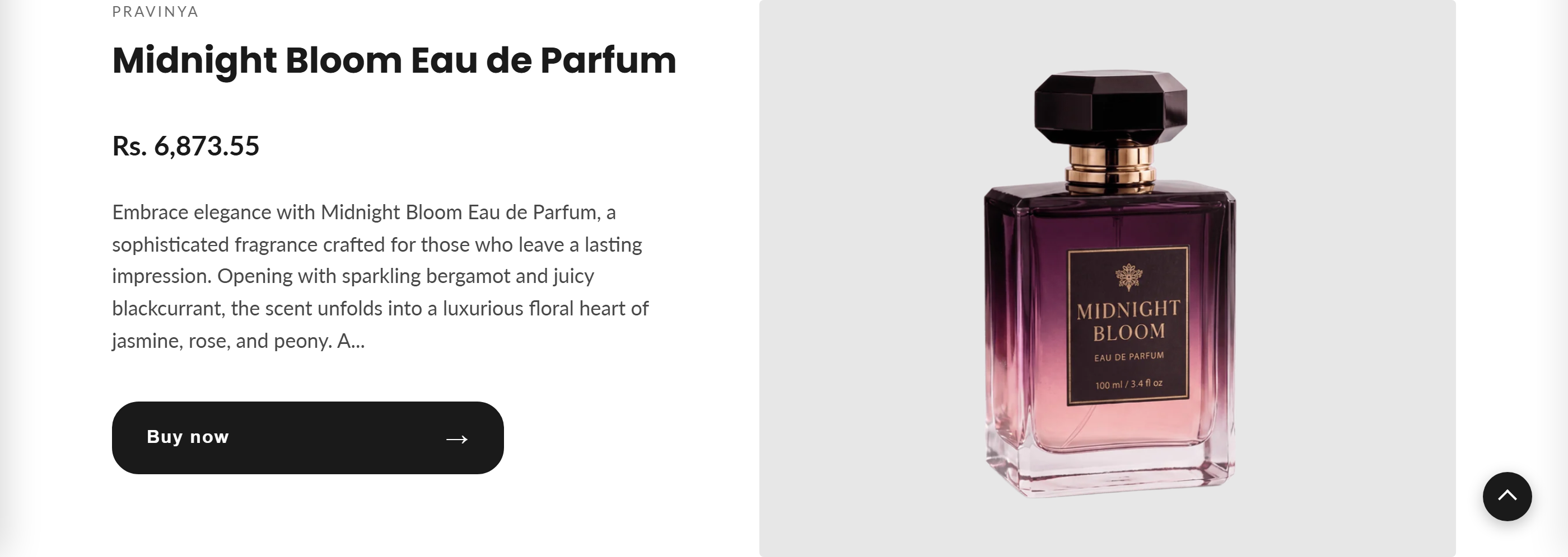
A split-screen section that spotlights one product with its details, price, rating, and a Buy now button on one side and a large product image on the other.
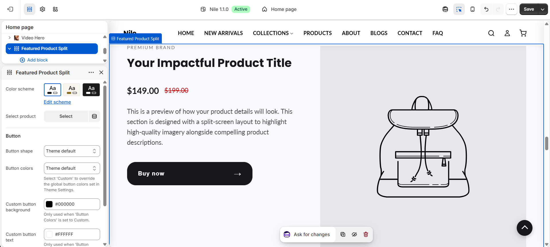
Featured product split shows a single chosen product in a two-column layout: the product's vendor, title, price, star rating, short description, and a Buy now button on one side, with a large featured image on the other. If no product is selected, it displays placeholder content so you can preview the layout.
How to use it
In the Shopify theme editor, add or open this section, then:
- In the theme editor, add or open the Featured product split section.
- Under Select product, pick the product you want to feature (its image, title, price, and description are pulled in automatically).
- Choose a Color scheme to match the section to the rest of your page.
- Set the Button shape for the Buy now button (or leave it on Theme default).
- To restyle the button, set Button colors to Custom and pick a background and text color; otherwise it uses your global theme button colors.
- Save and preview the page.
Use a high-quality product image; the featured image renders large (up to 1200px wide) and its natural width/height are used, so a clean, well-lit shot works best.
The star rating only appears when the product has review metafields (reviews.rating); products without reviews simply hide the rating row.
The description is auto-shortened to 40 words with HTML stripped, so no manual trimming is needed.
Settings reference
| Setting | Type | Default | What it does |
|---|---|---|---|
| Color scheme | color_scheme | scheme-1 | Applies a theme color scheme to the section background and text. |
| Select product | product | (none) | The product to feature. If left empty, placeholder content is shown. |
| Button shape | select | default | Shape of the Buy now button: Theme default, Rectangle, Rounded, or Rounded rectangle. |
| Button colors | select | default | Select 'Custom' to override the global button colors set in Theme Settings. |
| Custom button background | color | #000000 | Only used when 'Button Colors' is set to Custom. |
| Custom button text | color | #ffffff | Only used when 'Button Colors' is set to Custom. |
Supports Shopify app blocks only (@app), which render after the section content; there are no built-in repeatable content blocks.
Developer notes
Renders section-color-scheme and loads featured-product-split.css; the section wrapper id is FPSplit-{{ section.id }} for scoped styling.
- Button colors default to the section color-scheme tokens
rgb(var(--color-button))/rgb(var(--color-button-text))unlessbutton_color_style == 'custom', which switches to the section'sbutton_bg/button_text_color; the resolved values are injected via an inline{% style %}block scoped to the section id. - Button shape is the section's own
button_shapesetting with a literal| default: 'default'fallback; applied as abtn-shape-{shape}class. - Rating is read from
product.metafields.reviews.ratingandreviews.rating_count; the Buy now form postsselected_or_first_available_variant.idvia a{% form 'product' %}.
{%- assign product = all_products[section.settings.product] -%}
{%- if product != blank -%}
  <h2 class="fp-title">{{ product.title }}</h2>
  <span class="fp-price">{{ product.price | money }}</span>
{%- endif -%}