Featured products
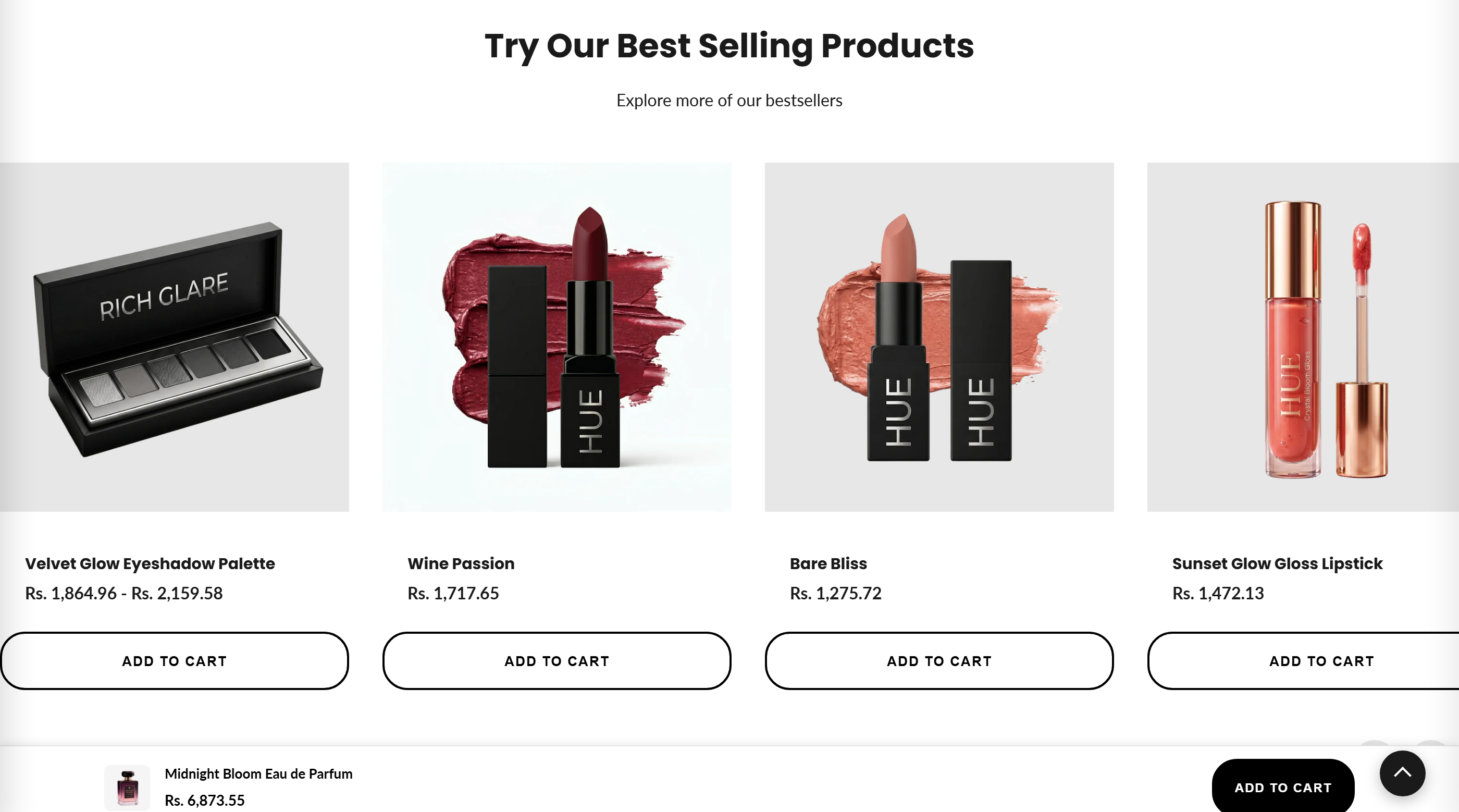
Displays products from a chosen collection in a horizontally scrolling slider with previous and next arrow controls.
The Featured products section shows a heading, optional subheading, and a horizontal slider of product cards pulled from a collection you select. On a collection page it automatically uses the current collection; anywhere else it uses the collection chosen in the section settings, and left/right arrows scroll the row four cards at a time.
How to use it
In the Shopify theme editor, add or open this section, then:
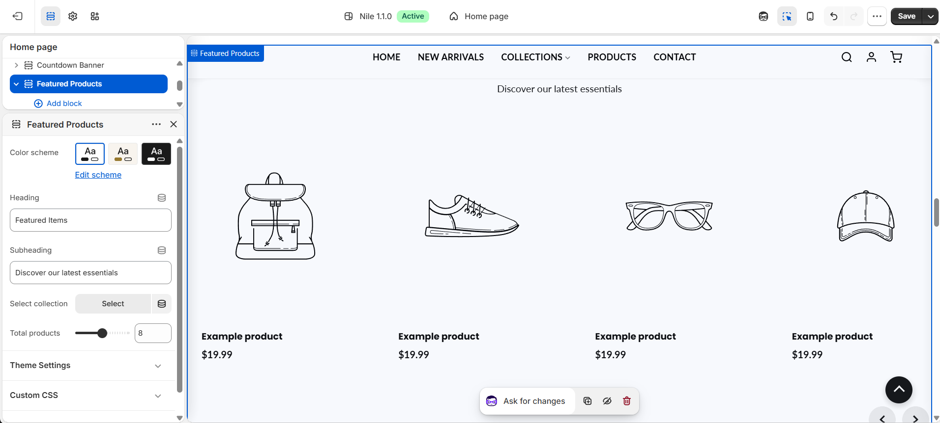
- In the theme editor, open the page and add or select the Featured products section.
- Enter a Heading (for example "Featured Items") and an optional Subheading.
- Use Select collection to pick which collection's products appear.
- Adjust Total products (4-12) to control how many products load in the slider.
- Optionally set a Color scheme for the section, then Save.
If no collection is selected, the live storefront shows nothing for this section - placeholder products only appear inside the theme editor.
On a collection page the section ignores the selected collection and shows that page's own products automatically.
Add-to-cart button colors are inherited from your theme's global secondary button color settings.
Settings reference
| Setting | Type | Default | What it does |
|---|---|---|---|
| Color scheme | color_scheme | scheme-1 | Background and text color scheme for the section. |
| Heading | text | Featured Items | Main title shown above the product slider; hidden if left blank. |
| Subheading | text | Discover our latest essentials | Optional line of text below the heading; hidden if left blank. |
| Select collection | collection | - | Collection whose products fill the slider (ignored on collection pages, which use their own products). |
| Total products | range | 8 | Number of products to display, from 4 to 12 in steps of 1. |
The section supports only @app blocks, letting Shopify apps inject content; it has no merchant-editable content blocks.
Developer notes
Loads featured-products.css and renders the section-color-scheme, quick-view-assets, and product-card snippets.
- All markup is scoped to
#CollectionSection-{{ section.id }}; an inline{% style %}block themes.product-card-add-to-cartfrom globalsettings.button_secondary_*values. - An inline script scrolls the slider by four card widths per arrow click and guards against empty collections (FB22).
- Onboarding placeholder cards render only when
request.design_modeis true, so they never appear on the live storefront.
{%- for product in display_collection.products limit: section.settings.products_to_show -%}
  {% render 'product-card', product: product %}
{%- endfor -%}