Hero Banner
Full-width image slider or video banner - usually the first thing visitors see.
The Hero Banner is Nile's headline section. It runs in one of two modes - an auto-rotating image slider (each slide has its own heading, text and button) or a single video background. It's designed to be the page's LCP element, so image compression matters.
How to use it (merchants)
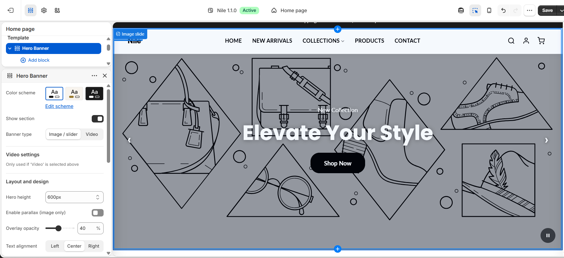
Add it: In the theme editor, open the page, click Add section → Hero banner. To build a slider, use Add block → Image slide and repeat for each slide.
- Choose Banner type - “Image / slider” or “Video”.
- For a slider: add one Image slide block per slide, each with its own image, heading, subheading and button.
- Set Hero height (400/500/600px or “Adapt to image”) and Overlay opacity so text stays readable over busy images.
- For video: pick “Video”, then upload an MP4 or paste a video URL, and set the fallback text content.
- Tune Auto slide speed and arrows under Slider settings.
Image sizing: slide images render best at 2400×1350px (16:9), full-bleed with the subject centered. Compress hard - this is the largest image on the page and directly affects load speed.
Settings reference
| Setting | Type | Default | What it does |
|---|---|---|---|
| Color scheme | color_scheme | scheme-1 | Applies one of the theme's global color schemes to this section. |
| Show section | checkbox | true | Toggle the whole section on/off without deleting it. |
| Banner type | select | image | “Image / slider” for rotating slides, or “Video” for a video background. |
| Hero height | select | 600 | 400px, 500px, 600px, or “Adapt to image”. |
| Enable parallax | checkbox | false | Subtle scroll parallax (image mode only). |
| Overlay opacity | range | 30 | 0-90% dark overlay to keep overlaid text legible. |
| Text alignment | select | center | Left, center, or right alignment of the text block. |
| Button label / link | text / url | Shop Now | Call-to-action text and destination. |
| Button shape | select | default | Theme default, or rectangle / rounded / rounded-rect. |
| Button colors | select | default | Use theme button colors, or “custom” to set your own. |
| Custom button background | color | #000000 | Button background when Button colors is set to Custom. |
| Custom button text | color | #ffffff | Button text color when Button colors is set to Custom. |
| Enable auto slide | checkbox | true | Auto-advance slides (image mode). |
| Auto slide speed | range | 5 | Seconds per slide (3-10). |
| Show slider arrows | checkbox | true | Show prev/next navigation arrows. |
Image slide blocks
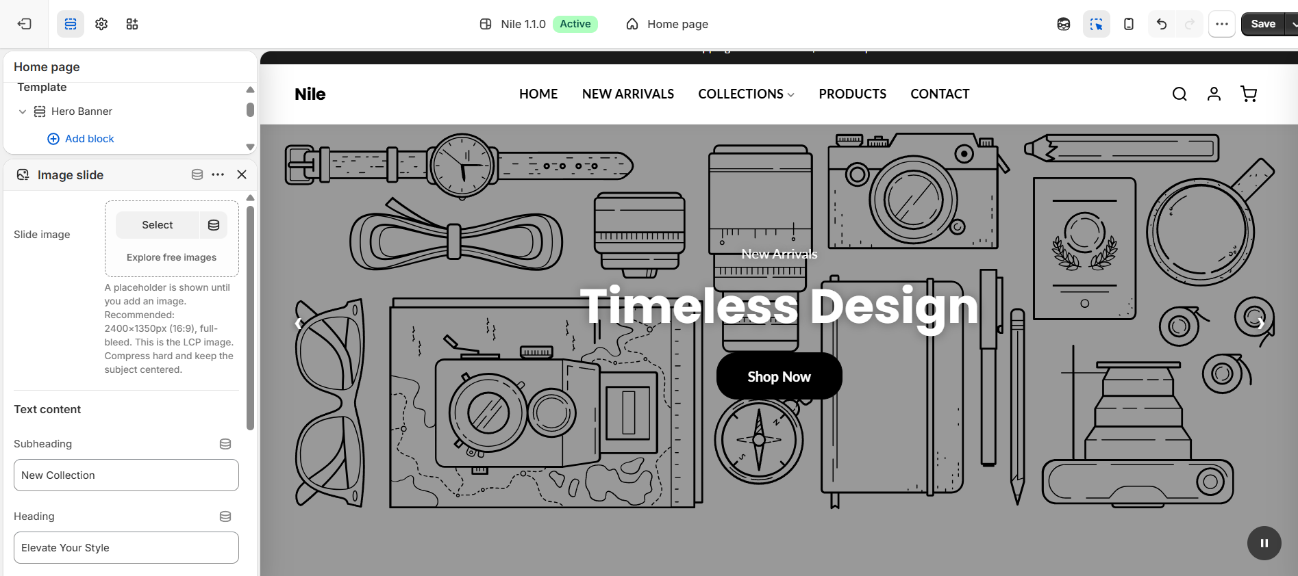
Each slide is an Image slide block. Select the block to set its Slide image plus its own subheading, heading, and button - so one Hero Banner can carry several distinct messages. A placeholder is shown until you add an image; the recommended size is 2400×1350px (16:9), full-bleed with the subject centered.
Developer notes
Button styling is resolved in Liquid: it defaults to the section color-scheme button tokens rgb(var(--color-button)) / rgb(var(--color-button-text)) and only overrides to the per-section button_bg/button_text_color when button_color_style == 'custom'. Follow that pattern when adding button-bearing sections.
- Overlay opacity is passed to CSS as
--overlay-opacityon#Hero-{{ section.id }}. - Video mode accepts a direct MP4 or a YouTube URL (parsed server-side in Liquid, which builds a
youtube-nocookie.com/embediframe). - Styles are scoped by
#Hero-{{ section.id }}so multiple instances don't collide.
{% render 'section-color-scheme' %}
{{ 'hero-banner.css' | asset_url | stylesheet_tag }}

#Hero-{{ section.id }} {
 --overlay-opacity: {{ section.settings.overlay_opacity | divided_by: 100.0 }};
}