Icon Features
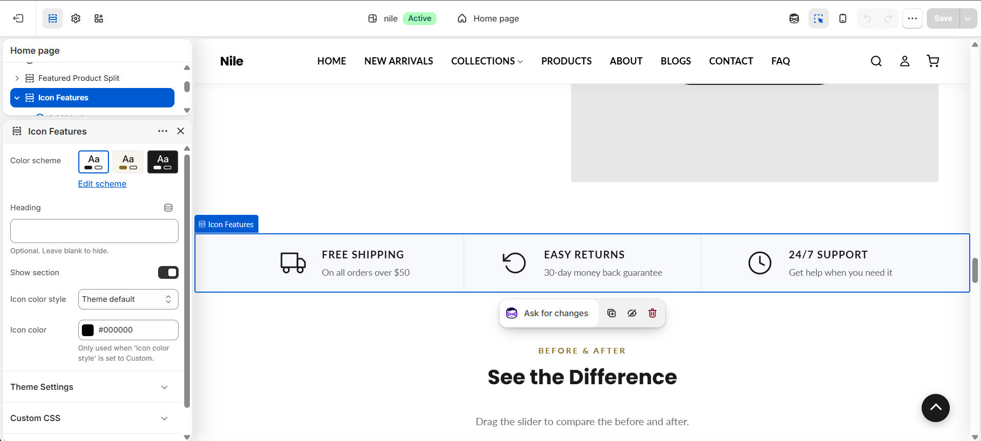
A row of up to four trust-badge features, each pairing a built-in line icon with a heading and short caption.
Icon Features displays a horizontal grid of small feature callouts (trust badges) such as free shipping, easy returns, and 24/7 support. Each feature uses one of the built-in SVG line icons plus a short heading and caption, making it ideal for reassuring shoppers on the homepage. The same section is also reused on the About page as its Values block (with icons like Gem, Heart, and Star).

How to use it
In the Shopify theme editor, add or open this section, then:
- In the theme editor, open the home-sections group and add the Icon features section (or use the ready-made preset).
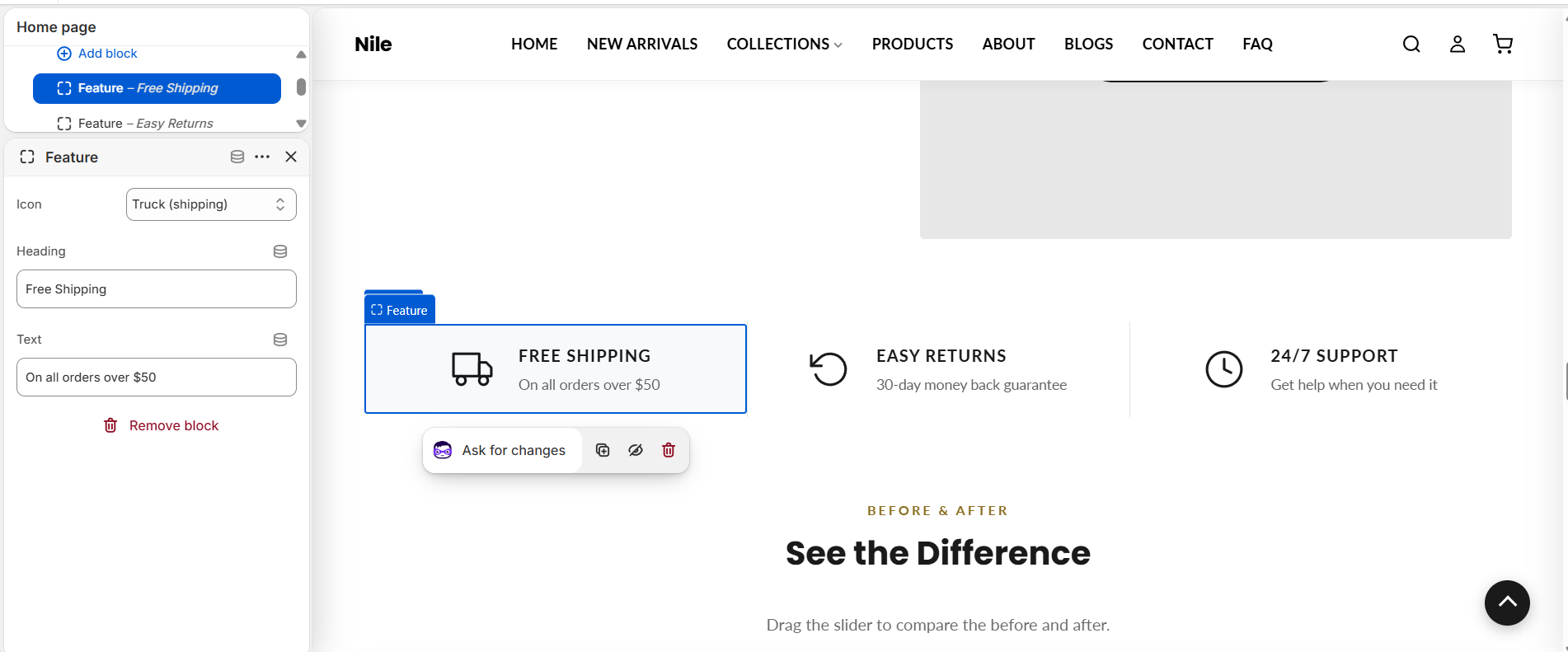
- Click Add block → Feature to create each badge (up to 4 blocks).
- For each block, pick an Icon from the dropdown and fill in the Heading and Text fields.
- Choose a Color scheme for the section background, and set Icon color style to Custom if you want a specific icon color.
- Leave Show section checked to make the section visible, then save.
There are 23 selectable line icons to choose from - the shipping/trust set (Truck (Shipping), Clock (24x7 Support), Arrow (Easy Returns), Lock (Secure), Wallet (Payments), Megaphone (Offer), Gift Box) plus a general set (Star, Heart, Gem, Eye, Target, Shield, Leaf, Award, Sparkle, Globe, Lightbulb, Handshake, Users, Truck, Clock, Check), plus None. You cannot upload custom icons here.
Icons render at a fixed 40×40px. Keep headings and captions short so all badges align on one row.
The Icon color setting only applies when Icon color style is set to Custom; otherwise icons use the theme's primary color.
Settings reference
| Setting | Type | Default | What it does |
|---|---|---|---|
| Color scheme | color_scheme | scheme-1 | Background/text color scheme applied to the whole section. |
| Heading | text | - | Optional section-level heading rendered as an <h2> above the feature row (distinct from each block's own heading). Leave blank to hide. |
| Show section | checkbox | true | Toggles whether the entire section renders on the storefront. |
| Icon color style | select | default | Theme default uses the theme primary color; Custom enables the Icon color picker below. |
| Icon color | color | #000000 | Only used when 'Icon color style' is set to Custom. |
Repeatable Feature blocks (max 4) each provide an Icon select, a Heading, and a Text caption; @app blocks are also supported.
Feature blocks
Each badge is a repeatable Feature block (up to 4). Select a block to pick its Icon and write its Heading and Text.
| Setting | Type | Default | What it does |
|---|---|---|---|
| Icon | select | shipping | One of 23 preset line icons, or None to hide the icon. |
| Heading | text | Feature Heading | Short badge title; hidden when blank. |
| Text | text | Add subtext here | One-line caption under the heading; hidden when blank. |
Developer notes
Stylesheet section-icon-features.css is loaded via asset_url | stylesheet_tag; per-section padding and icon sizing are injected in an inline {% style %} scoped by .section-{{ section.id }}.
- The seven selectable shipping/trust icons are hard-coded inline SVGs selected through a
{% case block.settings.icon %}(thecasehas eightwhenbranches - the extrasupportbranch is dead code, as no schema option maps to it); any other value falls through to the sharedabout-iconsnippet (the general set), and'none'skips the icon wrapper entirely. - Icon color resolves to
settings.color_primaryby default, overridden bysection.settings.icon_colorwhenicon_color_style == 'custom'. - Block headings and text are output with the
escapefilter, so raw HTML in those fields is not rendered.
{%- case block.settings.icon -%}
  {%- when 'shipping' -%}<svg ...></svg>
  {%- when 'service' -%}<svg ...></svg>
{%- endcase -%}
<h3>{{ block.settings.heading | escape }}</h3>
<p>{{ block.settings.text | escape }}</p>