Slide-in Newsletter Popup
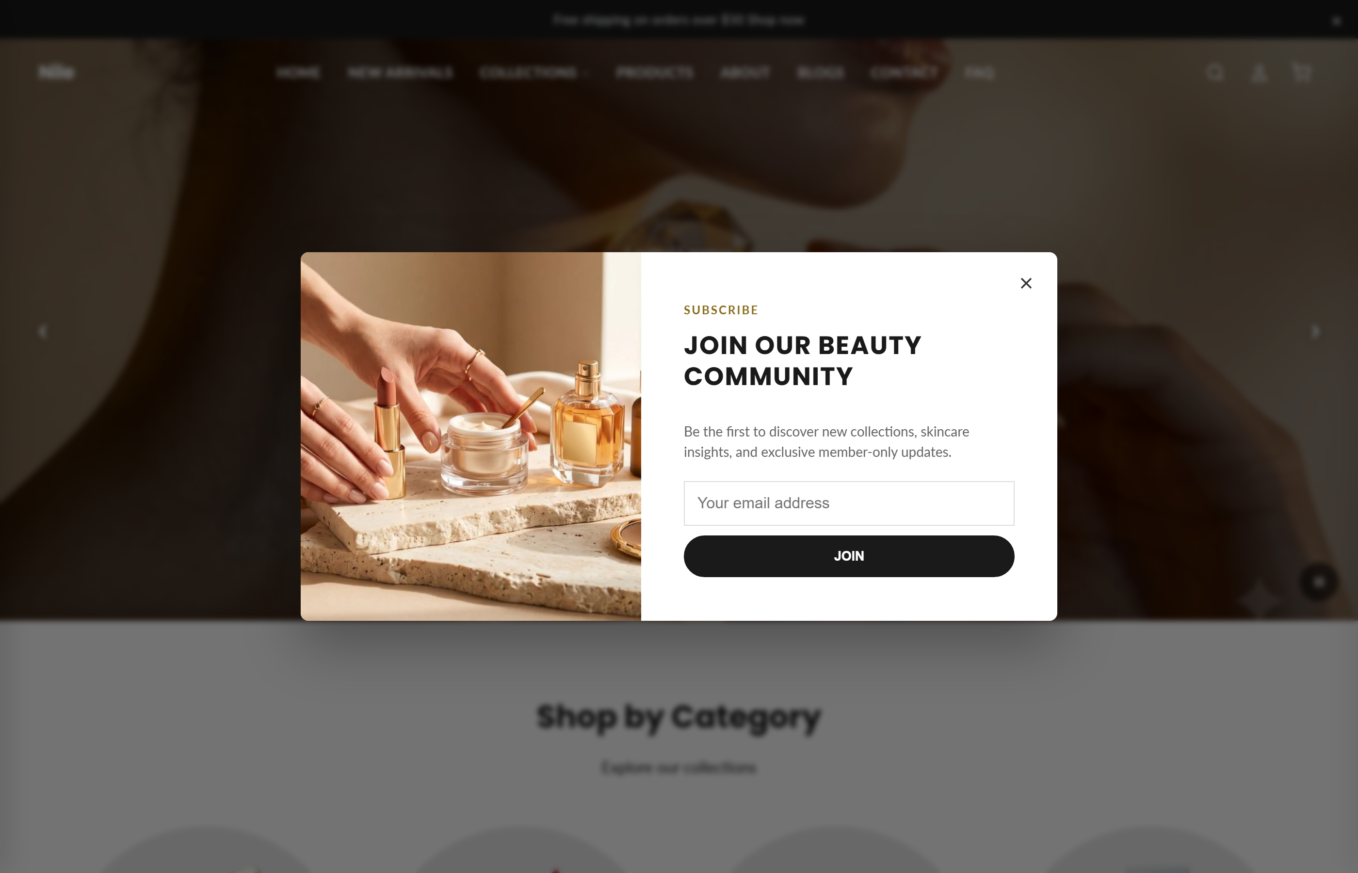
A two-column slide-in email-capture popup that appears on a timer, scroll, or exit-intent trigger and remembers when a visitor dismisses it.
Displays a dismissible slide-in modal that invites shoppers to subscribe to your email list. The popup pairs an optional image with a heading, incentive line, and email form, and can be triggered by a time delay, scroll depth, or exit intent. Successful signups are tagged newsletter and shown a confirmation message.
How to use it
In the Shopify theme editor, add or open this section, then:
- In the theme editor, add the Slide-in newsletter section to your home page (or wherever the section group is used).
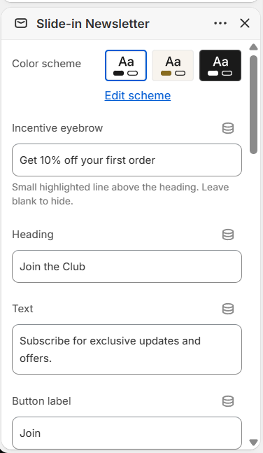
- Fill in the Incentive eyebrow, Heading, Text, and Button label so shoppers know what they get for subscribing.
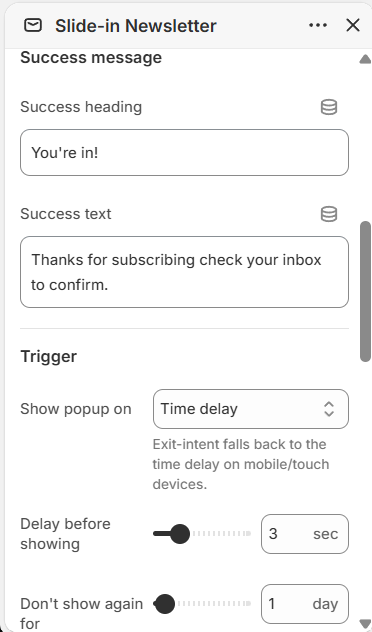
- Under Trigger, choose when the popup appears (Time delay, Scroll, or Exit intent) and set the Delay and Don't show again for values.
- In the Image section, pick an image and set its position (Left or Right); a placeholder shows until you add one.
- Edit the Success message heading and text shown after a shopper subscribes, then save.
- Optionally add an app block (e.g. a marketing app) to the section to hook into the popup.
Use a portrait image around 1000×1200px (5:6) for the best fit in the two-column layout.
Set Don't show again for to 0 to remember a dismissal forever, or a number of days to re-show it later - dismissals are stored per-visitor in the browser.
Exit intent has no equivalent on mobile/touch devices, so it automatically falls back to the time delay there.
The popup usually won't appear in the theme editor. It respects its real trigger there, and the default trigger is Exit intent, which can't fire inside the editor's preview frame. To preview it while editing, set Show popup on to Time delay with a Delay of 1 second. If it still doesn't show, you've dismissed it before - the dismissal is remembered in the browser, so open the preview in an incognito window to reset it.
Settings reference
| Setting | Type | Default | What it does |
|---|---|---|---|
| Color scheme | color_scheme | scheme-1 | Sets the popup's background and text colors. |
| Incentive eyebrow | text | Get 10% off your first order | Small highlighted line above the heading. Leave blank to hide. |
| Heading | text | Join the Club | Main popup title. |
| Text | text | Subscribe for exclusive updates and offers. | Supporting copy below the heading. |
| Button label | text | Join | Text on the subscribe button. |
| Success heading | text | You're in! | Shown after a successful signup. |
| Success text | text | Thanks for subscribing check your inbox to confirm. | Confirmation message after signup. |
| Show popup on | select | exit | Choose Time delay, Scroll (35% of page), or Exit intent. Exit-intent falls back to the time delay on mobile/touch devices. |
| Delay before showing | range | 3 sec | 1-10 seconds. Used by the Time delay trigger (and the touch fallback). |
| Don't show again for | range | 7 day | 0-30 days. How long to wait before re-showing after a visitor closes it. 0 = remember forever. |
| Image | image_picker | (placeholder) | Shown beside the form as a two-column modal. A placeholder is used until you set one. Recommended: 1000×1200px (5:6 portrait). |
| Image position | select | left | Place the image on the Left or Right of the form. |
| Button shape | select | default | Theme default, Rectangle, Rounded, or Rounded rectangle. |
| Button colors | select | default | Select 'Custom' to override the global button colors set in Theme Settings. |
| Custom button background | color | #000000 | Only used when 'Button Colors' is set to Custom. |
| Custom button text | color | #ffffff | Only used when 'Button Colors' is set to Custom. |
The section accepts only @app blocks, so marketing or popup apps can render their own content inside the section; there are no theme-defined repeatable content blocks.
Developer notes
Loads newsletter.css via {% render 'css-async', asset: 'newsletter.css' %} and renders section-color-scheme; all rules are scoped to #NewsletterPopup-{{ section.id }}.
- Button styling is resolved in a Liquid block: the theme-default colors come from the section color-scheme tokens
rgb(var(--color-button))/rgb(var(--color-button-text)), overridden by the section'sbutton_bg/button_text_colorwhenbutton_color_style == 'custom'. - Behavior is driven by an inline
DOMContentLoadedscript readingdata-delay,data-trigger, anddata-frequency; dismissals persist inlocalStorageundernewsletter-dismissed-{section.id}. - Uses Shopify's
{% form 'customer' %}with a hiddencontact[tags]=newsletter; onform.posted_successfully?it setsdata-force-opento re-open and show the confirmation. Includes a focus trap and Escape/backdrop dismiss for accessibility.
<div class="newsletter-slide-in" id="NewsletterPopup-{{ section.id }}"
  data-delay="{{ section.settings.delay }}"
  data-trigger="{{ section.settings.trigger }}"
  data-frequency="{{ section.settings.frequency_days }}">
  {%- form 'customer' -%} … {%- endform -%}
</div>