Split Banner
An editorial two-panel banner: up to two side-by-side image panels, each with a number badge, subheading, heading and an arrow text link over a dark scrim.
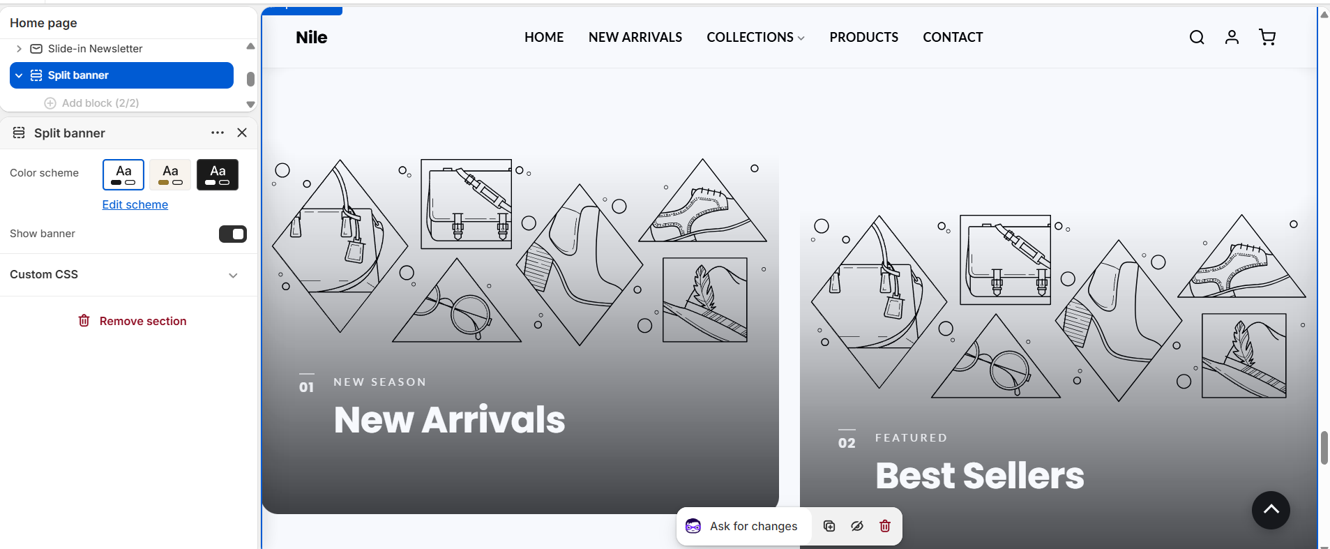
Split Banner shows up to two image panels side by side in an editorial layout. Each panel carries a small index number (01, 02), a subheading, a heading, and an arrow-style text link, laid over the image with a built-in dark scrim so light text stays readable. It is designed as a homepage feature block, and when it is the first section on the page it makes the site header transparent so the banner sits behind it.
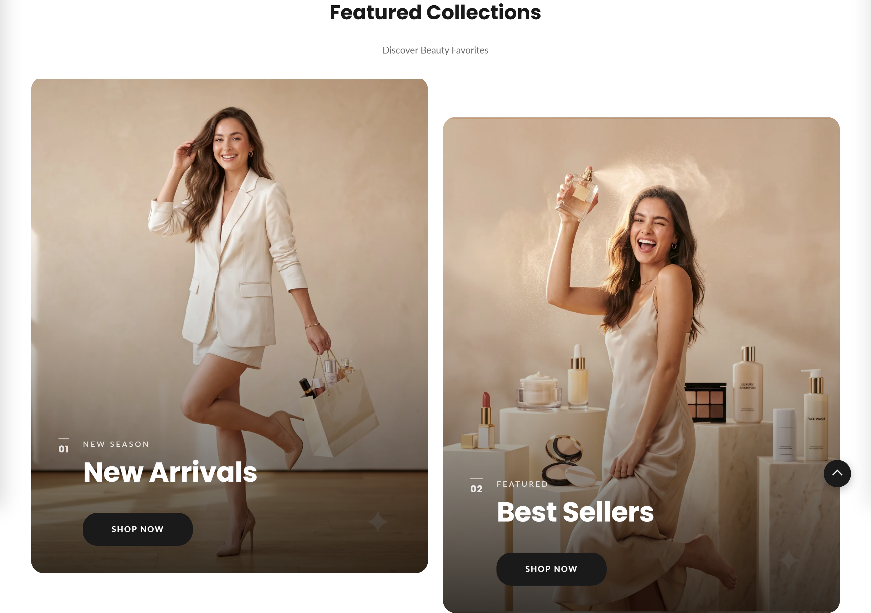
How to use it
In the Shopify theme editor, add or open this section, then:
- In the theme editor, add the Split banner section (or open it if already present); it starts with two Banner blocks.
- Select a Banner block and upload a Background image for each panel - both panels should share the same dimensions so they line up.
- Fill in the Subheading and Heading, then set the Button label and Button link to the target page or collection.
- To hide the whole section, uncheck Show banner; pick a Color scheme to match the rest of the page.
- Save. To use the transparent-header effect, keep this section as the first content section on the page.
Use two images of the same dimensions - recommended 1200×1500px (4:5 portrait) - so the two panels align cleanly.
The arrow link only appears when both a Button label and a Button link are filled in; the subheading and heading each hide when left blank.
If you leave a Background image empty, a built-in placeholder graphic is shown instead. The dark scrim over the image is fixed (there is no overlay-opacity slider), so pick images that are not too light behind the text.
Settings reference
| Setting | Type | Default | What it does |
|---|---|---|---|
| Color scheme | color_scheme | scheme-1 | Applies the selected theme color scheme to the section. |
| Heading | text | - | Optional section heading rendered in an .editorial-split__header above the two panels; blank hides the header. |
| Subheading | text | - | Optional line shown under the section heading in the same .editorial-split__header; blank hides it. |
| Show banner | checkbox | true | Toggles the entire section on or off; when off the header reverts to its solid style. |
Supports up to two repeatable Banner blocks (each an image panel with subheading, heading and link), plus @app blocks for app content.
Banner blocks
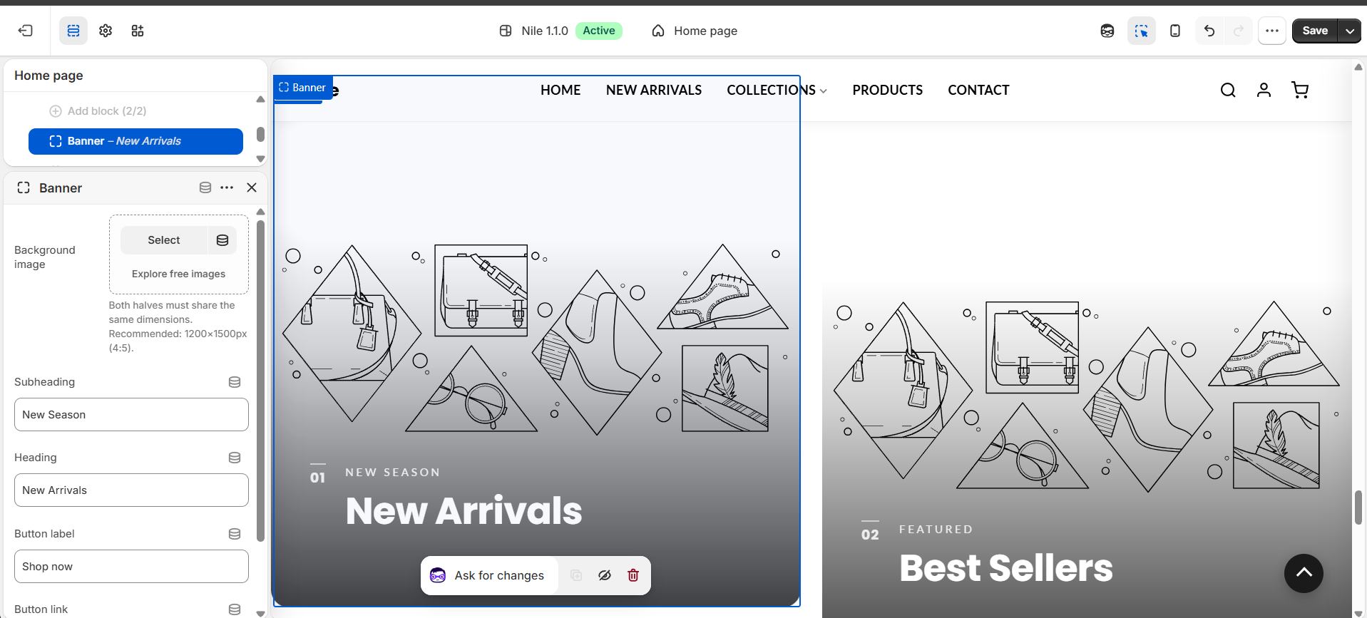
Each panel is a repeatable Banner block (up to two). Select a Banner block to set its own background image, subheading, heading, and button - this is where you build each panel.
| Setting | Type | Default | What it does |
|---|---|---|---|
| Background image | image_picker | - | Fills the panel. Both panels must share the same dimensions. Recommended: 1200×1500px (4:5). A placeholder shows if empty. |
| Subheading | text | New Season | Small kicker line shown above the heading. |
| Heading | text | New Collection | Main heading overlaid on the panel. |
| Button label | text | Shop now | Text for the arrow link; needs a Button link too, or the link is hidden. |
| Button link | url | - | Destination for the panel link. |
Developer notes
Loads split-banner.css via asset_url | stylesheet_tag and renders section-color-scheme for scheme variables. Max two banner blocks ("max_blocks": 2), plus @app.
- Markup is an
.editorial-splitgrid whosedata-countmirrorssection.blocks | size; each block renders an.es-panelwith.es-media(image + fixed.es-scrimoverlay), an.es-indexnumber badge (01,02fromforloop.index), and.es-contentholding the kicker, heading, and an.es-linkarrow link. - The link (an inline arrow SVG) only outputs when
button_labelandbutton_linkare both non-blank; images render atwidth: 1400withloading="lazy", falling back to thelifestyle-1placeholder_svg_tag. - Inline JS checks whether this section is the first
.shopify-sectionin#MainContent; if so it addsheader-transparent/has-bannerto.site-header-wrapper, otherwise (or when disabled) it appliesno-banner(FB23). There is no per-block text-alignment or overlay-opacity setting - the scrim is styled in CSS.
<div class="editorial-split__grid" data-count="{{ section.blocks | size }}">
  {%- for block in section.blocks -%}
    <article class="es-panel block-{{ block.id }}">
      <div class="es-media">
        <img src="{{ block.settings.image | image_url: width: 1400 }}" loading="lazy">
        <span class="es-scrim" aria-hidden="true"></span>
      </div>
      <div class="es-content">
        <span class="es-index">{{ forloop.index | prepend: '0' }}</span>
        <h2 class="es-heading">{{ block.settings.heading }}</h2>
      </div>
    </article>
  {%- endfor -%}
</div>