Modern testimonials
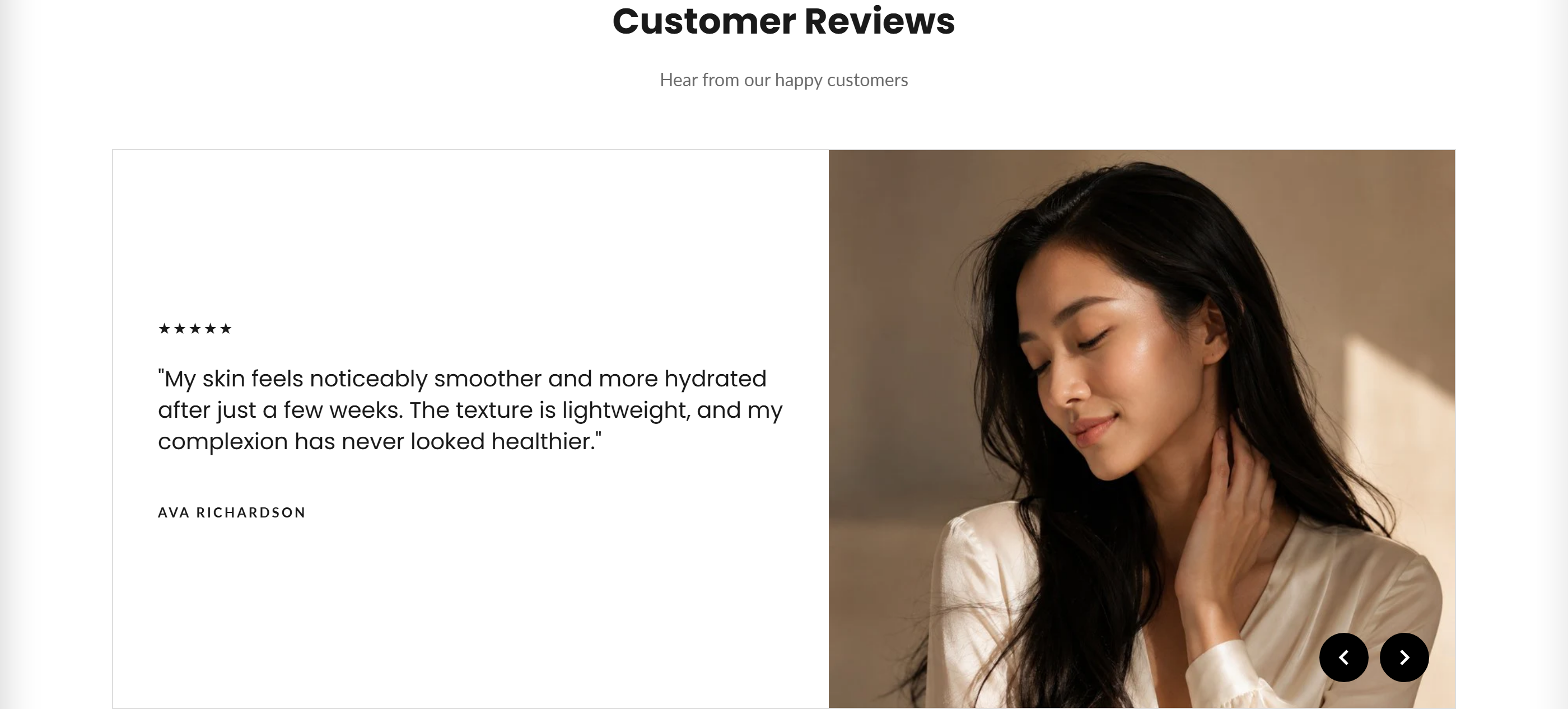
A customer-review carousel with star ratings that offers a compact grid slider or an editorial split-image layout, with optional autoplay.
Modern testimonials displays customer quotes with 1-5 star ratings in a rotating carousel. Choose the Grid slider layout for compact review cards or the Editorial (split image) layout to pair each quote with a side image. Slides can auto-rotate and are navigated with previous/next arrows or touch swipe.
How to use it
In the Shopify theme editor, add or open this section, then:
- In the theme editor, add the Modern testimonials section to your page.
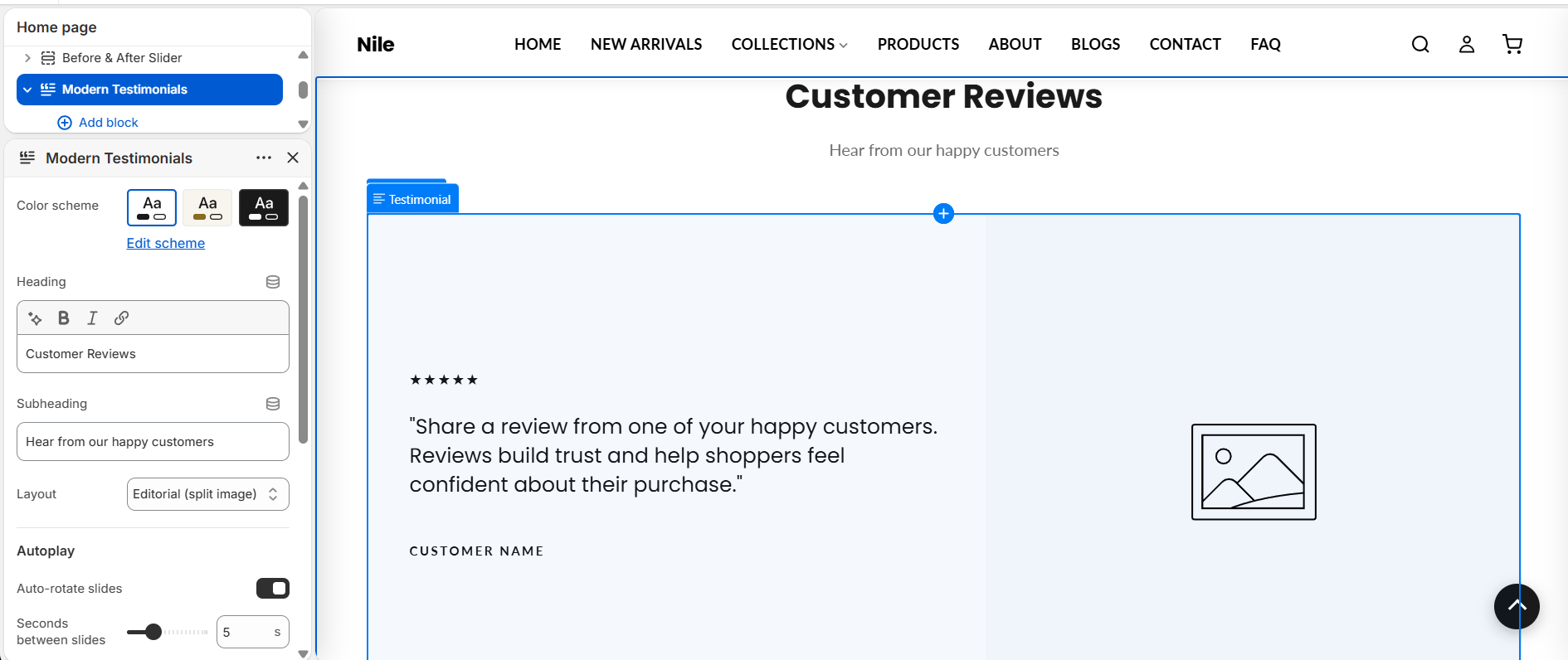
- Set the Heading (e.g. "Customer Reviews") and pick a Layout: Grid slider or Editorial (split image).
- Add a Testimonial block for each review and fill in the Stars, Review text, and Customer name.
- For the Editorial layout, add a Side image to each testimonial block (ignored in the Grid slider layout).
- Under Autoplay, toggle Auto-rotate slides and set the Seconds between slides.
- Optionally adjust the Arrow colors and pick a Color scheme for the section.
The Side image only appears in the Editorial (split image) layout; recommended size is 800×800px (1:1), displayed small and rounded.
Autoplay is automatically disabled when there are fewer than two testimonials or when the visitor has reduced motion enabled, and it pauses on hover, keyboard focus, or touch.
Add at least a few testimonial blocks so the carousel and wrap-around navigation feel natural.
Settings reference
| Setting | Type | Default | What it does |
|---|---|---|---|
| Color scheme | color_scheme | scheme-1 | Color scheme applied to the section. |
| Heading | inline_richtext | Customer Reviews | Heading shown above the testimonials; leave blank to hide it. |
| Subheading | text | Hear from our happy customers | Secondary line shown under the heading; shown by default, leave blank to hide it. |
| Layout | select | split | Choose Grid slider (3 items) or Editorial (split image). |
| Auto-rotate slides | checkbox | true | Automatically advance slides; disabled if fewer than 2 slides or reduced-motion is set. |
| Seconds between slides | range | 5 | Delay between automatic slide changes (3-10 seconds). |
| Custom arrow background | color | #000000 | Background color of the previous/next arrow buttons. |
| Custom arrow icon color | color | #ffffff | Icon (chevron) color of the previous/next arrow buttons. |
Repeatable Testimonial blocks, each with Stars (1-5 rating), a Review quote, a Customer name, and an optional Side image (used only in the Editorial layout); an @app block type is also supported.
Testimonial blocks
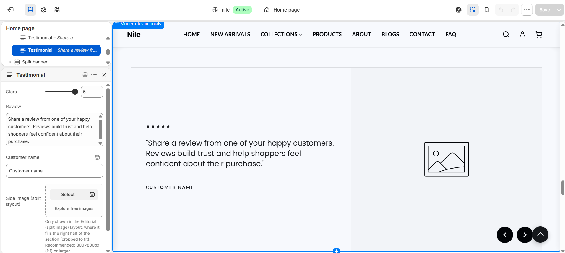
Each review is a repeatable Testimonial block. Select a block to set its own Stars, Review, Customer name, and Side image - this is where you write each review.
| Setting | Type | Default | What it does |
|---|---|---|---|
| Stars | range | 5 | Star rating shown above the quote, 1-5. |
| Review | textarea | The quality of the product exceeded my expectations. Highly recommend. | The quote text, shown wrapped in quotation marks. |
| Customer name | text | Jane Doe | Name shown under the quote. |
| Side image (split layout) | image_picker | - | Only shown in the Editorial (split image) layout, where it fills the right half (cropped to fit). Recommended: 800×800px (1:1) or larger. |
Developer notes
Loads testimonials.css via asset_url | stylesheet_tag and renders section-color-scheme; arrow colors are injected in an inline {% style %} block scoped to #Testimonials-{{ section.id }}.
- A self-contained inline
<script>IIFE drives navigation: thesplitlayout toggles anis-activeclass with custom swipe handling, while thesimplelayout scrolls the viewport using native scroll-snap. - Autoplay respects
prefers-reduced-motion(WCAG 2.2.2) and pauses onmouseenter,focusin, andtouchstart; star ratings use anaria-labelfromaccessibility.rating_stars. - Blocks include the
@apptype, so app blocks can be inserted alongside testimonials.
{% for block in section.blocks %}
  {%- if block.type == '@app' -%}{% render block %}
  {%- else -%}
    <div class="modern-t-item {% if forloop.first %}is-active{% endif %}" {{ block.shopify_attributes }}>...</div>
  {%- endif -%}
{% endfor %}