Article page
The template that renders a single blog article, including its hero image, body content, sharing links, and comments.
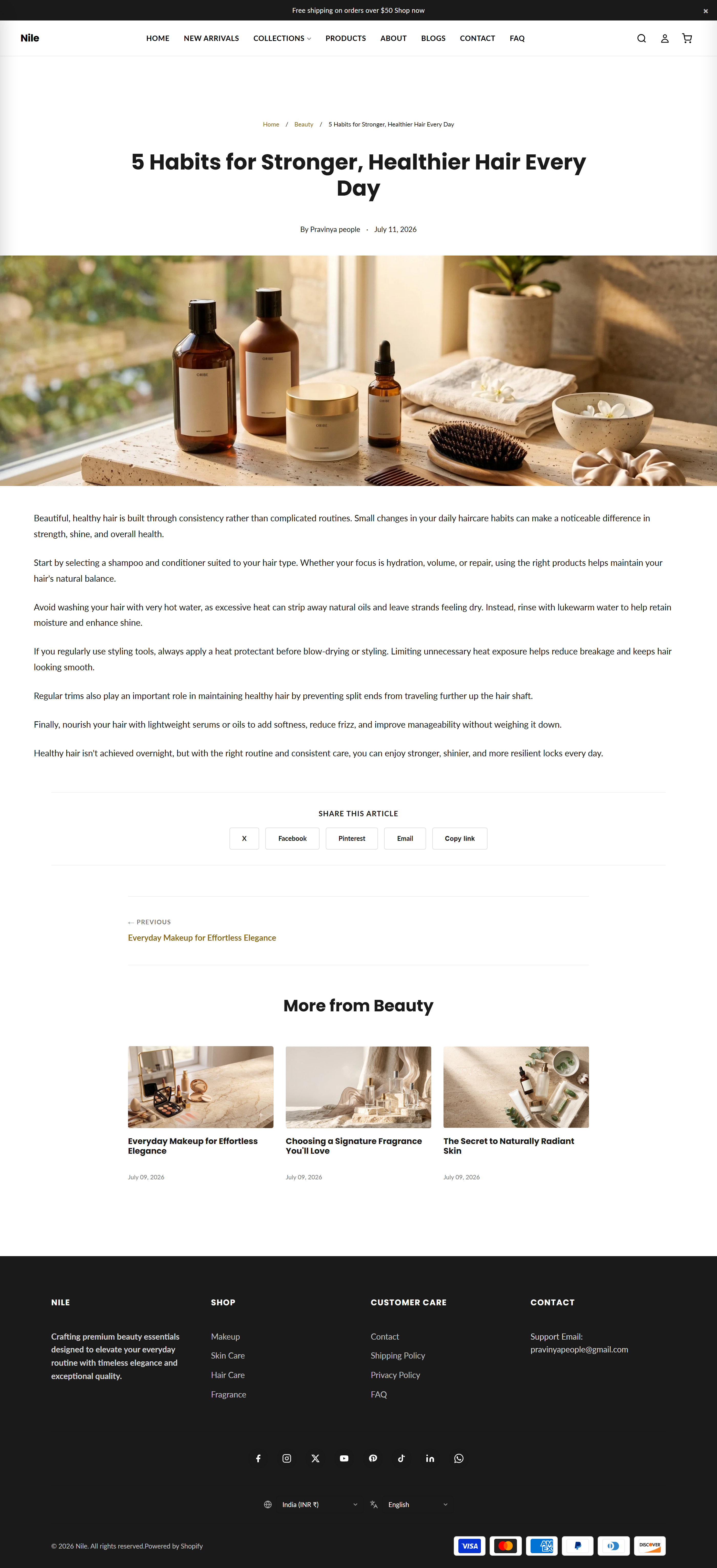
This is the reading page for a single blog post. It shows the article's title, tags, author and date, an optional full-width hero image, the post body, social share buttons, previous/next navigation, related articles, and a comment form when comments are enabled. A reading-progress bar and an auto-built table of contents are added by JavaScript.
Sections on this template
- Article
How to use it
In the Shopify theme editor, add or open this section, then:
- In the Shopify admin go to Online Store → Themes and click Customize on the Nile theme.
- In the top template picker choose Blogs → Article (or open any blog post) to edit the article layout.
- Select the Article section to toggle Show breadcrumbs, Show share buttons and Show related articles.
- Use Banner image height to control how the article's featured image displays, and adjust top/bottom padding as needed.
- The article's actual text, image, tags and author come from the post itself - edit those under Content → Blog posts, then click Save in the editor.
The hero image is the blog post's Featured image; upload a wide image (around 2000px) for crisp full-width display.
The table of contents only appears when the article body contains 3 or more H2/H3 headings.
Comments only show if you enable them for the blog under Content → Blogs → Manage → Comments.
Settings reference
| Setting | Type | Default | What it does |
|---|---|---|---|
| Color scheme | color_scheme | scheme-1 | Background and text colors used for the article section. |
| Show breadcrumbs | checkbox | true | Displays a Home / Blog / Article breadcrumb trail above the title. |
| Show share buttons | checkbox | true | Shows X, Facebook, Pinterest, email and copy-link sharing buttons. |
| Show related articles | checkbox | true | Displays up to three other posts from the same blog below the article. |
| Banner image height | select | original | Sizes the featured hero image: Original, Small (300px), Medium (450px), Large (600px) or Full (viewport height). |
| Top padding | range | 60px | Space above the section (0-120px). |
| Bottom padding | range | 80px | Space below the section (0-120px). |
Accepts Shopify app blocks (@app) only, letting apps inject content at the end of the article.
Developer notes
Single section sections/article-main.liquid; all CSS is inline and scoped to #ArticleMain-{{ section.id }}, and it renders the section-color-scheme snippet.
- Inline JS (no external asset) powers the copy-link button, the sticky reading-progress bar, and the TOC auto-built from H2/H3 headings (shown only when ≥3 headings exist).
- Comments use Shopify's
{% form 'new_comment' %}withpaginate article.comments by 20, gated onblog.comments_enabled?. - Hero, TOC and body render full-bleed; breadcrumbs, header and footer blocks are wrapped in
.page-width.
<section class="article-main" id="ArticleMain-{{ section.id }}">
  <div class="article-main__content" data-article-body>
    {{ article.content }}
  </div>
</section>