Collection page
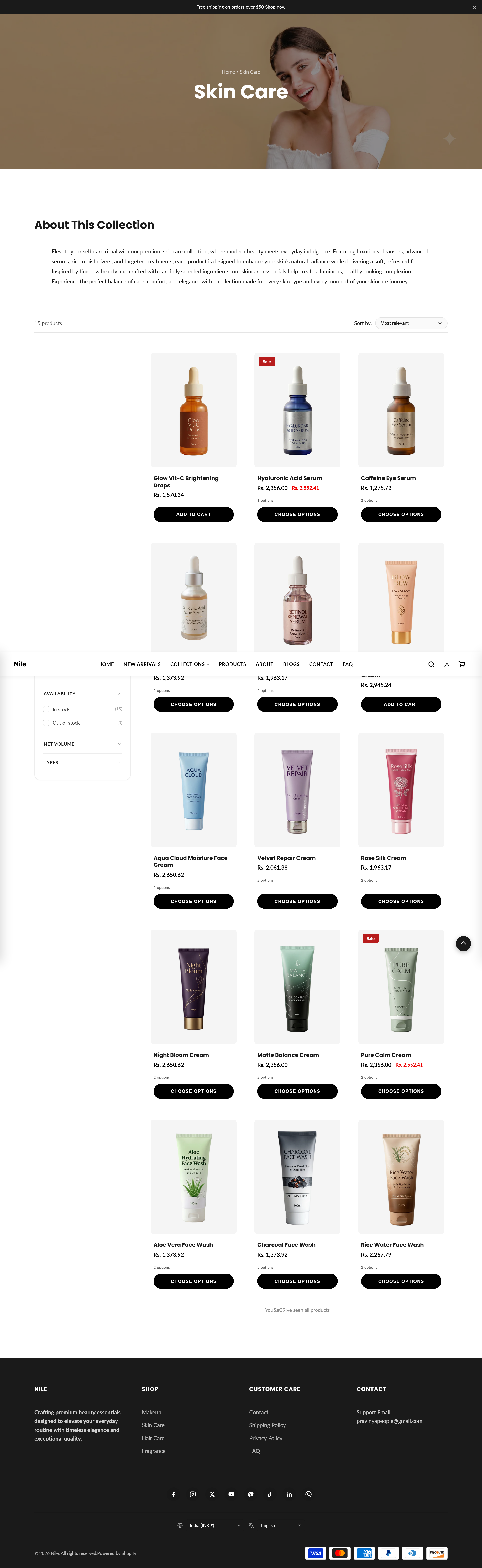
The Collection page template controls how a single collection's products, banner, and description are displayed to shoppers.
This is the template Shopify renders for any collection page (for example a "Skincare" or "New Arrivals" collection). It stacks a banner, an optional description, and the filterable product grid, followed by three optional promotional sections that are disabled by default.
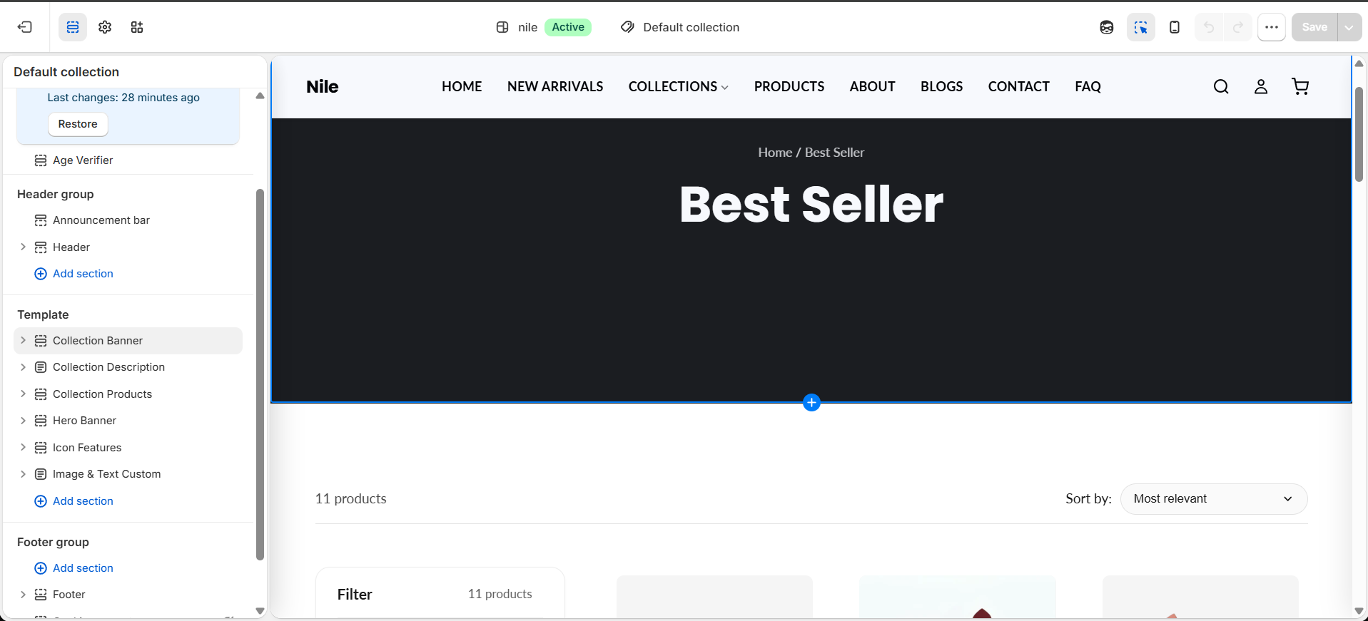
Sections on this template
- Collection Banner
- Collection Description
- Collection Products
- Hero Banner
- Icon Features
- Image with Text
How to use it
In the Shopify theme editor, add or open this section, then:
- In the Shopify admin, go to Online Store → Themes and click Customize on the Nile theme.
- In the top template dropdown, choose Collections → Default collection to edit this template.
- Select a section in the left sidebar (for example Collection Products) to change how many products show per row, the image ratio, and whether filters and sort appear.
- Enable optional sections such as Hero Banner, Icon Features, or Image & Text Custom by clicking the section and ticking its enable checkbox.
- Click Save. Preview the change on any collection to confirm it looks right.
The banner image set here (Collection Banner) is a template default; individual collections can override imagery via their own collection settings.
The product grid uses infinite scroll and loads 24 products per batch automatically - there is no pagination setting to configure.
Filters only appear when the collection actually has filter options or products with multiple variants, even if Show filters is enabled.
Settings reference
| Setting | Type | Default | What it does |
|---|---|---|---|
| Show filters | checkbox | true | Displays the filter sidebar when the collection has available filters or variant options. |
| Show sort | checkbox | true | Shows the sort-by dropdown above the product grid. |
| Products per row (desktop) | number | 3 | Number of product columns on desktop. |
| Products per row (tablet) | number | 3 | Number of product columns on tablet widths. |
| Products per row (mobile) | number | 2 | Number of product columns on mobile widths. |
| Image ratio | select | 3/4 | Aspect ratio applied to product card images in the grid. |
Developer notes
The main section sections/collection-main.liquid loads collection-main.css and renders section-color-scheme and quick-view-assets snippets.
- Grid columns are set via inline
<style>scoped to.collection-section-{{ section.id }}and#CollectionGrid, driven by the products-per-row settings; per FB15 there is no hardcoded 480px override. products_per_pageis hardcoded to 24 for the infinite-scroll fetch batch and is intentionally not merchant-facing.- The optional sections (
hero-banner,icon-features,image-with-text) ship withenable_section:falseso they are inert until a merchant turns them on.
{%- assign has_sidebar = false -%}
{%- if section.settings.show_filters -%}
  {%- if collection.filters.size > 0 or has_variant_options -%}
    {%- assign has_sidebar = true -%}
  {%- endif -%}
{%- endif -%}