All collections
The list-collections page shows a browsable grid of your store's collections, built from a single Collections list section.
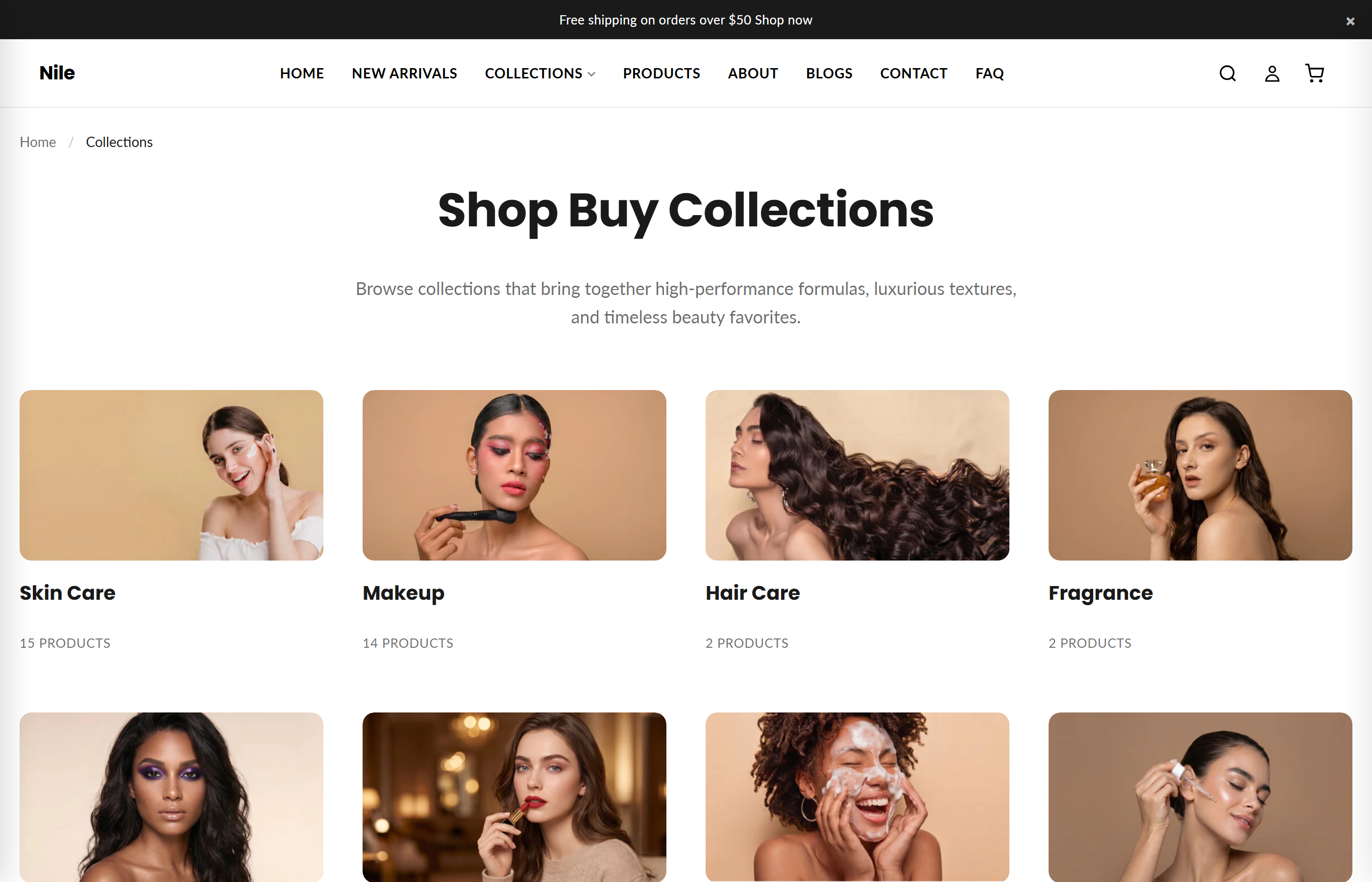
This is the All collections page (URL /collections). It renders a heading, subheading, breadcrumbs, and a responsive grid of collection cards. You can either show every collection automatically or hand-pick and reorder specific collections using blocks.
Sections on this template
- Collections list
How to use it
In the Shopify theme editor, add or open this section, then:
- In the Shopify admin, go to Online Store → Themes → Customize.
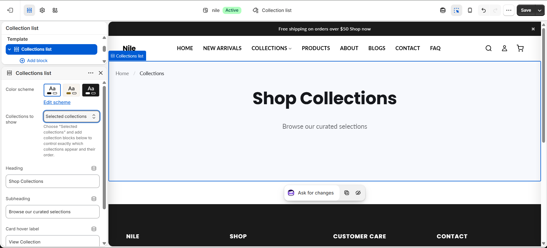
- In the top template picker choose Pages → All collections (the
templates/list-collections.jsontemplate). - Select the Collections list section and edit the Heading, Subheading, and Card hover label text.
- Set Collections to show to All collections to list every collection automatically, or Selected collections to control which ones appear.
- When using Selected collections, add or remove Collection blocks and drag them to set the display order.
- Pick an Image shape for the cards and click Save.
Use square or landscape collection images of consistent dimensions so the grid stays visually even; mixed aspect ratios can look uneven.
With All collections selected the grid is paginated at 12 per page and the all collection is hidden automatically; with Selected collections pagination is skipped and only your chosen blocks show.
Each collection card uses that collection's featured image set under Products → Collections in the admin, not an image chosen in the theme editor.
Settings reference
| Setting | Type | Default | What it does |
|---|---|---|---|
| Color scheme | color_scheme | scheme-1 | Sets the background and text colors for the section. |
| Collections to show | select | all | Choose "Selected collections" and add collection blocks below to control exactly which collections appear and their order. |
| Heading | text | Shop Collections | Main title shown above the grid. |
| Subheading | text | Browse our curated selections | Supporting text shown under the heading. |
| Card hover label | text | Shop Now | Call-to-action label shown on each collection card. |
| Image shape | select | square | Card image shape: Square, Landscape, Circle, or Angled. |
The section supports repeatable Collection blocks (each picks one collection); their order sets the display order, and they are only used when Collections to show is set to Selected collections. An @app block type is also supported for app integrations.
Developer notes
Main section file is sections/collections-list.liquid; it loads collections-list.css via asset_url and renders section-color-scheme, breadcrumbs, and pagination snippets.
- Each card is rendered through the
collection-grid-itemsnippet, passed eitherblock.settings.collection(selected mode) or the loopcollection(all mode). - In all mode collections are wrapped in
{% paginate collections by 12 %}and theallhandle is skipped; pagination is not rendered in selected mode. - The saved template ships in selected mode with 10 collection blocks and the heading "Shop Buy Collections"; the schema default source is all.
{%- if section.settings.collection_source == 'selected' -%}
  {%- for block in section.blocks -%}
    {%- render 'collection-grid-item', collection: block.settings.collection, section: section -%}
  {%- endfor -%}
{%- else -%}
  {%- for collection in collections -%}...{%- endfor -%}
{%- endif -%}