Search page
The search results page shows storefront search matches for a shopper's query, with filtering, sorting, and pagination.
This is the page shoppers land on after running a search from the header search bar. It is built from a Search Header (page title) and a Search Results section that lists matching products, articles, and pages with optional filters, a sort dropdown, and pagination. When there are no matches it shows a friendly empty state with a link to browse all products.
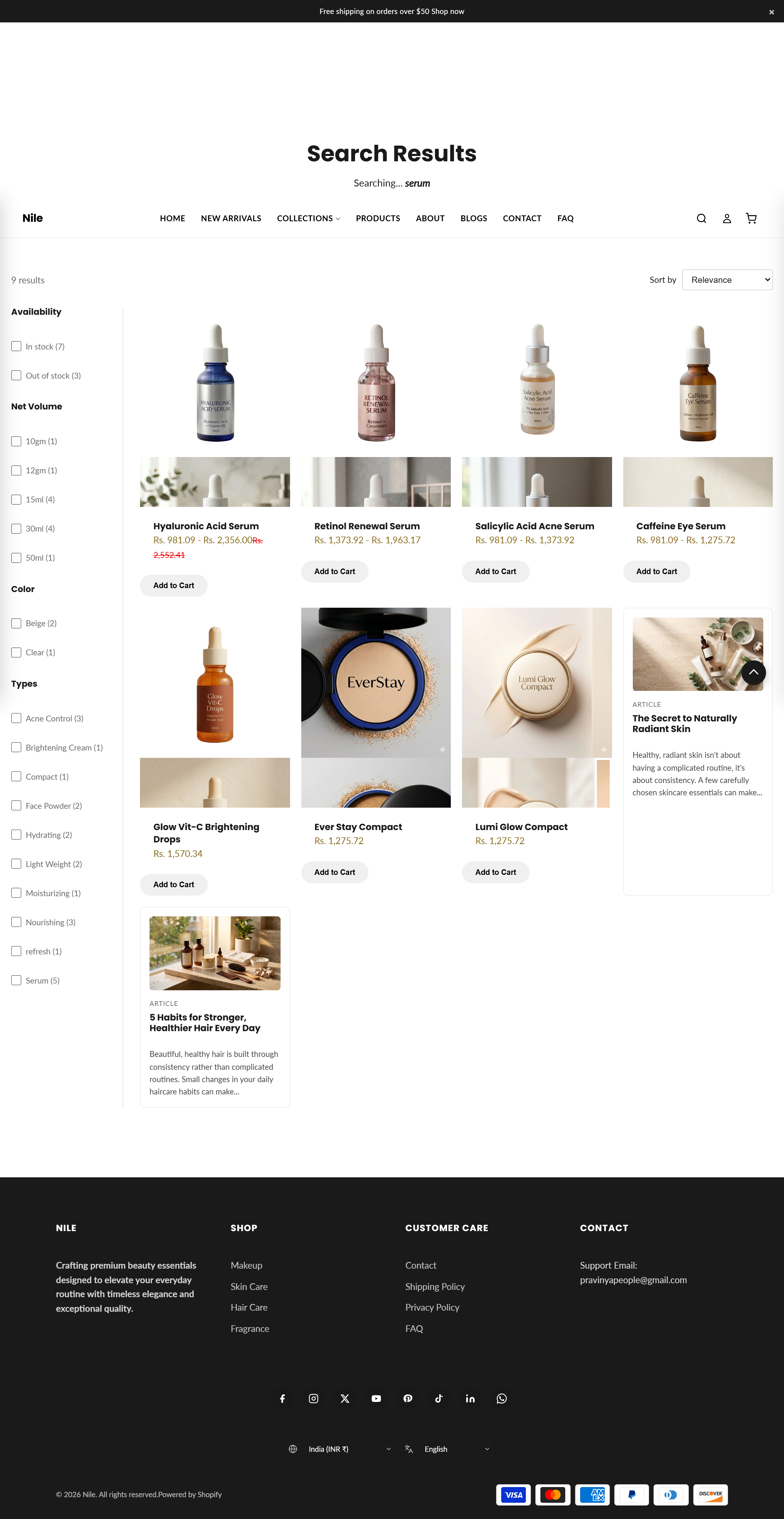
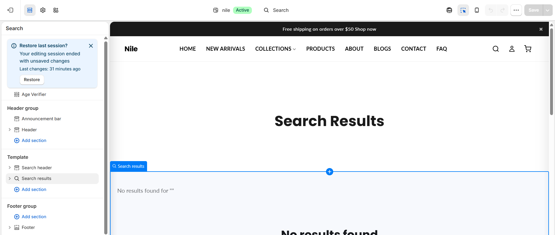
Sections on this template
- Search Header
- Search Results
How to use it
In the Shopify theme editor, add or open this section, then:
- In the Shopify admin, go to Online Store → Themes and click Customize on the Nile theme.
- In the top template dropdown, choose Pages → Search results (or run a search on the preview to reach it).
- Click the Search Results section to adjust results per page, products per row, the product image ratio, and whether filters and the sort menu appear.
- Click the Search Header section to change the page title and its top/bottom spacing.
- Click Save to publish your changes.
The filter checkboxes only appear when your storefront has search filters set up (Shopify Search & Discovery app or storefront filters) - otherwise the sidebar stays hidden.
Results include products, blog articles, and pages, so a search can surface more than just products.
Sort and filter changes update the results in place without a full page reload, preserving scroll and focus.
Settings reference
| Setting | Type | Default | What it does |
|---|---|---|---|
| Items per page | range | 24 | How many results load before pagination (8-48). |
| Products per row | range | 4 | Grid columns on desktop (2-5). |
| Products per row (tablet) | range | 3 | Grid columns on tablet (2-4). |
| Products per row (mobile) | range | 2 | Grid columns on mobile (1-3). |
| Show filters | checkbox | true | Shows the filter sidebar when search filters exist. |
| Show sort | checkbox | true | Shows the sort-by dropdown above the results. |
| Product image ratio | select | square | Image shape for product cards: square, portrait, or landscape. |
| Color scheme | color_scheme | scheme-1 | Background and text colors for the section. |
| Top padding | range | 40 | Space above the results, in px. |
| Bottom padding | range | 60 | Space below the results, in px. |
The section supports only @app blocks, so it has no merchant-facing repeatable content blocks - it exists to let apps inject storefront widgets.
Developer notes
Main section sections/search-results.liquid wraps output in {% paginate search.results by section.settings.items_per_page %} and switches on item.object_type to render products via the product-card snippet and articles/pages via inline cards.
- Renders
section-color-schemeandquick-view-assetssnippets; all CSS is scoped persection.idand driven by--color-*theme variables. - An inline script AJAX-fetches the GET URL on filter/sort
change(elements markeddata-auto-submit), swaps the.search-results-{{ section.id }}region, updates history, and restores focus (FB16); it falls back to a full navigation on error. - The sort and filter forms intentionally omit
type=productso article and page results survive a sort or filter change (FB5).
{%- paginate search.results by section.settings.items_per_page -%}
  {%- for item in search.results -%}
    {%- case item.object_type -%}
      {%- when 'product' -%}{% render 'product-card', product: item %}
    {%- endcase -%}
  {%- endfor -%}
{%- endpaginate -%}