Accordion
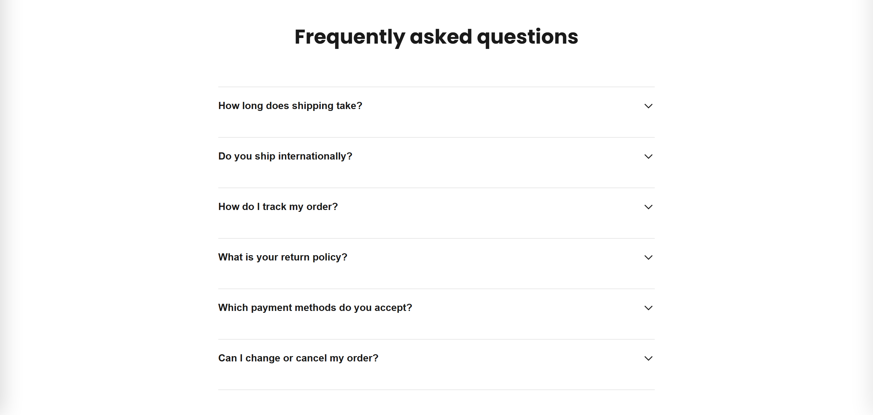
A collapsible accordion of expand/collapse items, ideal for product details, shipping, returns, and FAQ-style content.
The Accordion section stacks a list of collapsible items under an optional heading. Each item shows a title with a chevron that toggles its rich-text content open or closed, keeping long product information tidy. Multiple items can be open at once.
How to use it
In the Shopify theme editor, add or open this section, then:
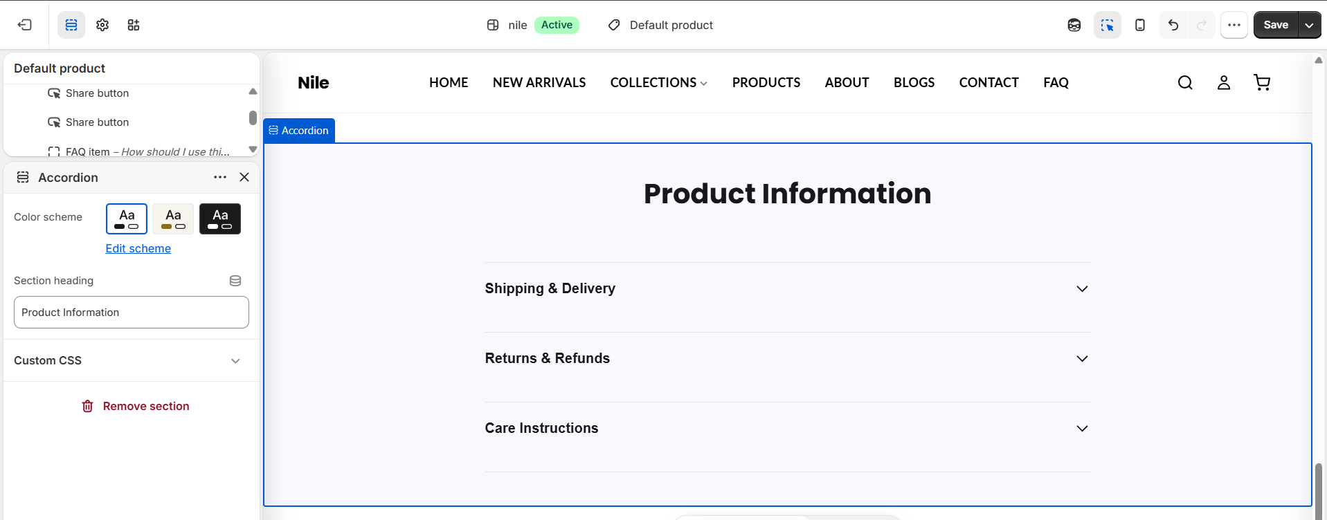
- In the theme editor, add the Accordion section (or open an existing one) within a product or other page area.
- Optionally edit the Section heading (defaults to Product Information); leave it blank to hide the heading.
- Add an Accordion item block for each entry you want to show.
- For each block, set the Item title and fill in the Item content rich text.
- Reorder or delete blocks as needed, then pick a Color scheme and save.
Item content is a rich-text field, so you can add bold text, lists, and links; links inside content inherit the text color and are underlined.
The section has no built-in "one item open at a time" mode - any number of items can be expanded simultaneously. This same Accordion section powers the FAQ page, so it doubles as your FAQ list.
There is no empty-state placeholder: add at least one Accordion item or the section renders blank.
Settings reference
| Setting | Type | Default | What it does |
|---|---|---|---|
| Color scheme | color_scheme | scheme-1 | Sets the section's background and text colors from your theme color schemes. |
| Section heading | text | Product Information | Centered heading shown above the accordion. Leave blank to hide it. |
Repeatable Accordion item blocks, each with an Item title and rich-text Item content; app blocks (@app) are also supported.
Accordion item blocks
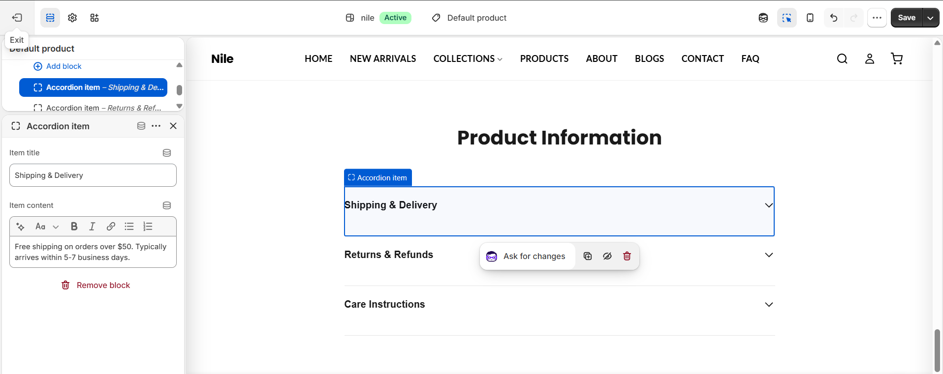
Each entry is a repeatable Accordion item block. Select a block to set its Item title (the question or label) and Item content (the answer body).
| Setting | Type | Default | What it does |
|---|---|---|---|
| Item title | text | What is this? | The clickable heading that expands the item. |
| Item content | richtext | <p>Add your answer or product details here.</p> | The body revealed when the item is opened; supports bold, lists, and links. |
Developer notes
Self-contained section: scoped inline {%- style -%} block keyed to #Accordion-{{ section.id }}, plus a small inline IIFE <script> for toggle behavior - no external CSS or JS assets.
- Renders
{% render 'section-color-scheme' %}at the top to apply the selected color scheme's CSS variables. - Open/close uses a CSS grid
grid-template-rows0fr→1fr transition; the toggle button flipsaria-expandedand toggles the.is-openclass on the content, witharia-controlswiring for accessibility. - Blocks of type
@appare rendered directly via{% render block %}; all other blocks render as accordion items.
{%- for block in section.blocks -%}
  <button class="accordion__toggle" aria-expanded="false" aria-controls="accordion-{{ section.id }}-{{ forloop.index }}">
    <span>{{ block.settings.title }}</span>
  </button>
  <div class="accordion__content">{{ block.settings.content }}</div>
{%- endfor -%}