Product Bundles (Bought Together)
Shows a "Buy it with" strip on product pages that lets shoppers add the current product plus recommended companions to the cart in one click.
Product Bundles displays the current product alongside automatically recommended companion products as a selectable, checkbox-driven strip. Shoppers can toggle which items to include, see a live running total, and add the whole bundle to the cart with a single button. Companion products are fetched at runtime from Shopify's /recommendations/products.json endpoint, so the merchant does not pick them manually.
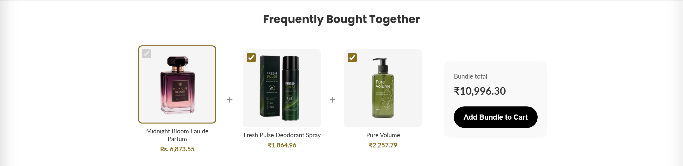
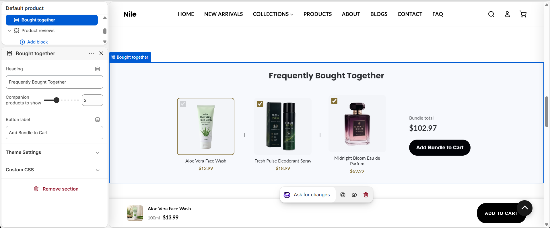
How to use it
In the Shopify theme editor, add or open this section, then:
- On a product page in the theme editor, select the Bought together section - it sits on the product template by default, further down the page (below the main product area, recommendations, reviews, and feature icons).
- Set the Heading shown above the strip (defaults to Buy it with).
- Use Companion products to show to choose how many recommended items appear (1 to 4).
- Edit the Button label that adds the selected items to the cart.
- Save and preview on a product that has related products so recommendations can load.
The companion products are chosen automatically by Shopify's recommendation engine (intent=related), not by the merchant. If a product has no related products, the whole section hides itself.
The current product is always included and cannot be unchecked; only companion items can be toggled on or off.
Product images look best square; the strip renders thumbnails at 160x160 and requests images at 300x300 for retina sharpness.
Settings reference
| Setting | Type | Default | What it does |
|---|---|---|---|
| Heading | text | Buy it with | Title displayed above the bundle strip. |
| Companion products to show | range | 2 | Number of recommended companion products to display, from 1 to 4. |
| Button label | text | Add Bundle to Cart | Text on the button that adds all checked items to the cart. |
Developer notes
Styles come from product-bundles.css (loaded via asset_url | stylesheet_tag); everything is scoped under the .product-bundles block and the section id ProductBundles-{{ section.id }}.
- Companions are fetched client-side from
/recommendations/products.json?intent=related, filtered to exclude the current product, and rendered into[data-bundle-companions], replacing skeleton placeholders. The section hides itself (display:none) if the fetch fails or returns no products. - The add-to-cart flow posts to
/cart/add.js, then reads/cart.jsto update any[data-cart-count]badges and dispatches acart:openCustomEvent to open the cart drawer. - The main item's price stays in sync by listening for the PDP's
variant:changedevent; button shape uses the globalsettings.button_shape, and storefront strings (total/adding/added) come fromsections.product_bundles.*translation keys.
<div class="bundle-companions" data-bundle-companions>
  {%- for i in (1..bundle_count) -%}
    <div class="bundle-item bundle-item--skeleton"></div>
  {%- endfor -%}
</div>