Product Main (product page)
The core product-page section: image gallery with zoom and lightbox, variant picker, price, add-to-cart, sticky bar, feature badges, share buttons, FAQ accordions, and an optional quick-order list.
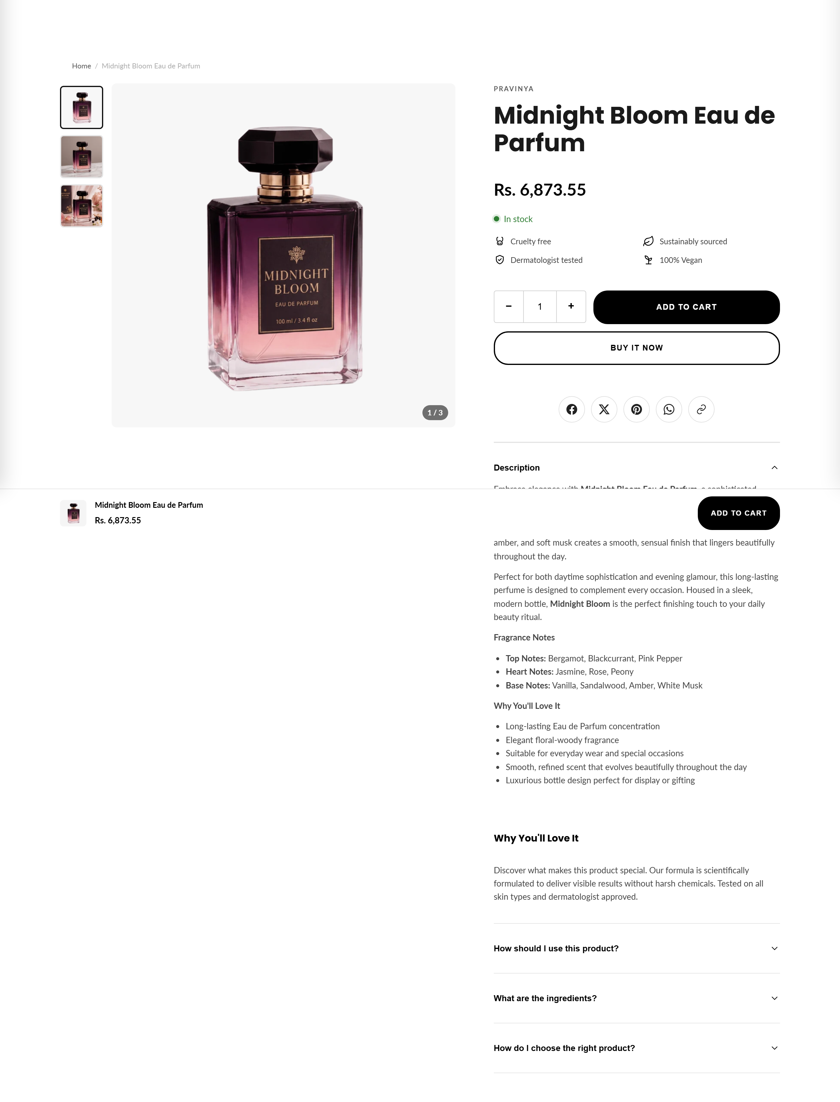
Product Main is the main content area of a product page. It renders the left-column media gallery (thumbnails, zoom-on-hover, lightbox, swipe, plus video and 3D-model support) and the right-column product info: vendor, title, star rating, price with sale badge, unit price, stock status, variant picker, quantity, add-to-cart, dynamic checkout buttons, local pickup, back-in-stock form, size guide, SKU, sharing, description and FAQ accordions.It also drives a sticky add-to-cart bar and an optional full-width quick-order list for multi-variant products.
How to use it
In the Shopify theme editor, add or open this section, then:
- Open Online Store → Themes → Customize and switch the top selector to a Products → Default product page.
- Click the Product (Product Main) section in the left panel to open its settings.
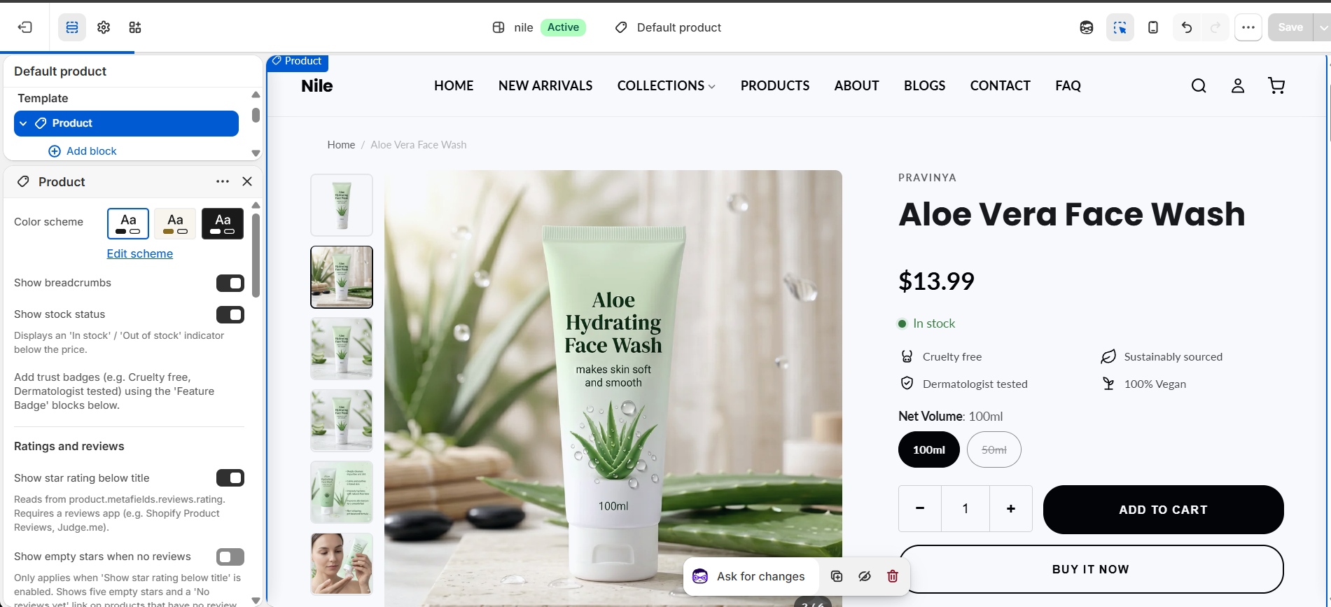
- Toggle what appears near the price: Show stock status, Show low stock warning, Show quantity selector, Show dynamic checkout buttons, and Show star rating below title.
- Pick a Variant picker style (Buttons, Swatches, or Dropdown) to control how options are presented.
- Use Add block to insert Feature badge trust icons, Share button links, and FAQ item accordions; drag to reorder.
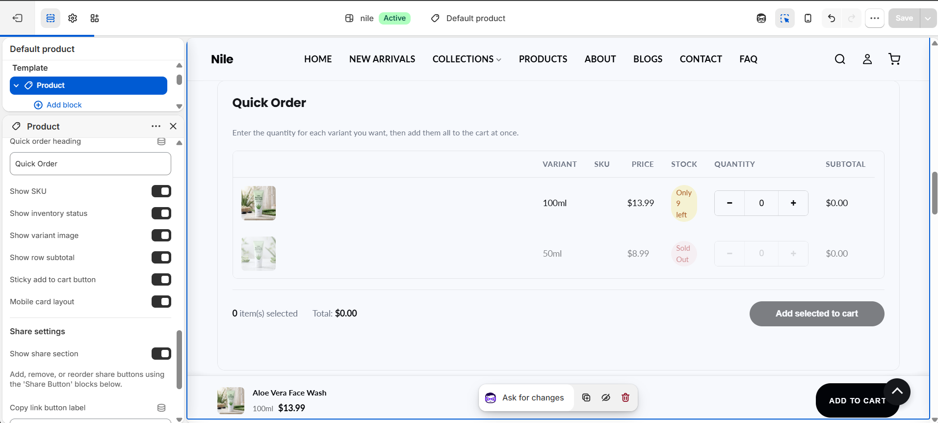
- Optionally enable the Quick order list and fill the Rich text fields, then click Save.
Gallery thumbnails load at 140px and the main image at up to 1000px, so upload square product photos around 1000×1000px or larger for a sharp zoom and lightbox.
Show empty stars when no reviews only takes effect when Show star rating is on; the rating itself reads product.metafields.reviews.rating and needs a reviews app to populate it.
Back-in-stock submissions are sent through the Shopify contact form to your store contact email; the form only appears on sold-out variants when the product has an unavailable variant.
Settings reference
| Setting | Type | Default | What it does |
|---|---|---|---|
| Color scheme | color_scheme | scheme-1 | Color scheme applied to this section. |
| Show breadcrumbs | checkbox | true | Shows a Home / collection / product breadcrumb trail above the product. |
| Show stock status | checkbox | true | Displays an 'In stock' / 'Out of stock' indicator below the price. |
| Show star rating below title | checkbox | true | Reads from product.metafields.reviews.rating. Requires a reviews app (e.g. Shopify Product Reviews, Judge.me). |
| Show empty stars when no reviews | checkbox | false | Only applies when the star rating is enabled. Shows five empty stars and a 'No reviews yet' link on products with no review data. |
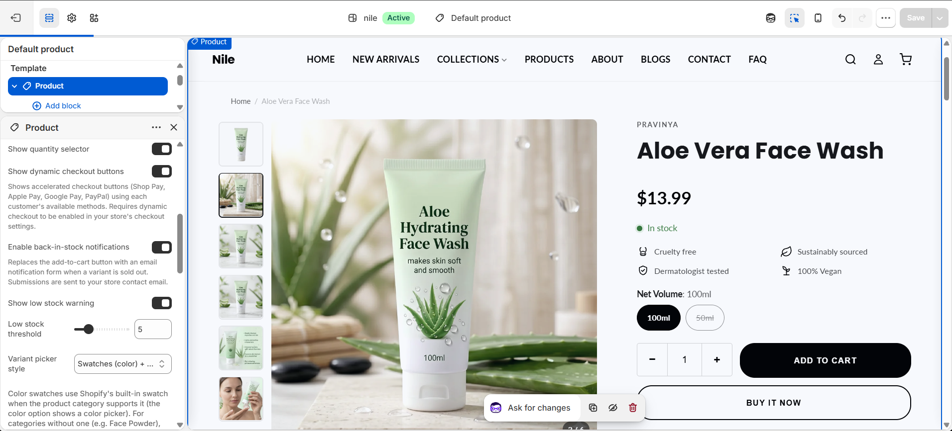
| Show quantity selector | checkbox | true | Shows the +/- quantity stepper next to the add-to-cart button. |
| Show dynamic checkout buttons | checkbox | true | Shows accelerated checkout buttons (Shop Pay, Apple Pay, Google Pay, PayPal). Requires dynamic checkout to be enabled in checkout settings. |
| Enable back-in-stock notifications | checkbox | true | Replaces add-to-cart with an email notification form when a variant is sold out. Submissions are sent to your store contact email. |
| Show low stock warning | checkbox | true | Shows an 'Only N left' message when stock is at or below the threshold (Shopify-tracked inventory only). |
| Low stock threshold | range | 5 | Inventory level (1-20) at or below which the low-stock warning appears. |
| Variant picker style | select | swatch | How variant options render: Buttons, Swatches (color) + buttons for other options, or Dropdown. |
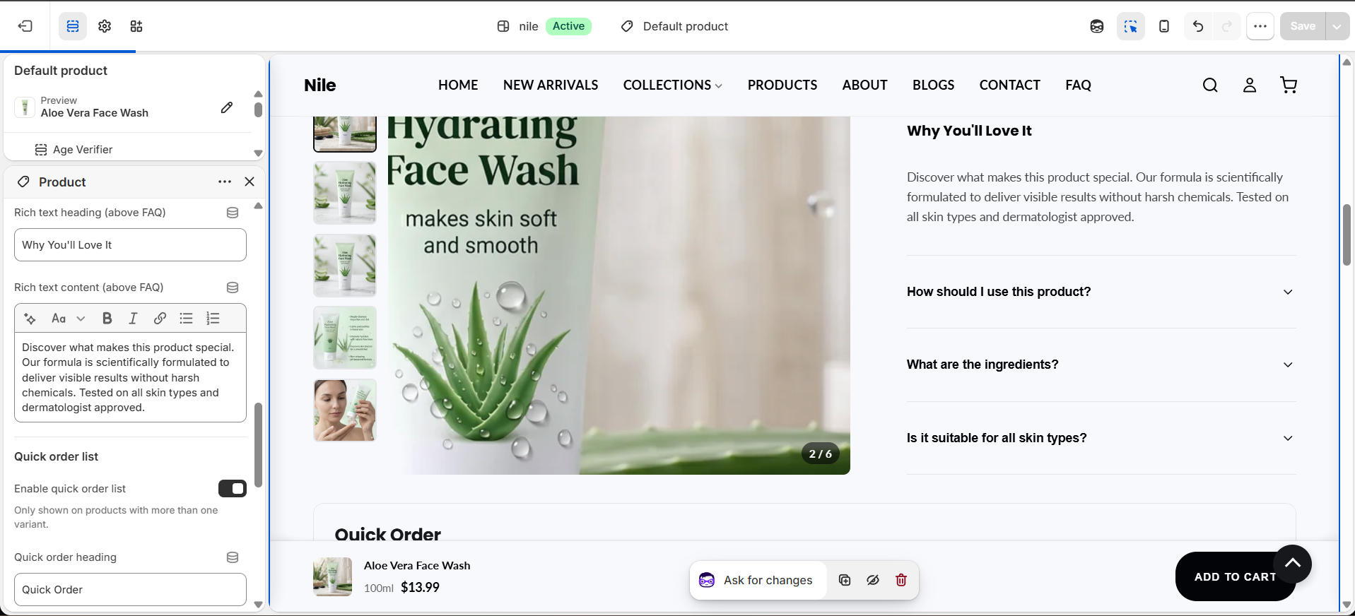
| Rich text heading (above FAQ) | text | - | Optional heading for an always-visible rich text block below the description. |
| Rich text content (above FAQ) | richtext | - | Optional always-visible rich text shown above the FAQ accordions. |
| Enable quick order list | checkbox | false | Adds a full-width variant order table below the product. Only shown on products with more than one variant. |
| Quick order heading | text | Quick Order | Heading shown above the quick-order list. |
| Show SKU | checkbox | true | Shows each variant's SKU column in the quick-order list. |
| Show inventory status | checkbox | true | Shows the inventory/stock status column in the quick-order list. |
| Show variant image | checkbox | true | Shows a thumbnail image for each variant row in the quick-order list. |
| Show row subtotal | checkbox | true | Shows a per-row subtotal as quantities are entered in the quick-order list. |
| Sticky add to cart button | checkbox | true | Keeps the quick-order list's submit button pinned as the shopper scrolls. |
| Mobile card layout | checkbox | true | Renders each quick-order variant as a stacked card on mobile instead of a table row. |
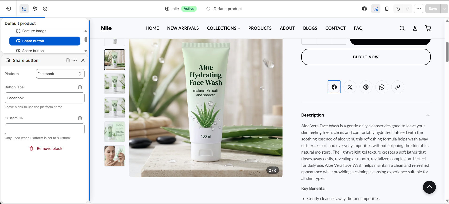
| Show share section | checkbox | true | Shows social share buttons plus a copy-link button. Configure buttons with Share button blocks. |
| Copy link button label | text | Copy Link | Text/label for the copy-link button in the share row. |
| Show Follow on Shop button | checkbox | true | Shows a Follow on Shop button so customers can follow your store in the Shop app. Only appears if the feature is available on your store. |
Supports repeatable blocks: Feature badge (trust icons like Cruelty free / Vegan / Free shipping), Share button (Facebook, X, Pinterest, WhatsApp, Reddit, Telegram, Email, or Custom), Size guide row (chest/waist/hips measurement rows for the size-guide modal), FAQ item (collapsible title + answer accordions), and App blocks.
Blocks
This section has four block types. Add them with Add block inside the Product Main section, and drag to reorder within each type.
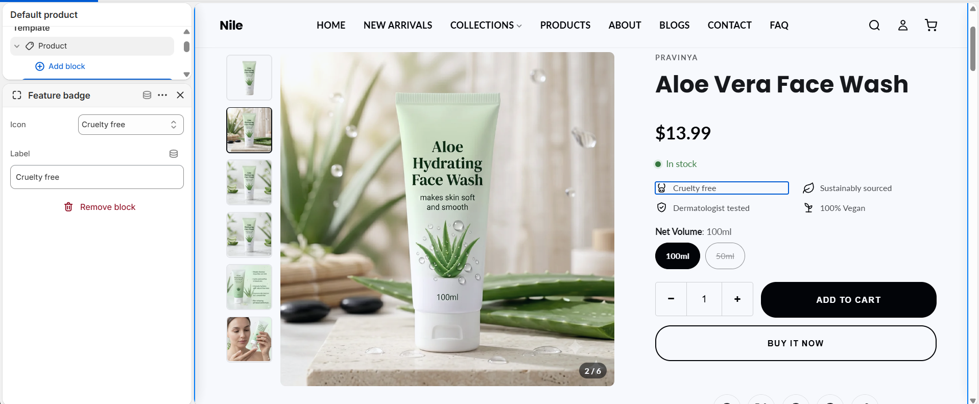
Feature badge
Trust badges shown under the buy box (for example Cruelty free, Vegan, Free shipping).
Share button
Each social destination in the share row. The row itself is toggled by Show share section in the section settings.
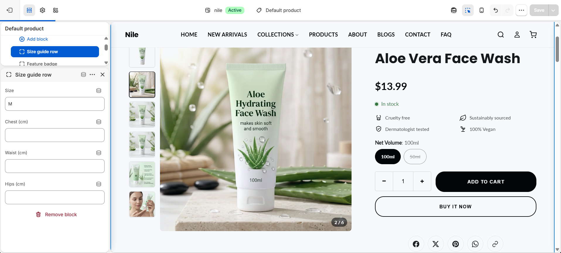
Size guide row
One measurement row (for example chest / waist / hips) in the size-guide modal.
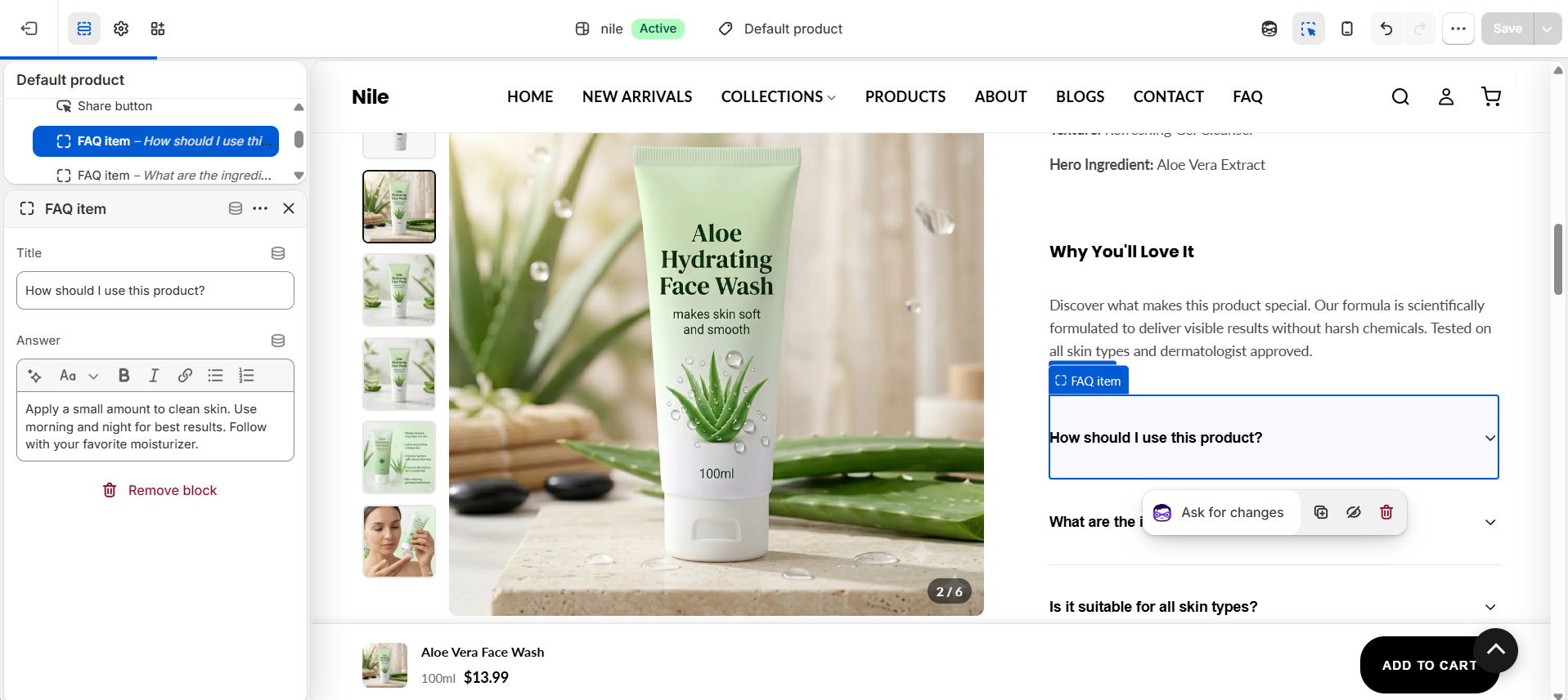
FAQ item
A collapsible question-and-answer accordion shown on the product page.
Developer notes
Root wrapper is #ProductMain-{{ section.id }}; button colors, shape and gallery aspect ratio are injected via inline {%- style -%} from global settings.button_*, settings.button_shape and settings.product_image_ratio.
- Loads
product-main.cssandproduct-variant-picker.css; renders snippetsproduct-variant-picker,add-to-cart-button,pickup-availability,quick-order-list,size-guide-modal,product-feature-iconandsocial-share-icon. - Inline JS handles variant matching against
window.productVariants, price formatting with money tokens, gallery swap/zoom/lightbox, sticky bar via IntersectionObserver, and dispatchesvariant:changed/variantChangedevents; it also re-fetches pickup availability per variant and syncs ATC labels oncart:updated. - 3D models pull
model-viewer-ui.jsfrom Shopify's CDN; video, external video and model media render fromproduct.media. Size guide only appears when the product has a 'Size' option, and SKU only when the variant has a SKU value.
{%- render 'product-variant-picker',
  product: product,
  picker_type: section.settings.variant_style,
  section: section
-%}