Product Recommendations
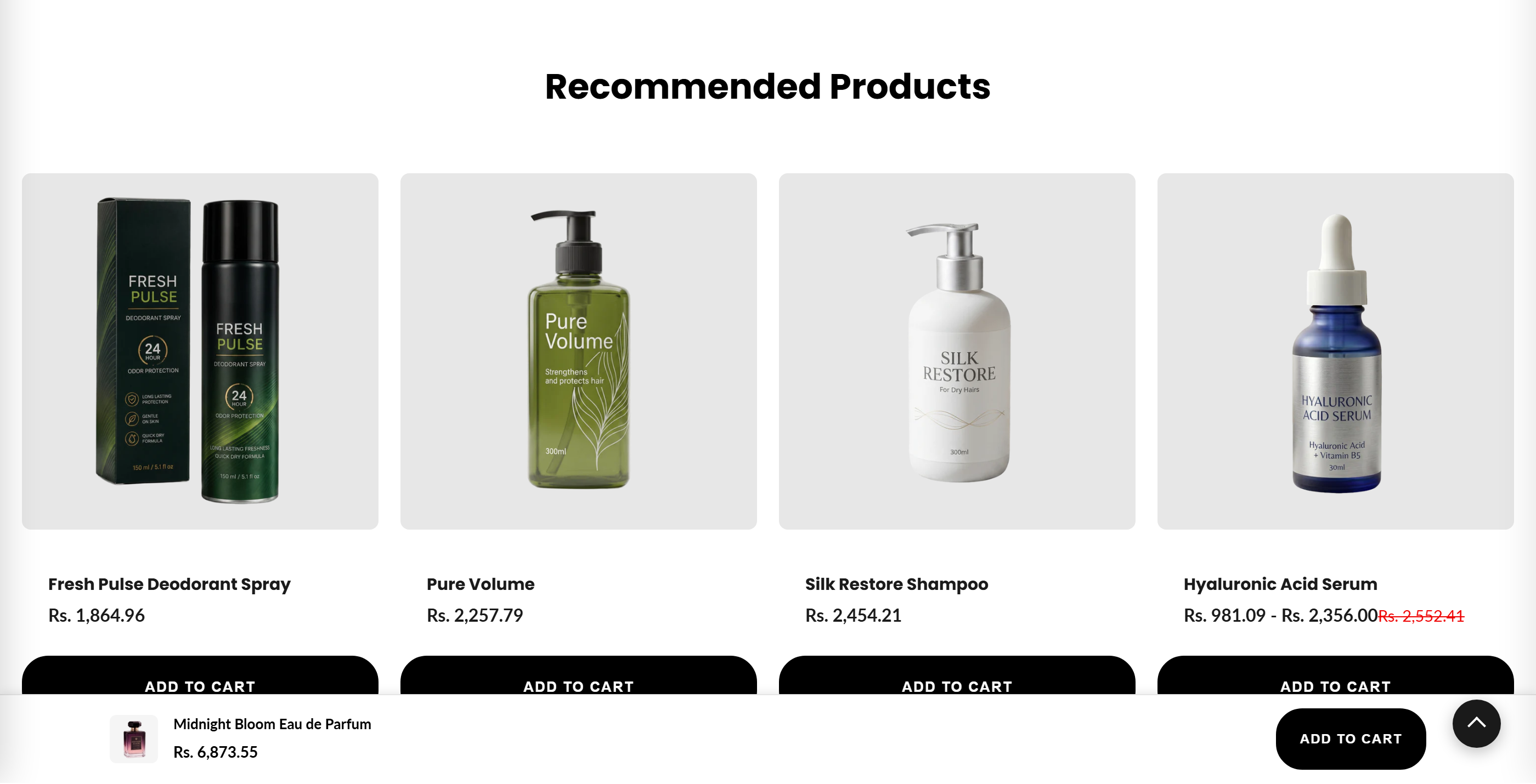
Displays a grid of Shopify-generated related or complementary product recommendations on product pages, fetched dynamically via the recommendations API.
Ships on the product page in this theme. The default product template already includes two Product Recommendations sections - one as complementary ("Pairs well with") and one as related ("Recommended Products"). You can add more, reorder, or remove them in the theme editor. It only returns results on a product template, since it keys off product.id.
This section shows a responsive grid of products that Shopify automatically recommends for the current product, either related or complementary items. Cards are loaded client-side from Shopify's recommendations API and support quick-view and quick-add-to-cart. Because it relies on product.id, it only produces results when placed on a product page.
How to use it
In the Shopify theme editor, add or open this section, then:
- In the theme editor, open a Product template and add the Product recommendations section (or use its preset).
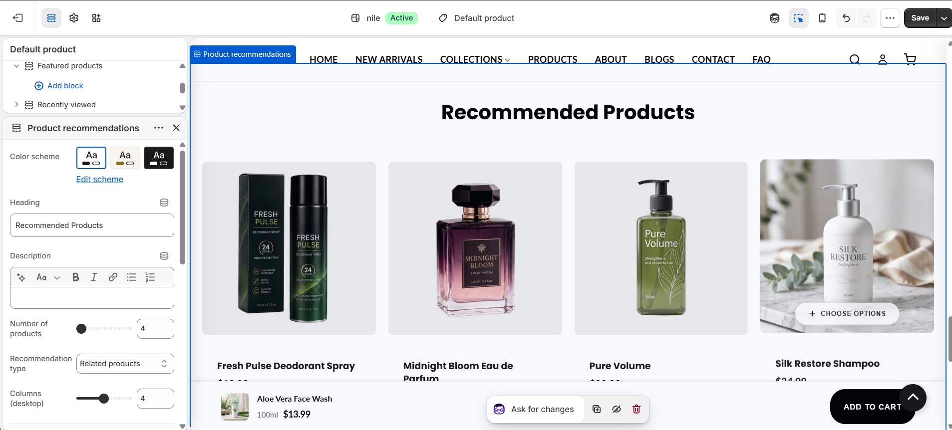
- Set the Heading and optional Description shown above the grid.
- Choose the Recommendation type (Related or Complementary) and the Number of products to display.
- Adjust Columns (desktop) and Gap between products to fit your layout.
- Use the Styling and Spacing groups to tune heading alignment, font size, colors, image corner radius, and top/bottom padding.
- Save and preview on a live product page to confirm recommendations appear.
Recommendations are generated by Shopify and only appear on product pages; on other pages the section shows a 'not available' message.
Product images are requested at 500px wide and cropped square (1:1 aspect ratio), so square or centered product photos look best.
If no recommendations are found, Shopify may need time to build its recommendation data, or the store may lack enough related-product signals.
Settings reference
| Setting | Type | Default | What it does |
|---|---|---|---|
| Color scheme | color_scheme | scheme-1 | Applies a theme color scheme to the section. |
| Heading | text | Recommended Products | Title shown above the recommendation grid. |
| Description | richtext | (empty) | Optional supporting text below the heading. |
| Number of products | range | 4 | How many recommended products to request (4-12). |
| Recommendation type | select | related | Related products or Complementary products; sets the API intent. |
| Columns (desktop) | range | 4 | Number of grid columns on desktop (2-6). Auto-reduces to 3, 2, then 1 on smaller screens. |
| Padding top | range | 60px | Space above the section (0-120px). |
| Padding bottom | range | 60px | Space below the section (0-120px). |
| Gap between products | range | 20px | Grid gap between cards (8-40px). |
| Heading alignment | select | center | Align the header block Left or Center. |
| Heading font size | range | 32px | Maximum heading size (20-60px); scales down responsively via clamp. |
| Heading color | color | #000000 | Color of the section heading. |
| Description color | color | #666666 | Color of the description text. |
| Image border radius | range | 8px | Corner rounding of product images (0-20px). |
Accepts @app blocks only, letting merchants embed Shopify app blocks within the section.
Developer notes
Loads its own stylesheet product-recommendations.css and renders section-color-scheme and quick-view-assets snippets.
- Cards are built client-side in an IIFE that fetches
/recommendations/products.json?product_id=&limit=&intent=; prices come back in cents and are formatted withIntl.NumberFormatusingcart.currency.iso_codeandrequest.locale.iso_code. - Cards wire into quick view via
data-quick-view/data-quick-add-btn; multi-variant products show 'Choose Options', single-variant show 'Add to Cart'. Output is escaped with a localesc()helper. - Button appearance and sale accents pull from global theme settings (
settings.button_primary_bg,button_primary_text,button_primary_hover,button_shape); most inline CSS is scoped under.product-recommendations-*keyed offsection.id.
fetch(`/recommendations/products.json?product_id=${productId}&limit=${limit}&intent=${intent}`)
  .then(response => response.json())
  .then(data => { /* build cards */ });